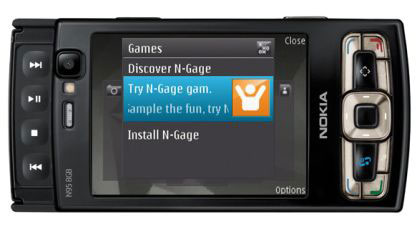
Nokia N95 8GB

Although some of the enhancements over its predecessor are minor, they make a big difference to the user experience and deliver a device that's better behaved and more primed for business than its predecessor.

Last year, I had a brief relationship with the silver-fox that was the original Nokia N95. This made its debut in late 2007, but that quickly broke down when its bigger (capacity-wise), and better-looking brother appeared on the scene.
You may feel IT PRO somewhat slow of the mark for featuring a review of this product after so many months, but there is method in our madness. I wanted to live, breathe, work and play N95 8GB to ensure it has truly been road tested for corporate use; more of a meaningful, long-term relationship than a brief fling, if you will.
Size-wise, the N95 8GB is no super model, but nor is it, as Cartman in South Park would say 'big boned.' At 128g, 99mm long (and that's before you've even extended the number pad), 53mm wide and 21mm thick, it's bigger than I'd like but it does have a lot of features and functionality to pack in and smartphone fans have always accepted the need to compromise the svelte factor to cram in the goods.
The N95 8GB is no exception. Chunky is perhaps the wrong word, but it's certainly not discreet and will certainly put a budge in your trousers, so you might need to be careful where you put it, especially if you're male.
Perhaps the size of the device helps keep it safe from harm. I've dropped the phone quite a few times and it doesn't appear to have done it any harm - a plus for those working in the field or in less than ideal conditions.
The most obvious visual difference between the N95 8GB and its predecessor is the shell, a sophisticated black hue, which actually fools you into thinking it's a different model on first glance. There's also the screen size, with the 8GB version having a very slightly larger 2.8in screen, compared to the original's 2.6inches. Otherwise it offers the same respectable QVGA (240 x 320 pixels) TFT display, an ambient light detector and the ability to display up to 16 million colours.
The handset offers dual-slide opening options, (as in, the screen can slide both up and down), which is a pretty funky in my opinion.
Sliding the screen up provides easy access to the traditional numeric keypad below, while sliding it down reveals fast forward, play/pause, stop and rewind buttons. When you open this option, the screen automatically turns into landscape mode, to optimise your viewing pleasure.
Get the ITPro daily newsletter
Sign up today and you will receive a free copy of our Future Focus 2025 report - the leading guidance on AI, cybersecurity and other IT challenges as per 700+ senior executives
Maggie has been a journalist since 1999, starting her career as an editorial assistant on then-weekly magazine Computing, before working her way up to senior reporter level. In 2006, just weeks before ITPro was launched, Maggie joined Dennis Publishing as a reporter. Having worked her way up to editor of ITPro, she was appointed group editor of CloudPro and ITPro in April 2012. She became the editorial director and took responsibility for ChannelPro, in 2016.
Her areas of particular interest, aside from cloud, include management and C-level issues, the business value of technology, green and environmental issues and careers to name but a few.
-
 ‘Phishing kits are a force multiplier': Cheap cyber crime kits can be bought on the dark web for less than $25 – and experts warn it’s lowering the barrier of entry for amateur hackers
News Research from NordVPN shows phishing kits are now widely available on the dark web and via messaging apps like Telegram, and are often selling for less than $25.
By Emma Woollacott Published
-
 Redis unveils new tools for developers working on AI applications
News Redis has announced new tools aimed at making it easier for AI developers to build applications and optimize large language model (LLM) outputs.
By Ross Kelly Published
-
 Google layoffs continue with "hundreds" cut from Chrome, Android, and Pixel teams
News The tech giant's efficiency drive enters a third year with devices teams the latest target
By Bobby Hellard Published