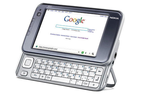
Nokia N810 Internet Tablet
Nokia N810 Internet Tablet

Nokia's linux based N810 internet tablet has a good range of connectivity options, a high-res screen and integrated GPS, but with no SIM card support and a paucity of relevant third part applications its appeal to the enterprise market is limited.
Unless you've got a Linux whiz in your department and can convince the IT policy that anything written to talk to their back-end software is safe and secure, you're going to be restricted to using existing web based interfaces.
In this respect the N810 mobile browser is one of the better mobile browsers. It handles Flash sites, some elements of Ajax, and coped with a large number of websites - more than the browser on the Nokia smartphones. The browser can be maximised to take up the entire 800 x 480 screen, and that means most web pages are going to be displayed in the same way as on a full screen monitor. But it's not perfect, and the zoom ability is light years behind Apple's mobile Safari implementation. Anything other than the regular 100 per cent size and formatting and layout errors start creeping in.
The browser is also saddled with the Maemo user interface, and describing this as clunky would be generous. Where the iPod touch and iPhone have a clear and simple UI, dedicated to being used by big clumsy fingers, the N810 comes equipped with a menu button and cursor to drive round the applications; a stylus for hitting radio buttons in dialogs and tiny textual links in the browser; and parts of the interface have large sized target areas for your fingers to work the device. With no consistency to when each should be used, I ended up using the stylus at all times and cursing the tiny target areas on many of the dialogs.
The slide out keyboard, while improving on this internet tablet's handwriting recognition interface, has a compromised four row layout - all the numbers are accessed by holding down the function key, slowing down text entry to the point where you have to really look at the keyboard while typing. The layout for punctuation and special characters is not intuitive, and for the first time that I can recall, the keyboard does not have any raised bumps to let you feel where the F and J keys are. It's an improvement over the on-screen keyboard that you can also choose to use, so there is some benefit to having it.
How would I classify the N810? As nothing more than a handheld web browser (with some good multimedia functions). Two or three years ago, this would have been enough to make the N810 a revolutionary device; now it seems rather tired. A lot of promise is in the device, but compromises, bad design decisions, and no clear vision of the target market have dulled the appeal of the N810. It's a good personal media device, but in no way should it be considered as a replacement or even a partner to a laptop. Until both the operating system and the third party developer scene mature, it's going to remain nothing more than a curiosity to the enterprise market.
Verdict
Nokia's linux based N810 internet tablet has a good range of connectivity options, a high-res screen and integrated GPS, but with no SIM card support and a paucity of relevant third part applications its appeal to the enterprise market is limited.
Dimensions (LxWxD): 72 x 128 x 14mm Weight: 228g Battery type: Li-ion 1,500maH Usage time (mfr: ) up to four hours (continuous) Standby time (mfr: ) 14 days GSM frequencies: None 3G/HSDPA: No Screen size: 4.13in Resolution: 800 x 480 pixels On-board memory: 128MB Memory card type: none Camera: VGA Connectivity: Infrared, Bluetooth, Wi-Fi, 802.11b/g GPS: Yes, built-in
Get the ITPro daily newsletter
Sign up today and you will receive a free copy of our Future Focus 2025 report - the leading guidance on AI, cybersecurity and other IT challenges as per 700+ senior executives
-
 M&S suspends online sales as 'cyber incident' continues
News Marks & Spencer (M&S) has informed customers that all online and app sales have been suspended as the high street retailer battles a ‘cyber incident’.
By Ross Kelly Published
-
 Westcon-Comstor unveils new managed SOC solution for Cisco partners
News Powered by Cisco XDR, the new offering will enable partners to tap into new revenue streams, the company said
By Daniel Todd Published
-
 More than 5 million Americans just had their personal information exposed in the Yale New Haven Health data breach – and lawsuits are already rolling in
News A data breach at Yale New Haven Health has exposed data belonging to millions of people – and lawsuits have already been filed.
By Emma Woollacott Published