Symbian-based smartphones
Smartphones can be as vital to conducting business as your laptop, so choosing the right one to work with is essential. IT PRO compares and tests five of the latest Symbian-based devices.
Where the P990i is the classic all-rounder, all things to all people device, the M600 represents a tight focus on messaging. There are subtle differences in the UIQ interface between the two devices - the M600 leans more to being used in one hand with a thumb touching the screen, rather than a pointer - but that doesn't change the fact that the messaging application in the M600 is essentially the same as that in the P990i. So why have two different devices?
Have a look at what's missing. First of all there is no Wi-Fi. This isn't as much of a problem as you'd expect given that most people on this device are going to be using a 3G or GPRS data plan to go online and pick up their emails. As in the P990i, there is Push Email support for the popular brands, and you can still check POP3 quickly with a few thumb presses.
Along with losing Wi-Fi support, the M600 lacks a camera, primarily for the same reasons the E61 lacks one. Most businesses (particularly those involved in sensitive research and development, or handling sensitive customer/supplier data are wary of devices with cameras and tend to ban them. So the lack of one is an advantage for the M600. It also means that much less space is required inside the case. The result is one of the slimmest, most stylish phones out there.
The size means a small Qwerty keyboard would be very cramped in terms of button size, so the solution here is to double up the buttons in a similar fashion to the BlackBerry Pearl device. Each key can be pressed on the left hand or right hand side - each one gives a deferent letter, so the first key gives 'q' to the left and 'w' to the right (giving us a Qw Er Ty Ui Op over the top row of five buttons). Technically it's a great solution - in practice it does take some time to be comfortable with it, and it is slower than a full Qwerty solution. But to balance that off the keys are easily rocked to either side, and the size of them means there's very little problems with hitting the wrong key. When switching to numbers, either directional press will suffice to dial a digit.
And where the P990i has two interfaces, the M600, although only having one style of interface, actually has two ways it can be used, one handed with your thumb hitting the large onscreen buttons, and another using the stylus in the traditional two handed way. There in a touch too much compromise for each mode to work to make the M600 an easy device to use - the lack of a direction pad (you have a scroll wheel and on-screen buttons) contributes to this - most people expect a d-pad on a high end phone.
The M600 is good smartphone, and it does one job really well - the compromises mean that most people looking for a good multi function device will be disappointed. Sony Ericsson is looking to capture both the BlackBerry user with this device and the fashion conscious user.
Sony Ericsson user guides, FAQs, reviews & downloads at Know Your Mobile
Get the ITPro daily newsletter
Sign up today and you will receive a free copy of our Future Focus 2025 report - the leading guidance on AI, cybersecurity and other IT challenges as per 700+ senior executives
Verdict
Equally at home on the catwalks of Milan to the Starbucks in the City of London, will keep you looking cool and in touch with everything in the office.
-
 Google faces 'first of its kind' class action for search ads overcharging in UK
News Google faces a "first of its kind" £5 billion lawsuit in the UK over accusations it has a monopoly in digital advertising that allows it to overcharge customers.
By Nicole Kobie
-
 Neural interfaces promise to make all tech accessible – it’s not that simple
Column Better consideration of ethics and practical implementation are needed if disabled people are to benefit from neural interfaces
By John Loeppky
-
 Smartphones sales outpace feature phones in Q2
News Microsoft also overtakes BlackBerry to take third place.
By Rene Millman
-
 Nokia bids final farewell to Symbian
News Finnish phone manufacturer pulls plug on smartphone OS after 16 years.
By Jane McCallion
-
 Apple on top in smartphone wars
News The iPhone maker led the pack in 2011, thanks to record sales of its mobile device.
By Tom Brewster
-
 Nokia suffers weak Q4 despite Lumia success
News Nokia is still struggling to get some good numbers out, even though its Lumia range is performing well.
By Tom Brewster
-
 Nokia and Microsoft: not yet doing the business
In-depth Inside the enterprise: Nokia has unveiled its much-anticipated Windows phone. But the focus seems to be on consumers.
By Stephen Pritchard
-
 Nokia launches Windows Phone 7 handsets, but US and China miss out
News The long-awaited Nokia Windows Phone 7 handsets are out, but the Finnish giant is sitting out the lucrative American and Chinese markets this Christmas.
By Alan Lu
-
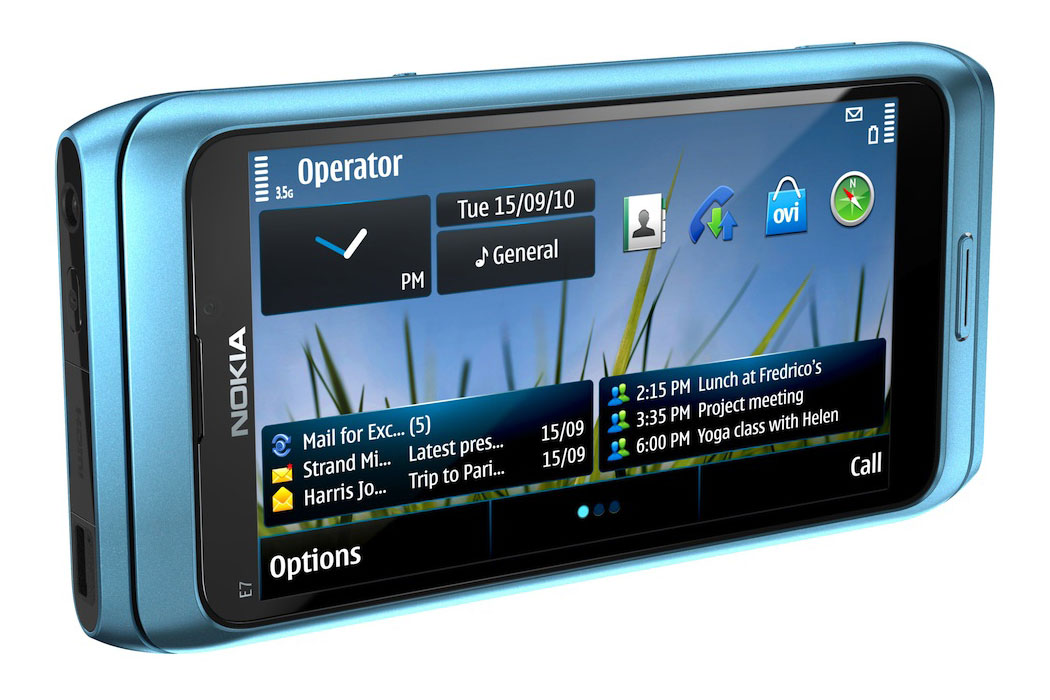 Nokia E7 review
Reviews Nokia's last gasp Symbian smartphone, the E7, is here. Does it go out in a blaze of glory or is it a damp squib? Julian Prokaza finds out in our review.
By Julian Prokaza
-
 Nokia cuts 4,000 jobs
News The mobile manufacturer admits 4,000 jobs will go, with a further 3,000 shifted over to Accenture as part of a Symbian partnership.
By Tom Brewster