In search of the Linux desktop
How can GNOME and KDE developers create the modern Linux desktop?

KDE and GNOME are the mainstream desktop environments for GNU/Linux. There are lightweight options that use fewer resources, such as Xfce or Fluxbox, but new users are more likely to encounter KDE or GNOME, which most closely follow the familiar desktop metaphors common to Windows or Mac.
The historic challenge for the KDE and GNOME developers has been to reproduce the functionality available to users of other operating systems, and a bit more besides. But in recent times the developers have begun to look towards a future that might take the desktop further beyond the accepted conventions.
As the KDE developers have expressed it: "Desktop computing has changed radically in the last 20 years, yet our desktops are essentially the same as they were in 1984. It's time the desktop caught up with us."
The point and click desktop as we know it has been around since monitors had flickering green screens, although the average laptop has disk, RAM and graphics capacity that was undreamt of a few short years ago.
The approach of both GNOME and KDE developers is to find ways of taking full advantage of both the expanding technology and the limited spacial characteristics of the modern computer screen. In doing this they have to satisfy the conflicting demands of users.
The 'interface Nazis'
GNOME and KDE offer different philosophies of usability. KDE is highly customisable and, within obvious limitations, offers the user the opportunity to maximise the personality of his or her desktop. GNOME tends towards a more sparse interface based on its HIG (Human Interface Guidelines) which dictates that programs should offer as few options to the user as possible, minimising confusion and maximising expected behaviours and thus enhancing usability. Both aim for the holy grail of consistency between applications.
Get the ITPro daily newsletter
Sign up today and you will receive a free copy of our Future Focus 2025 report - the leading guidance on AI, cybersecurity and other IT challenges as per 700+ senior executives
The GNOME stance on usability provoked Linus Torvalds to write in 2005: "I personally just encourage people to switch to KDE. This 'users are idiots, and are confused by functionality' mentality of GNOME is a disease. If you think your users are idiots, only idiots will use it. I don't use GNOME, because in striving to be simple, it has long since reached the point where it simply doesn't do what I need it to do. Please, just tell people to use KDE."
Torvalds also complained that: "GNOME seems to be developed by interface Nazis, where consistently the excuse for not doing something is not 'it's too complicated to do', but 'it would confuse users'," and continued this argument two years later on the Linux Foundation's Desktop Architects mailing list.
Likewise the KDE developers got into trouble with users when they prematurely released a radically revised version of KDE, although it was made plain that KDE 4.0 was a transition and not the final release. The predilection of Linux users to jump in and try everything early ensured a backlash against the KDE developers who had had the temerity to explore beyond the traditional desktop metaphors.
Usability is a delicate balance between utility and practicality, simplicity and aesthetics, and is inevitably subjective. How do you maximise both the potential scope and the usability of the desktop? Should the desktop be an end in itself, or should it be nothing more than a framework for accessing applications and data?
Unix users find usability in transparency and a multiplicity of choices. Mac users prefer one-click solutions and couldn't care less where their data hides.
-
 How the UK MoJ achieved secure networks for prisons and offices with Palo Alto Networks
Case study Adopting zero trust is a necessity when your own users are trying to launch cyber attacks
By Rory Bathgate
-
 Putting small language models under the microscope
ITPro Podcast The benefits of small language models are undeniable – but they're no silver bullet
By Rory Bathgate
-
 Developer preview offers first look at Android 13
News Changes include new privacy features, coding tools, and more options for creating bespoke settings at the app level
By Bobby Hellard
-
 AMD: Ryzen CPU owners should avoid Windows 11
News Company warns upgrading may cause performance dips of up to 15% for some apps
By Sabina Weston
-
 Latest Android 12 beta puts privacy front and centre
News Developers roll out a privacy dashboard alongside shortcuts to limit app access to components like the microphone and camera
By Keumars Afifi-Sabet
-
 New Chrome OS update makes it easier to check for hardware faults
News The diagnostic app can check for issues with the battery, the CPU, and on-board memory
By Bobby Hellard
-
 Acer drops Intel for AMD with latest Chromebook
News The Chromebook Spin 514 is Acer’s first to come with AMD Ryzen 3000 C-Series Mobile Processors
By Sabina Weston
-
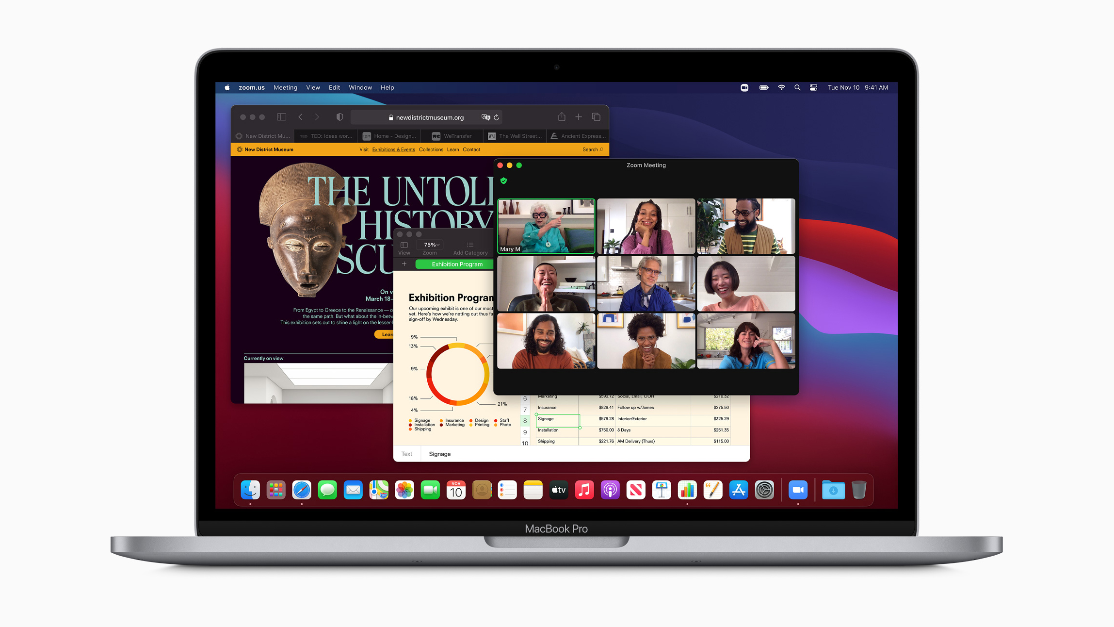
 Apple MacBook Pro 13in (2020) review: Powerful, portable – and almost perfect
Reviews The first business-grade M1 laptop is a huge hit
By Darien Graham-Smith
-
 BlackBerry and AWS are developing a standardized vehicle data platform
News Platform will give automakers a standardized way to process data from vehicle sensors in the cloud
By Rene Millman
-
 Apple’s iOS 14 to include a built-in translator for Safari
News Update to arrive later this month and may also enable Apple Pencil input on websites
By Mike Brassfield