Acer DX900 Dual-SIM mobile review
Carry two mobiles phones? Now you can use two SIM cards in one phone with the first dual-SIM mobile in the UK - the Acer DX900.

The Acer DX900 is pretty handy if you normally carry two mobiles around with you. It has it quirks like most devices, but hopefully other manufacturers will learn from Acer’s lead and start to produce more dual-SIM devices with better usability and battery life.

Dual SIM mobile phones have been a bit of a trend in Japan and Korea for quite some time, and now the first dual-SIM smartphone has hit our shores in the shape of the Acer DX900.
The DX900 is a re-branded E-TEN DX900, and the first device to come available in the UK, pipping the X960 to the post.
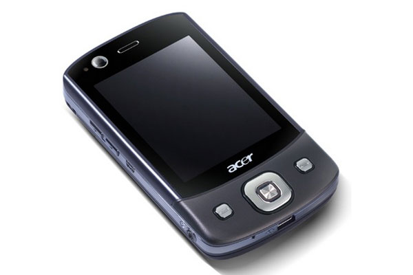
The Acer DX900 is a chunky beast at 106 x 60.5 x 17 mm (HxWxD) and it's heavy too with 147g behind it, but heavyweight features make up for the size.
The first impressive point to note is that it's dual-SIM, so a perfect option if you carry a work and personal phone around with you. It can take one 2G SIM card and a 3G module up to HSDPA speeds and both fit snugly behind the battery in the numbered slots. The top bar of the screen is split in two at the top, with the network status for each displayed clearly.
The dual SIMs work together so if get a call on either number, you can answer it.The device doesn't have separate phonebooks, or text message inboxes - all contacts and SMS messages are displayed in the same place.
However, when you write a text, you're asked which SIM you'd like to send it from directly after tapping send'.
If you tap on the network notification, you're taken to the connections menu where you can choose which number will be the one that calls will be coming from. You can also turn SIMs on and off. For example if you get home from work and want your personal SIM active and business number inactive, you can do this with a number of taps.
One important point to note on all Acer devices is that the rather sleek looking SPB Mobile Shell is preloaded, hiding the Windows Mobile 6.1 interface. SBP Mobile Shell enables you to flick through different screens, including your customisable homescreen, a quick contacts screen and the main menu. You can revert back to a Windows Mobile-style homescreen by swiping your finger up the screen.
The homescreen by default features a large calendar at the bottom of the screen, missed calls, texts and new emails along the top, plus chosen icons ours features weather and profile on either side. You can edit your homescreen options in SPB settings to suit your lifestyle, plus add extra tools and features if you wish.
Swipe your finger to the right and there's a contacts screen where you can add frequently accessed contacts. When you tap on any saved here, you can choose from different options depending on how much info you have on that person, including calling them, sending an SMS or email if you have their email address.
Get the ITPro daily newsletter
Sign up today and you will receive a free copy of our Future Focus 2025 report - the leading guidance on AI, cybersecurity and other IT challenges as per 700+ senior executives

Clare is the founder of Blue Cactus Digital, a digital marketing company that helps ethical and sustainability-focused businesses grow their customer base.
Prior to becoming a marketer, Clare was a journalist, working at a range of mobile device-focused outlets including Know Your Mobile before moving into freelance life.
As a freelance writer, she drew on her expertise in mobility to write features and guides for ITPro, as well as regularly writing news stories on a wide range of topics.
-
 Westcon-Comstor and Vectra AI launch brace of new channel initiatives
News Westcon-Comstor and Vectra AI have announced the launch of two new channel growth initiatives focused on the managed security service provider (MSSP) space and AWS Marketplace.
By Daniel Todd Published
-
 Third time lucky? Microsoft finally begins roll-out of controversial Recall feature
News The Windows Recall feature has been plagued by setbacks and backlash from security professionals
By Emma Woollacott Published
-
 The UK government wants quantum technology out of the lab and in the hands of enterprises
News The UK government has unveiled plans to invest £121 million in quantum computing projects in an effort to drive real-world applications and adoption rates.
By Emma Woollacott Published