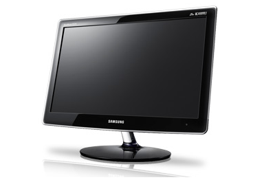
Samsung SyncMaster P2370 review
This 23in Samsung monitor offers a high resolution and low power consumption at a price that's as attractive as the display itself. Are there any downsides to the P2370?

Gorgeous design and impressive image quality combine to make a mockery of that low price. We'd only consider it for home/office use however, rather than in a more corporate environment.
Large-format monitors are getting cheaper by the day, and it's incredible just how much desktop real estate you can get for well under 200. Samsung's latest demonstrates that with aplomb, offering a whopping 23 inches of screen for a price of just 172 excluding VAT. But don't let that fool you: Samsung's monitors tend to emphasise quality and style over penny-pinching, so we were very keen to find out whether the SyncMaster P2370 could deliver the results at such a bargain price.
Taking it out of the box was a reassuring experience, as the frame is as sleek and glossy as we'd hoped. The all-black body is finished with a thin transparent glass trim, giving the P2370 a ghostly appearance on a desk. The bezel is rather wide at 30mm, so it's not ideal for tiling multiple screens, but it's all finished with the kind of quality that suggests you won't need to make use of the three-year warranty any time soon. The oval base connects to the body via a separate glass neck, but we had it up and running in mere minutes and no tools were required.
Disappointingly, the Samsung's incredibly thin frame is achieved by removing the power supply from the main body; instead there's a rather hefty power brick that you'll need to tuck out of sight. It plugs into the tiny panel on the rear next to a DVI port in true minimalist fashion, that's your lot in terms of connections, but thankfully Samsung saw fit to bundle a DVI cable in the box.
We hooked it up to our test PC and powered it up, measuring a very reasonable 30W power draw when displaying an idle Windows desktop. Out of the box it looked a little overbright, so we needed to make some alterations to the menu. Initially we couldn't see an interface, just a small power indicator in the bottom-right corner of the bezel, but a few prods around that area brought the previously invisible touch-sensitive controls glowing into life. They don't stay lit for long: we tweaked a setting, then fired up some programs to check the results, only for the controls to fade to black within a few seconds, which was a little irritating.
But they work well, and the on-screen menu is large, clear and well laid out, plus it's automatically positioned out of the way in the bottom-right corner of the screen a nice touch that allows you to clearly see the results of your tweaks immediately. Using DisplayMate, we saw that blacks were a little washed out so we lowered the brightness a little from the maximum, and also lowered the contrast to prevent lighter greys from washing out against a white background.
Get the ITPro daily newsletter
Sign up today and you will receive a free copy of our Future Focus 2025 report - the leading guidance on AI, cybersecurity and other IT challenges as per 700+ senior executives
-
 Westcon-Comstor and Vectra AI launch brace of new channel initiatives
News Westcon-Comstor and Vectra AI have announced the launch of two new channel growth initiatives focused on the managed security service provider (MSSP) space and AWS Marketplace.
By Daniel Todd Published
-
 Third time lucky? Microsoft finally begins roll-out of controversial Recall feature
News The Windows Recall feature has been plagued by setbacks and backlash from security professionals
By Emma Woollacott Published
-
 The UK government wants quantum technology out of the lab and in the hands of enterprises
News The UK government has unveiled plans to invest £121 million in quantum computing projects in an effort to drive real-world applications and adoption rates.
By Emma Woollacott Published