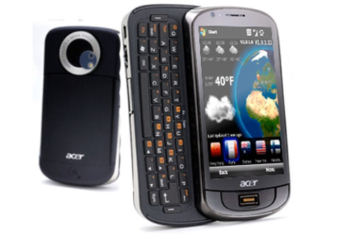
Acer M900 smartphone review
Acer churns out another Windows Mobile based smartphone, this time featuring a keyboard. Can it match up in a tough market?

We’ve been open-minded with Acer smartphones, but each seems to get worse. The M900 is chunky, unresponsive and bug-ridden, and even its low price can’t save this one.

Acer's Tempo series of Windows Mobile smartphones are now in full rollout mode across shop shelves, each designed to suit a different audience.
With its slide out body, the Acer M900 most certainly suits someone who requires a full QWERTY keyboard for typing long emails, documents or notes.
The specification is essentially the same as the HTC Touch HD, but of course with the addition of the keyboard. In particular, the screen matches the impressive 800 x 480 resolution of the HTC Touch HD.
Acer's M900 is hardly pocketable, with vital statistics of 62 x 17.1 x 119mm (WxDxH) and a hefty weight of 188g.
Despite the bulk, battery life is nothing short of poor. It uses the same 1530mAh as the F900, but on this device it seems the keyboard drains all juice from the rest of the device, lasting less than a day after being fully charged with moderate usage.
When we plugged the Acer M900 into the power supply to charge it, the smartphone seemed to get confused. It uses a miniUSB port, like other Acer Tempo phones, but the M900 kept asking which USB mode we wanted to go into, rather than just getting on with charging the device.
The bright screen is one of the M900's redeeming features though. Like the HTC touch HD, it's a high-resolution 480 x 800 pixel number, spanning 3.8-inches. It's pleasing to look at, with sharp images and clear text in browser windows. It's just the usability that lets the side down.
In fact, it's so supremely unresponsive, we were almost sobbing into our lap. This isn't just a problem with the screen though. To get the Acer M900 to respond to any prod or poke, whether by using the touchscreen or buttons, seems futile. It's hit and miss whether the phone will respond and if it does, whether it'll take you to where you wanted to go or off to another, completely different menu or application.
Even the keyboard provided enough irritation to make us take a deep breath before trying to type out an email again. The keys are angled upwards, meaning as you type, your finger bashes the side of the key rather than hitting the top and reproducing a letter on screen. The left and right softkeys are placed on the end rather than below the description, causing some confusion at first.
Get the ITPro daily newsletter
Sign up today and you will receive a free copy of our Future Focus 2025 report - the leading guidance on AI, cybersecurity and other IT challenges as per 700+ senior executives

Clare is the founder of Blue Cactus Digital, a digital marketing company that helps ethical and sustainability-focused businesses grow their customer base.
Prior to becoming a marketer, Clare was a journalist, working at a range of mobile device-focused outlets including Know Your Mobile before moving into freelance life.
As a freelance writer, she drew on her expertise in mobility to write features and guides for ITPro, as well as regularly writing news stories on a wide range of topics.
-
 ‘Phishing kits are a force multiplier': Cheap cyber crime kits can be bought on the dark web for less than $25 – and experts warn it’s lowering the barrier of entry for amateur hackers
News Research from NordVPN shows phishing kits are now widely available on the dark web and via messaging apps like Telegram, and are often selling for less than $25.
By Emma Woollacott Published
-
 Redis unveils new tools for developers working on AI applications
News Redis has announced new tools aimed at making it easier for AI developers to build applications and optimize large language model (LLM) outputs.
By Ross Kelly Published
-
 Google layoffs continue with "hundreds" cut from Chrome, Android, and Pixel teams
News The tech giant's efficiency drive enters a third year with devices teams the latest target
By Bobby Hellard Published