Google bumps up search size
Google says the bigger search box and font size symbolises its focus on search.
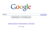

We're going to need a bigger (search) box - that seems to be the thinking at Google, which has extended the input box on its homepage and boosted the size of the font.
That may not seem like much, but Google has barely touched its minimalist homepage in the decade it's been around. Just this week, news broke that Google had patented its home page design.
Indeed, a slideshow of the changes to the site over the past decade is notable less for the tweaks than for how similar it is to the page at its original launch.
Yet, from today, the search box is a bit bigger both on the homepage and the results page, while the font is much larger and easier on the eyes.
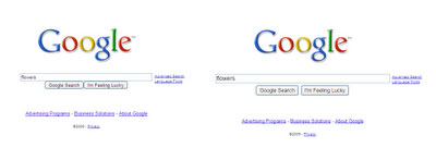
"Although this is a very simple idea and an even simpler change, we're excited about it because it symbolises our focus on search and because it makes our clean, minimalist homepage even easier and more fun to use," said vice president of user experience and search products Marissa Mayer on the Google blog.
"The new, larger Google search box features larger text when you type so you can see your query more clearly. It also uses a larger text size for the suggestions below the search box, making it easier to select one of the possible refinements," she added.
Get the ITPro daily newsletter
Sign up today and you will receive a free copy of our Future Focus 2025 report - the leading guidance on AI, cybersecurity and other IT challenges as per 700+ senior executives
Freelance journalist Nicole Kobie first started writing for ITPro in 2007, with bylines in New Scientist, Wired, PC Pro and many more.
Nicole the author of a book about the history of technology, The Long History of the Future.
-
 How the UK MoJ achieved secure networks for prisons and offices with Palo Alto Networks
Case study Adopting zero trust is a necessity when your own users are trying to launch cyber attacks
By Rory Bathgate
-
 Putting small language models under the microscope
ITPro Podcast The benefits of small language models are undeniable – but they're no silver bullet
By Rory Bathgate
-
 Google looks to shake up the way the tech industry classifies skin tones
News The tech giant is pursuing better ways to test for racial bias in tech products
By Mike Brassfield
-
 DuckDuckGo vs. Google: Privacy or popularity?
Vs Google may reign as king, but it’s not the only option in the world of search
By Sarah Brennan
-
 How to change your search engine in Microsoft Edge
Tutorials If you'd rather search through Google than Bing, here's how to change your default search provider in Windows 10's new browser
By Adam Shepherd
-
 Google's top 2014 search trends revealed
News Google 2014 trends have been unveiled, and include the year’s biggest sporting events, tech releases, cat stats and more
By Caroline Preece
-
 Google declares Amazon its biggest search rival
News Google has dubbed Amazon its biggest rival above other traditional search engine companies
By Caroline Preece
-
 EU demands more concessions from Google over search dominance
News Google gets another chance to end probe
By Rene Millman
-
 Bing's search now includes academic research
News Scholarly articles will also be featured in Microsoft's Cortana Personal Assistant
By Clare Hopping
-
 UK demands EU drops right to be forgotten law
News The government has asked for the right to be forgotten law to be removed from new European Union data protection laws
By Clare Hopping