Google Chrome 3 review
In seemingly no time, Chrome has made the leap from version 2 to 3. We see if Google's latest version should be your browser of choice.

The lack of major new features is perhaps not a surprise for a browser that prides itself on being lean and mean. It's also faster than ever, comfortably retaining its overall speed crown. Even so, it does struggle to justify the leap from version 2 to version 3. There are pleasing touches of polish that add to its usability, making it easier to use for longer periods for example, but with extension support currently held at developer-level, it seems as though its big moment is still to come.

When Google first released Chrome it came as both a shock, and the most natural thing in the world. Google has kept the fact that it was working on it tightly under wraps, yet once it arrived it seemed like an obvious and understandable move. After all, it doesn't make much sense for the web's biggest brand to rely primarily on its main rival to give its customers access to its services.
Now, just over one year on from its initial launch, version 3 has arrived. We had a quick look when thebeta appeared in August, but we thought we'd look again now the final version has arrived.
When the original beta appeared we immediately took to its innovative, lean, mean and pared down approach. However, we noted that in Google's quest for raw speed its browser lacked some of the finery that made the competition a more complete experience. Now version 3 is out, which takes it to just a half point release behind the long established Firefox, so it's time to take a look and see if the latest version has added any polish to the rough diamond.

The installation process is simple and speedy it runs the executable rather than makes you download the whole installer first and imports your favourites in no time at all. Note though that's it remains officially only available for Windows, with Mac and Linux versions still somewhere on the horizon.
In terms of appearance, Chrome has not moved away from the sleek, slimmed down look, that first marked its introduction and it still has a distinctive look over more traditional rivals such as Internet Explorer 8 and Firefox. Tabs sit above the taskbar, rather than below it, which does help to draw the eye to them. As before, you can close tabs just by hovering over them rather than having to click first, which feels noticeably less clunky than in Firefox, and dragging and moving tabs around and outside the browser feels easy.
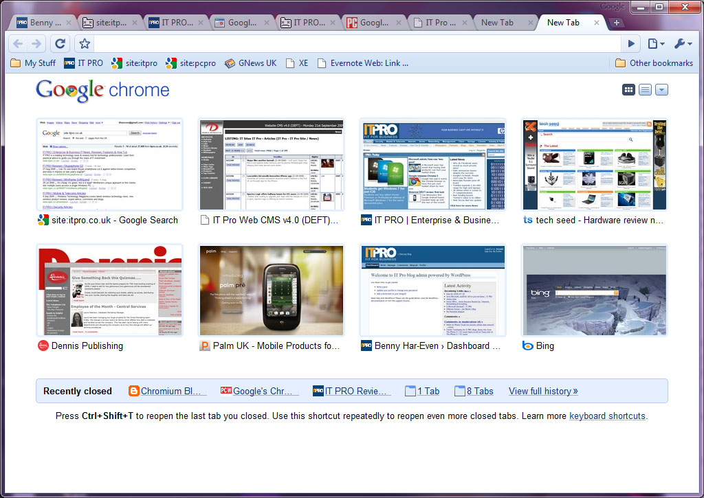
The headline new feature, however, in terms of looks is the thumbnail feature that displays, in grid-form, all the sites you've been to recently. This has been spruced up and - at last - you are able to move, and crucially delete, a recent page thumbnail, without having to wipe the entire history. If you've visited a somewhat 'sensitive' site this could prove a job saver.
Get the ITPro daily newsletter
Sign up today and you will receive a free copy of our Future Focus 2025 report - the leading guidance on AI, cybersecurity and other IT challenges as per 700+ senior executives
Benny Har-Even is a twenty-year stalwart of technology journalism who is passionate about all areas of the industry, but telecoms and mobile and home entertainment are among his chief interests. He has written for many of the leading tech publications in the UK, such as PC Pro and Wired, and previously held the position of technology editor at ITPro before regularly contributing as a freelancer.
Known affectionately as a ‘geek’ to his friends, his passion has seen him land opportunities to speak about technology on BBC television broadcasts, as well as a number of speaking engagements at industry events.
-
 Westcon-Comstor and Vectra AI launch brace of new channel initiatives
News Westcon-Comstor and Vectra AI have announced the launch of two new channel growth initiatives focused on the managed security service provider (MSSP) space and AWS Marketplace.
By Daniel Todd Published
-
 Third time lucky? Microsoft finally begins roll-out of controversial Recall feature
News The Windows Recall feature has been plagued by setbacks and backlash from security professionals
By Emma Woollacott Published
-
 The UK government wants quantum technology out of the lab and in the hands of enterprises
News The UK government has unveiled plans to invest £121 million in quantum computing projects in an effort to drive real-world applications and adoption rates.
By Emma Woollacott Published