Palm Pre review
Does the Palm Pre live up to the expectations of style conscious business users? Read our review to find out.

It’s slicker than using Symbian, arguably more pocketable than its top rivals the HTC Hero and iPhone and a valuable and valid alternative to the ever-expanding sea of Android phones we seem to be pelted with on a weekly basis these days. Updates would be welcome, but this is a good start.
Classy business
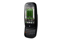
The Pre has admirably discrete keys, with strong contours and a gap between each one, but if your thumbs are on the larger side, it's all too easy to press multiple keys. We suggest heading down to a retail store to get your hands on a Pre if you're prone to problems with smaller devices. There's currently no virtual keyboard option either.
The dinky keyboard is the price paid for one of the Palm Pre's main aspirations to be a thoroughly business-capable smartphone that's still desirable. Let's face it, the Pre is certainly more of a looker than the Palm Treo.
However, in trying to make the Pre appear sleek and svelte, there's been a more genuine misstep made in the phone's design. While it might look like the Pre's front only houses a touchscreen and a single main button, there are actually additional touch-sensitive panels to the left and right of this lone real' button.
Swiping gestures across these panels are used almost constantly in the webOS interface and these lend the Pre its unfortunate learning curve. Your first half an hour with the device is spent wondering precisely how to use it largely because of the unintuitive nature of these touch buttons.
Thankfully, things improve with use and you realise that the webOS interface is in fact painfully simple to use. That said, we still don't like the touch sensitive interface elements much.
The Palm Pre lets you multi-task the hours away, because the phone's home screen is essentially nothing more than a task manager. Apart from this simple home screen, there's just a scrolling, touchscreen-controlled menu where all the phones functions and apps live as little icons in a 3x4 grid.
Sign up today and you will receive a free copy of our Future Focus 2025 report - the leading guidance on AI, cybersecurity and other IT challenges as per 700+ senior executives
Just like the iPhone, tap them and they load. Unlike the iPhone, when you hit the main button the Pre exits out to the home screen where the app continues running on some level in snapshot form rather than closing down completely. You can even switch apps from within the apps themselves with a swipe across the touch-sensitive buttons if you activate advanced gesture control one thing we have to doff a cap to the touchpad for as it's quite useful. Closing apps is as simple as flicking them upwards from the home screen, using the response capacitive touch screen.
-
 95% of organizations don’t fully trust their cybersecurity vendors – here’s why
News Organizations are struggling to assess vendor credibility as trust becomes a key factor in risk management.
By Daniel Todd Published
-
 Everything we know about the Hasbro hack so far
News The toy-maker keeps running thanks to business continuity plans, but nature of attack remains unclear
By Ross Kelly Published
-
 ‘Skipping a beat on resilience investment isn’t an option any more’ as IT outage costs soar
News Organizations are ramping up resilience efforts at IT outage costs continue mounting
By Emma Woollacott Published