Microsoft Office Web Apps review: first look
Has Microsoft finally got a worthy competitor to Google Docs waiting in the wings? We take a gander at the technical preview of Microsoft Office Web apps.


Google has almost single-handedly brought cloud computing to the mainstream, firstly with its Gmail service, and latterly with Google Docs. The concept of an online office suite took a couple of years to gain acceptance, but even though we weren't that impressed with it, many business have paid up for Google Apps, the corporate fully supported version. Microsoft has finally responded with Office Web apps, its own version that will be tied into the launch of Office 2010.
The Web Apps component is only at the technical preview stage and not publicly available and Microsoft has admitted that it's very much not the finished article. It's not kidding either, as of the four apps, Excel, PowerPoint, Word and OneNote, only the first two are editable at this stage. Word is a viewer only and OneNote doesn't work at all.
Of what there is, it's officially compatible with Internet Explorer, Firefox and Safari, but, perhaps unsurprisingly, not Chrome. Try it on the latter and while you can access the Skydrive you don't get the option to create new files. One has to wonder if that lack of support will carry over to the finished version
Even so for a Microsoft release it's decidedly low key. For those who do have access, the new web apps appear within Windows Live Skydrive, but after you've logged in, there's nothing to scream at you about the update.

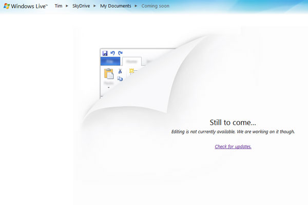
Unlike Google Docs, which presents you with a list of files, in SkyDrive a bunch of Windows style folders is displayed, and only once you've gone into the folder will you find a New' button appears, which lets you create Excel and PowerPoint files. Word and OneNote are in there too, but click Word and a "Still to come... Editing is not currently available. We are working on it though" message comes up. At least the Add Files' option lets you make up to five selections at once, which is a time saver.
When you click a file it doesn't open it straight away. Instead you get a page that shows a large icon on the left and information such as date, file size, and who it's shared with along with a URL to link directly to it. Above this is a slideshow showing other files in the folder and below is a comment box. It's all fine, but we'd rather it just opened the file and let you get to all of this afterwards.
Excel
Get the ITPro daily newsletter
Sign up today and you will receive a free copy of our Future Focus 2025 report - the leading guidance on AI, cybersecurity and other IT challenges as per 700+ senior executives
We did find an immediate benefit over Google though, as Microsoft gives you a generous 50MB files size limit. To test we chose an Excel file at random and uploaded it, and to compare with Google Docs we tried the same file but found that it would not upload as it was slightly larger than Google Docs' measly 2MB limit.
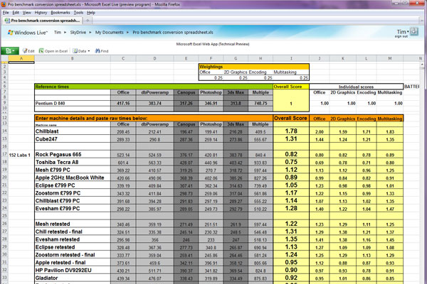
Once our Excel file was uploaded, we were impressed with how similar the file looked in terms of layout compared to the desktop version having Silverlight installed helps here. The ribbon interface that Microsoft introduced in Office 2007 has been carried over and there's no doubt it looks slicker than Google Docs.

Performance was good, but the fact that it wasn't as snappy as using a local copy of Excel was exacerbated by the fact that it looks so similar. We had an Excel file with 250 lines of data and scrolling down was laggy with a truly huge file it could get unworkable. How well the browser deals with JavaScript is crucial here, so we can expect Internet Explorer to get some attention in this area.
You don't automatically get to edit the file, but first have to click an Edit' button - but this brings up another annoyance in that standard .xls files have to first be converted into Microsoft's xlsx format. It's a clear attempt to push that upgrade to Office 2010, especially for Office 2003 users.
The formula embedded into the file were also carried over without issue and charts were also carried over well, but VBA macros are missing from the online party at the moment. However, things are rather limited when it comes to creation the Home and Insert tabs are the only available at the moment so you can't create charts online.
PowerPoint
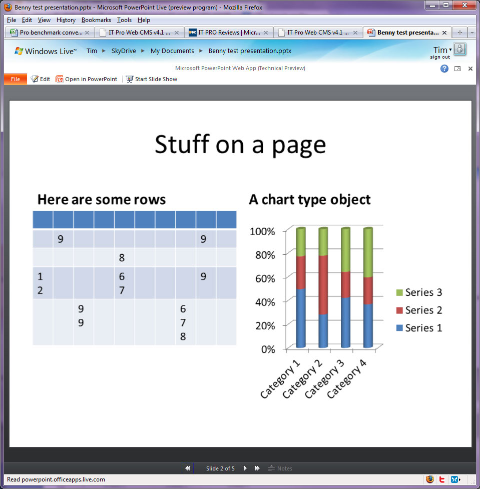
PowerPoint does a very good job with displaying your uploaded files, but creating content is still limited compared to the desktop version. However, you can create a range of slides and easily add images or choose from a range of smart art. If you want to run the slide show full screen you can do, once you've allowed pop-ups in your browser. You could theoretically prepare your slides on the desktop version, use the Live Apps to back it up even use your browser as a presentation tool if you had too.

Word
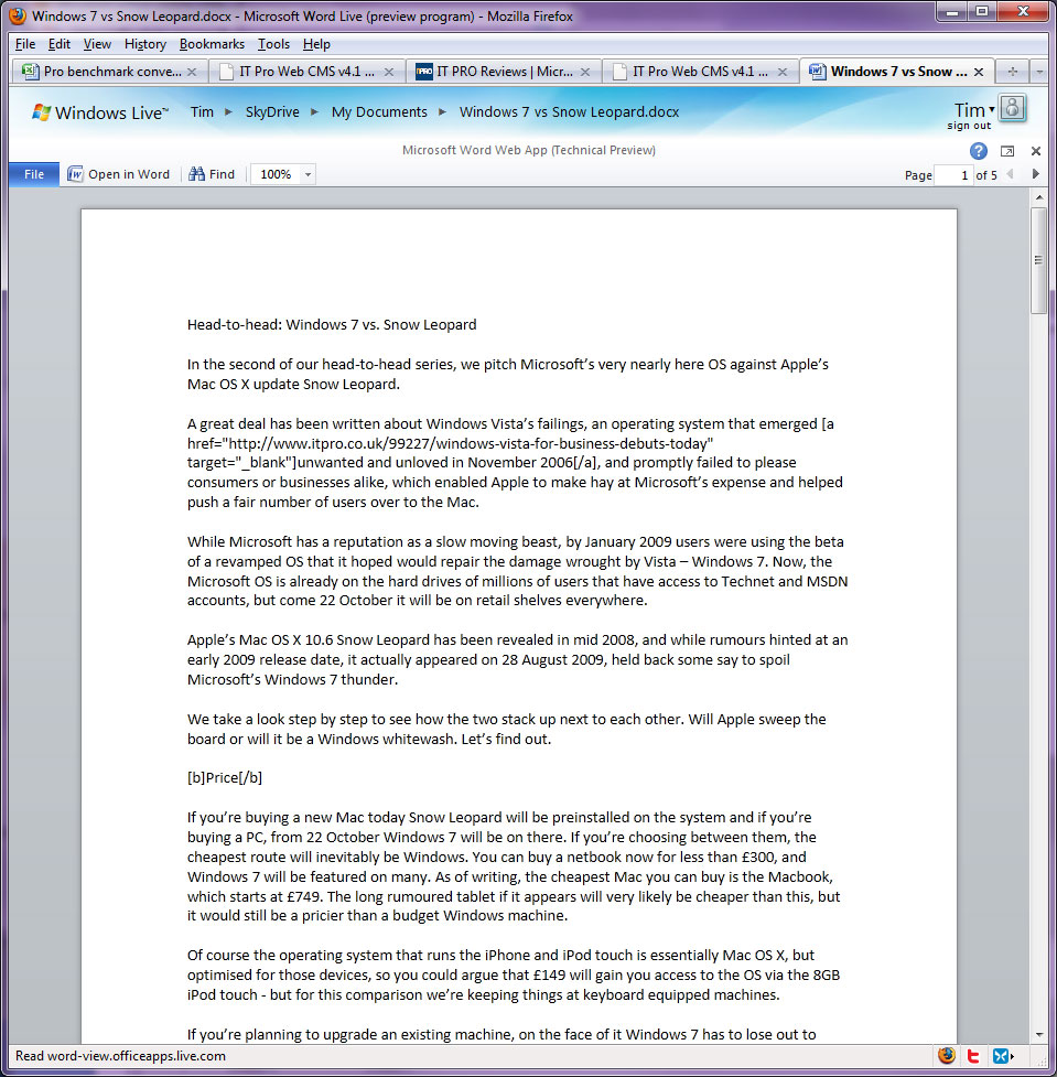
As there's no editing currently enabled Word is simply a presentation tool. It does a great job of mimicking the look of your local application, though with no editing the ribbon has yet to make an appearance. The Office 2010 style menu is still in evidence. One feature we use all the time on the desktop version when viewing documents is to keep the file in print view but double click in-between the pages to remove the header and footer area for keeping the text contiguous. That's not present online at the moment but it's still early days.

Collaboration
One of the major advantages of an online tool is that it makes sharing documents and collaborating on them so much easier. As it stands though, Microsoft has a lot of work to do in this area. Unlike Google Docs, there's no quick and easy way of sharing a particular file. What you have to do is share entire folders, so to share multiple files with multiple people you're going to have to create a lot of folders. You can at least invite anyone using any email address they aren't required to have a Windows Live ID. After you add someone they will get an email enabling them to open the folder directly.
All in all, one does get the sense that Microsoft has perhaps made this technical preview available a little too early, perhaps under pressure to show that it too was going to have an online component to its Office 2010 suite. In practice it's really not ready for use beyond investigating what's coming up so don't think of jumping away from Google Docs just yet.
However, in terms of look and feel, it's good. If a company is looking to "go cloud", a suite that looks just like the apps its employees are already using is going to be a big draw. We're going to have to wait for Microsoft to finish the job but when it does, Google certainly isn't going to have everything its own way.
Verdict
Microsoft's Office Web Apps are somewhat lean at the moment in terms of features, but what is there is impressive. In terms of mimicking the look and feel of the desktop app, it's done a good job.
Benny Har-Even is a twenty-year stalwart of technology journalism who is passionate about all areas of the industry, but telecoms and mobile and home entertainment are among his chief interests. He has written for many of the leading tech publications in the UK, such as PC Pro and Wired, and previously held the position of technology editor at ITPro before regularly contributing as a freelancer.
Known affectionately as a ‘geek’ to his friends, his passion has seen him land opportunities to speak about technology on BBC television broadcasts, as well as a number of speaking engagements at industry events.
-
 Third time lucky? Microsoft finally begins roll-out of controversial Recall feature
News The Windows Recall feature has been plagued by setbacks and backlash from security professionals
By Emma Woollacott Published
-
 The UK government wants quantum technology out of the lab and in the hands of enterprises
News The UK government has unveiled plans to invest £121 million in quantum computing projects in an effort to drive real-world applications and adoption rates.
By Emma Woollacott Published