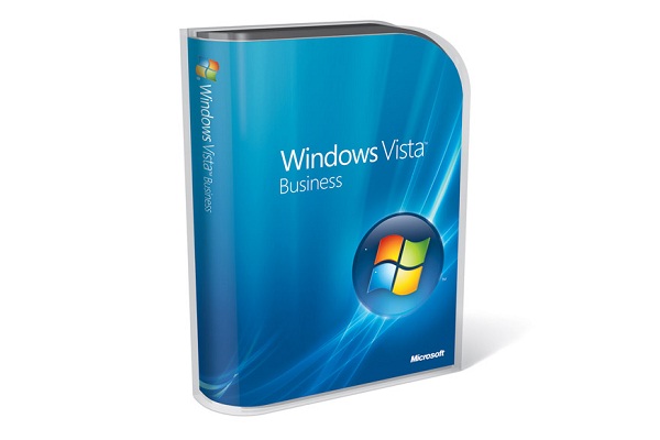
Microsoft Windows Vista review
Window's XP's replacement is finally here. We delve deep into the new OS to see if it's worth upgrading?

It's by no means perfect, but the improved security, search and look-and-feel make Vista an obvious upgrade for anyone whose hardware will support it. But only if you can afford the high price.
Windows Explorer
With an increasing number of files littering our hard disks, Vista introduces new ways of finding and organising them, as well as easier navigation. The new-look Explorer windows dump the cartoon icons of XP, hiding most of the options behind drop-down arrows. The menu bar is also hidden by default. The "breadcrumb trail" bar at the top of Explorer Windows takes some getting used to, but it's a much easier way of navigating deep folder structures, and presents a friendlier nomenclature than XP's absolute paths. The absence of the Up button is the most frustrating change, but you can generally achieve the same effect using a drop-down menu.
The window itself is divided into a number of optional panes. The new Links menu on the left-hand side of windows is a great addition - you can re-order, add, delete or rename shortcuts there, and it's by far the quickest way to skip between folders. Disappointingly, however, you can't Ctrl + click to open a new window instance from it. Underneath, there's a Folder tree list, which can be slid up to join or replace it. It's handy to have both, but isn't an elegant implementation, particularly at lower screen resolutions, and it's easy to end up with a mess of shortcut buttons.
The Properties pane at the bottom of Explorer windows is a handy way to view or edit metatags (supported on all file types), and you can also set a preview pane on the right-hand side. This will preview Office documents, or supported media formats, although it's often only marginally quicker than invoking the actual application.
XP's passive column headers have been replaced by more complex versions. Drop-down arrows allow you to sort or filter by name, date range, type or practically any other attribute. You can further sort into Stacks (effectively virtual folders, with a single item representing each division) or collapsible lists. In conjunction with the multitude of "view by", "sort by" and "group by" options, you can display folders or files in hundreds of ways, with little regard to where they're actually stored. As this uses the Instant Search index, you can create a Saved Search from this, and immediately recall a dynamically updated version in the future, complete with the same formatting. It's a very powerful tool.
Instant Search
Windows XP's search feature was painfully slow and cumbersome, and although both Windows 2000 and XP had indexing services, they were turned off by default. That's all changed in Vista, with an index acting as its principle source for search results. All Explorer windows (and many of the integrated apps) contain a search box at the top right, and results appear almost as soon as you start typing. Once you train Vista to your way of working (by adding extra folders to the index or including non-indexed locations and system files), it's much, much quicker than XP - and there isn't a bounding puppy in sight, either.
There's also an Instant Search box integrated into the redesigned Start menu. With the focus switching to it immediately, hit the Windows key and type in part of the application name - "calc", for example - and the standard program list is replaced by search results. Applications are prioritised (in this case showing Calculator uppermost), with emails or documents displayed beneath. For browsing programs, the All Programs link now uses scrollbars to display large numbers of items, rather than XP's cascading approach. The end result is both neater and quicker to use.
Get the ITPro daily newsletter
Sign up today and you will receive a free copy of our Future Focus 2025 report - the leading guidance on AI, cybersecurity and other IT challenges as per 700+ senior executives
-
 Layoffs loom for underskilled tech workers and poor performers – but there's light on the horizon for those willing to upskill
News Tech hiring managers expect to make layoffs in the coming months, with roles ripe for automation and workers with outdated skills the most likely to be cut.
By Emma Woollacott Published
-
 Executives think AI can supercharge cybersecurity teams – analysts aren’t convinced
News As organizations adopt AI, frontline cybersecurity workers are worried AI will reduce job security and increase their manual workload
By Rory Bathgate Published
-
 Software deployments are plagued by delays: Rampant skills shortages and underinvestment are slowing down processes – and it’s costing businesses big
News UK software deployments are running an average of four months beyond schedule, new research shows, with delays affecting more than eight-in-ten businesses.
By Emma Woollacott Published