Head to Head: Windows 7 vs Windows Vista
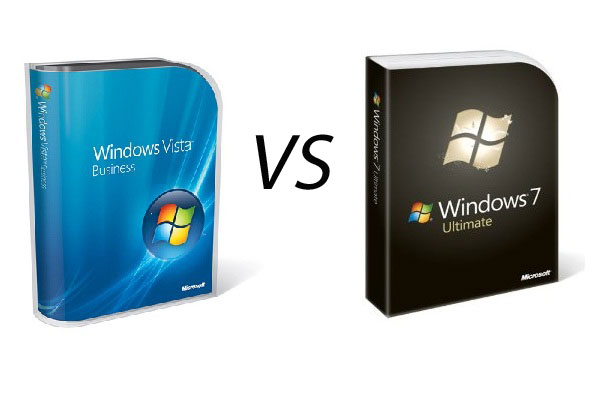
In our latest head to head, Windows 7 faces its immediate predecessor, Windows Vista. Will Vista be able to mount any kind of challenge?

User interface
Windows Vista did modernise the look and feel of Windows compared to XP, which has a rather simplistic and almost child-like look to it in parts when you use it these days, but few of them really added to the user experience. When comparing them side-by-side it does feel as if Windows 7 has finished off the many of the things that were added in Windows Vista but were perhaps not quite complete.
Aero Peek is one of them. Vista introduced Aero Glass, which on compatible hardware offered translucent Windows with rounded edges, and added glowing effects to edges of windows. You also got thumbnail views of open programs when you rolled over them in the task bar, which was quite a nice touch.
There was also the much touted Flip 3D' mode, which brought all open Windows into a carousel view and let you scroll through them via Windows-key + tab. However, there was nothing here of note that really improved functionality.
However, in Windows 7 a lot more thought has been put into things. All the features of Aero Glass are there, but things have been polished off. Rather than a single thumbnail, rolling over the app in the task bar lets you see multiple thumbnails for each app Window or browser tab that's open. Right clicking or left dragging brings up Jump Lists, giving you quick access to recently opened files. You can also interact with the thumbnails. Check out iTunes 9 on Windows 7, which lets you pause, skip and play tracks from the thumbnail. This means there's no need for the clumsy third-party gadgets that Vista offered, most of which looked pretty poor and worked poorly.
The Flip 3D feature is still present, but oddly it's actually worse in Windows 7. You can only use the Windows key+ tab to move through Windows, and the arrow keys no longer work. However, the more useful standard Alt-Tab has been improved. As in Windows 7, when you tab between windows, that app appears and all the others fade away, so you can clearly see what you're switching between. The task bar is also far better in Windows 7. There's no need for a Quick Launch' bar as you can pin apps directly to the Start Menu, and the larger default icons are easier to see.
Get the ITPro daily newsletter
Sign up today and you will receive a free copy of our Future Focus 2025 report - the leading guidance on AI, cybersecurity and other IT challenges as per 700+ senior executives
Benny Har-Even is a twenty-year stalwart of technology journalism who is passionate about all areas of the industry, but telecoms and mobile and home entertainment are among his chief interests. He has written for many of the leading tech publications in the UK, such as PC Pro and Wired, and previously held the position of technology editor at ITPro before regularly contributing as a freelancer.
Known affectionately as a ‘geek’ to his friends, his passion has seen him land opportunities to speak about technology on BBC television broadcasts, as well as a number of speaking engagements at industry events.
-
 Asus ZenScreen Fold OLED MQ17QH review
Reviews A stunning foldable 17.3in OLED display – but it's too expensive to be anything more than a thrilling tech demo
By Sasha Muller
-
 How the UK MoJ achieved secure networks for prisons and offices with Palo Alto Networks
Case study Adopting zero trust is a necessity when your own users are trying to launch cyber attacks
By Rory Bathgate
-
 Microsoft angers admins as April Patch Tuesday delivers password feature without migration guidance
News Security fixes include a zero day exploited by a ransomware group and seven critical flaws
By Connor Jones
-
 Managing a late migration
Opinion When it comes to moving from Windows 7 to Windows 10, it's better late than never
By Jon Honeyball
-
 How to set up a Windows 7 emulator for Windows 10
Tutorials A complete guide for setting up a Windows 7 emulator for Windows 10 so you don’t lose access to your apps
By Nik Rawlinson
-
 The autopsy of Windows 7
In-depth Report of a postmortem examination
By Chris Merriman
-
 The IT Pro Podcast: Farewell Windows 7
IT Pro Podcast We reflect on the legacy of one of Microsoft's most enduringly popular operating systems
By IT Pro
-
 Windows 7 ends: what do you do next?
In-depth From SMBs to big business and individuals, after 10 years it's time to move on from Windows 7
By Jon Honeyball
-
 Windows 7 end of life: What to do if you haven't upgraded yet
In-depth Microsoft has now officially moved Windows 7 to end of life, meaning it's no longer a viable business platform
By Dale Walker
-
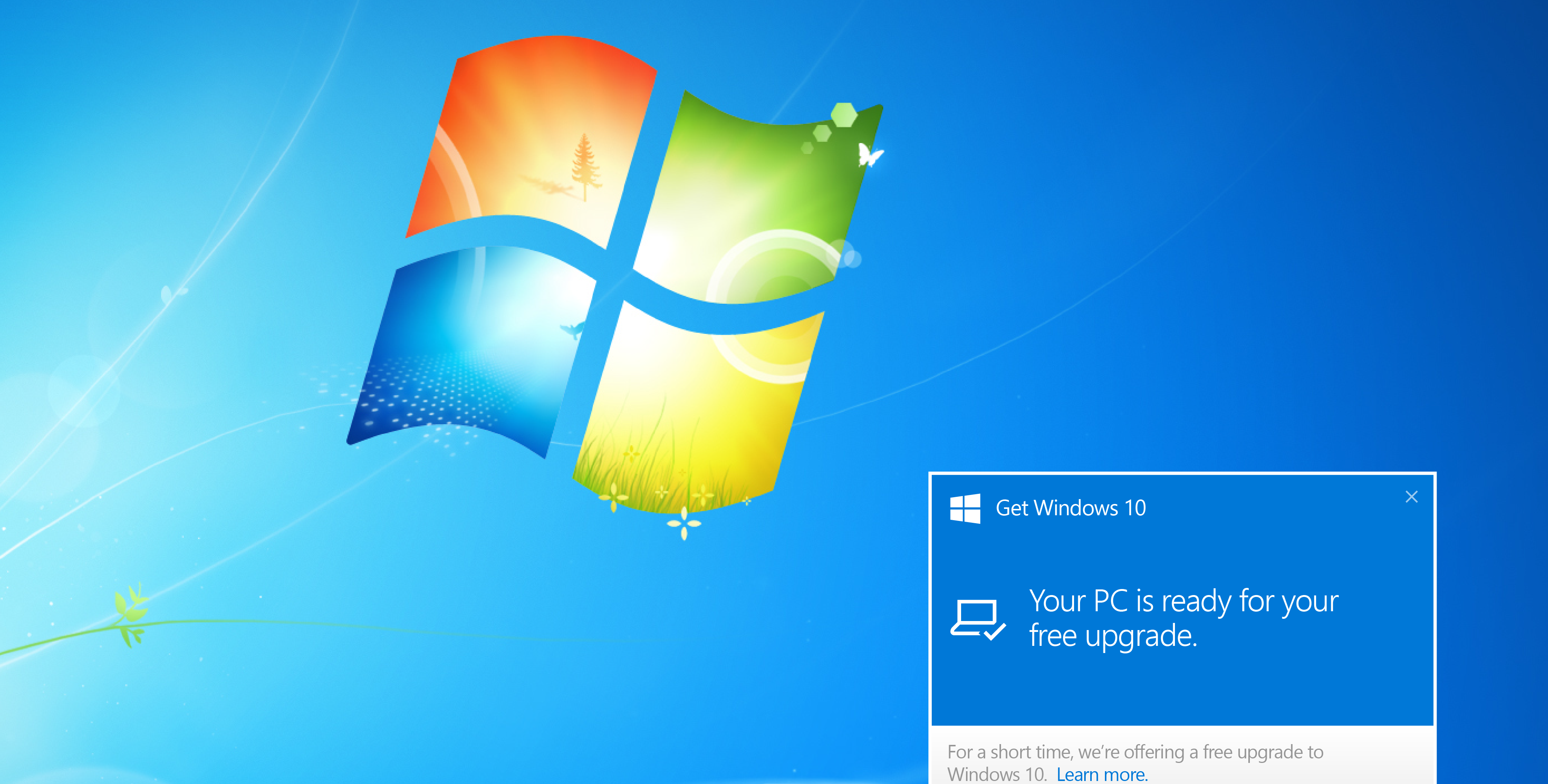 Windows 10 vs Windows 8.1 vs Windows 7 - Microsoft OS head-to-head
Vs We pit Microsoft's most popular operating systems against each other to see which is the greatest of all time
By Mike Passingham