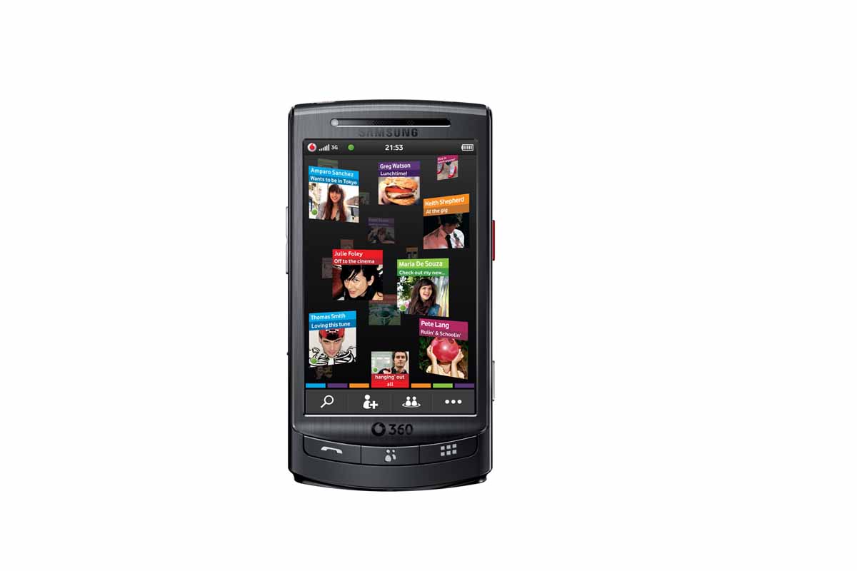
Vodafone 360 H1 review
We review Samsung's new H1 touch screen handset, exclusive to Vodafone and piloting its new 360 service.

With the added value of the built-in 360 social networking function - an area in which the iPhone is fast getting left behind - the H1 could be a winner, but only if Samsung and Vodafone sort out the glaring omissions and flaws in this device.Unfortunately though, the H1 isn’t the finished article and due to that it doesn’t score as highly as it could, and should, have.
We liked Vodafone's H1 handset and its accompanying 360 service when we played with it for a first look review earlier in the month, but are we still as enamoured?
Aesthetically, Vodafone's H1 handset looks like many of the other touch screen phones on the market at the moment. Although slightly larger than most, it has the familiar main function buttons below the screen and the usual rocker switches on the sides for volume control and zoom and the shutter button for the camera. The H1 also sports a nice sliding cover to the charger/data cable port, which adds to the aesthetics. It weighs in at 134g, which is neither too heavy nor too light, and feels comfortable in the hand in use.
The phone is finished on the front with brushed stainless steel framing the screen on our handset, which also comes in a black hue. Hard buttons on the front are minimalist, with just three (calls, contacts, activity) buttons on display, making it easy to navigate to where you want to be, However, the satin silver back casing looks and feels somewhat plasticky.
The screen itself is capacitive and large at 3.5in. The display is sharp and the icons on the home screen are laid out in the now familiar "iPhone" format. Further icons can also be found by sliding the screen across to the next page. Rather annoyingly though, you're informed about these extra screens by the fact that the first set of icons run off the edge of the screen. It just looks peculiar, as if the icons haven't quite made it all the way to their home position.
The icons themselves are easy to read and understand. However, this can be attributed to the fact they are, perhaps, a little too simplistic in their design. In an age where phone aesthetics and usability are becoming increasingly important in a saturated market, the bog standard design of the H1's icons are, to say the least, lack lustre and a bit boring.
Get the ITPro daily newsletter
Sign up today and you will receive a free copy of our Future Focus 2025 report - the leading guidance on AI, cybersecurity and other IT challenges as per 700+ senior executives
ITPro is a global business technology website providing the latest news, analysis, and business insight for IT decision-makers. Whether it's cyber security, cloud computing, IT infrastructure, or business strategy, we aim to equip leaders with the data they need to make informed IT investments.
For regular updates delivered to your inbox and social feeds, be sure to sign up to our daily newsletter and follow on us LinkedIn and Twitter.
-
 Cleo attack victim list grows as Hertz confirms customer data stolen – and security experts say it won't be the last
News Hertz has confirmed it suffered a data breach as a result of the Cleo zero-day vulnerability in late 2024, with the car rental giant warning that customer data was stolen.
By Ross Kelly Published
-
 Women show more team spirit when it comes to cybersecurity, yet they're still missing out on opportunities
News While they're more likely to believe that responsibility should be shared, women are less likely to get the necessary training
By Emma Woollacott Published
-
 OpenAI wants developers using its new GPT-4.1 models – but how do they compare to Claude and Gemini on coding tasks?
News OpenAI says its GPT-4.1 model family offers sizable improvements for coding, but tests show competitors still outperform it in key areas.
By Ross Kelly Published
