Microsoft Office 2010 beta review
The beta of Microsoft Office 2010 is now available for the public to download. We find out what’s new since the Technical Preview rolled out over the summer.

Look and Feel
The small but vocal minority of people who don't like the ribbon interface will not like Office 2010 because it has the ribbon everywhere but they are definitely the exceptions.
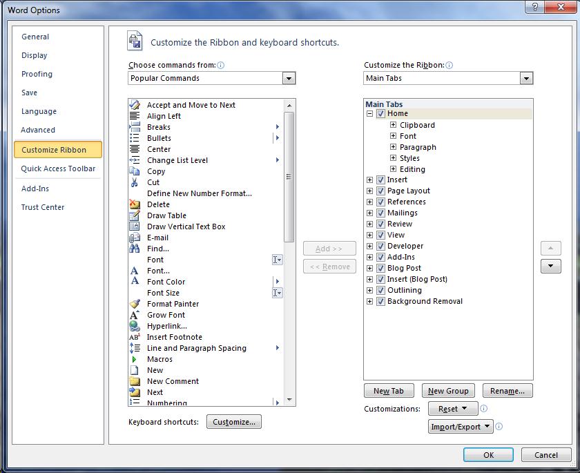
Forester Research claims that more than 85 per cent of users like the ribbon interface in Office 2007 and only 2.4 per cent found it "significantly more difficult to use". However, Microsoft has made some improvements for Office 2010, including allowing the ribbon to be customised by end users as well as IT professionals. This removes one of the naysayers' biggest objections.

Customise the ribbon as you want it in Office 2010 and share those customisations with others through import/export or Group Policy.
For most people, the way the new UI is introduced is important in setting their expectations and getting them comfortable with it. If they get a good start with a positive attitude from management and IT staff and a little training or hand-holding, any small dip in productivity is gone in a couple of weeks, replaced by a productivity boost, better looking documents and users who wouldn't want to go back.
All the applications have new icons, emphasising a capital letter, which may lead to some confusion between PowerPoint, Publisher (and Project), and the colour schemes are a little more subtle than in Office 2007 with the silver scheme being the default rather than blue.
Get the ITPro daily newsletter
Sign up today and you will receive a free copy of our Future Focus 2025 report - the leading guidance on AI, cybersecurity and other IT challenges as per 700+ senior executives
-
 Why keeping track of AI assistants can be a tricky business
Column Making the most of AI assistants means understanding what they can do – and what the workforce wants from them
By Stephen Pritchard
-
 Nvidia braces for a $5.5 billion hit as tariffs reach the semiconductor industry
News The chipmaker says its H20 chips need a special license as its share price plummets
By Bobby Hellard
-
 Touchjet Pond review
Reviews This Android-powered projector wants to replace your interactive whiteboard
By Mike Passingham
-
 Becta: Technology can be a catalyst for education reform
News Launch of annual report calls on education sector to follow industry's lead in technology.
By Nicole Kobie
-
 More internet access needed in classrooms say teachers
News Over a third of teachers feel internet access makes 'dramatic impact' on student results
By Iain Thomson