Head to head: Firefox vs Internet Explorer
In our latest head to head, we weigh up the web's most popular browsers: Microsoft’s Internet Explorer and Mozilla’s Firefox.

Winner: Firefox
User interface
At first glance, IE8 and Firefox look strikingly similar: both offer an address bar and search bar at the top, with shortcuts and tabs sitting below them, directly above the web page itself.
In fact, they're so similar it's a little suspicious, especially since other browsers such as Opera and Google Chrome arrange things differently. Glance back into history and the explanation becomes clear: while the Firefox front-end has barely changed in five years, Internet Explorer has in that time come to resemble it more and more closely.
But there are still differences between the IE8 and Firefox interfaces. An obvious one is the command bar the collection of icons and drop-down menus at the right-hand side of IE8's tab bar. Clearly, Microsoft wanted to put these controls at the user's fingertips, but this isn't a natural place to look for them, and it's not even obvious what they all do.
And although you can move or hide the command bar if you know what you're doing, in its default location it eats into the tab bar. Once you have just three or four tabs open, their handles and titles become irritatingly narrow.
Another quirk of IE8 is its menu bar, which by default is hidden away until the user presses the "Alt" key. This follows the style of Explorer windows in Vista and Windows 7, but it's still a terrible idea from a usability perspective. A non-expert user might never manage to find the feature they want.
Get the ITPro daily newsletter
Sign up today and you will receive a free copy of our Future Focus 2025 report - the leading guidance on AI, cybersecurity and other IT challenges as per 700+ senior executives
By comparison, the Firefox window looks positively basic, with a standard menu bar and just a handful of buttons on permanent display. But we think this is a more appropriate approach: after all, it's normally the website you're interested in, not the browser. And if you don't like the standard grey appearance, there are hundreds of freely downloadable "skins" to jazz it up as you see fit a nice touch that Microsoft can't match.
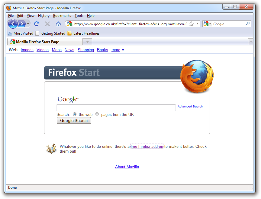
Firefox's simple front end does the job without distracting you from the page you're visiting.
The IE8 interface does have one neat original feature: when you open a link in a new tab, it colour-codes both pages so you can see at a glance which tabs are related. This is really more an aesthetic feature than a practical tool, though.
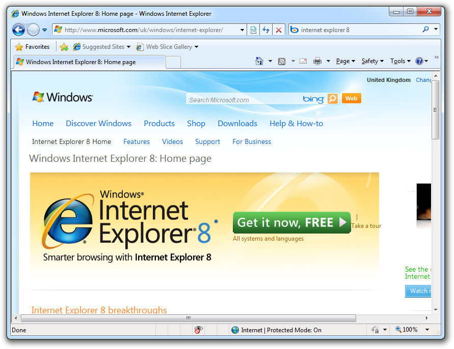
The Internet Explorer front end is a little more complicated than Firefox's.
Darien began his IT career in the 1990s as a systems engineer, later becoming an IT project manager. His formative experiences included upgrading a major multinational from token-ring networking to Ethernet, and migrating a travelling sales force from Windows 3.1 to Windows 95.
He subsequently spent some years acting as a one-man IT department for a small publishing company, before moving into journalism himself. He is now a regular contributor to IT Pro, specialising in networking and security, and serves as associate editor of PC Pro magazine with particular responsibility for business reviews and features.
You can email Darien at darien@pcpro.co.uk, or follow him on Twitter at @dariengs.
-
 Cleo attack victim list grows as Hertz confirms customer data stolen
News Hertz has confirmed it suffered a data breach as a result of the Cleo zero-day vulnerability in late 2024, with the car rental giant warning that customer data was stolen.
By Ross Kelly
-
 Lateral moves in tech: Why leaders should support employee mobility
In-depth Encouraging staff to switch roles can have long-term benefits for skills in the tech sector
By Keri Allan
-
 Spanish spyware outfit uncovered, develops exploits for Windows, Chrome, and Firefox
News Google was only able to discover the company after an anonymous submission was made to its Chrome bug reporting programme
By Zach Marzouk
-
 Firefox 95 boosts protection against zero-day attacks
News Mozilla's browser now takes a more granular approach to walling off code
By Danny Bradbury
-
 Mozilla to end support for Firefox Lockwise password manager
News Replacement service already lined up as browser specialist continues to streamline business
By Bobby Hellard
-
 Firefox available on Microsoft Store for first time
News Gecko-based browser arrives after Microsoft removes restrictions
By Danny Bradbury
-
 Mozilla to cut 250 jobs as part of major coronavirus restructure
News The reorganisation has been made so the company can become faster, more innovative, and find more revenue streams
By Keumars Afifi-Sabet
-
 Why I’m leading a browser double life
Opinion There are benefits to using more than one browser
By Barry Collins
-
 Mozilla re-hires veteran Mitchell Baker to serve as CEO
News The interim chair and CEO formally rejoins the organisation after Chris Beard stepped down in December 2019
By Keumars Afifi-Sabet
-
 Mozilla fixes two Firefox zero-days being actively exploited
News Critical vulnerabilities allow attackers to execute arbitrary code or trigger crashes
By Carly Page