Sony Ericsson Xperia X10 review: first look
Ahead of our full review of the Sony Ericsson Xperia X10, we take a first look at how the smartphone shapes up.

Sign up today and you will receive a free copy of our Future Focus 2025 report - the leading guidance on AI, cybersecurity and other IT challenges as per 700+ senior executives
You are now subscribed
Your newsletter sign-up was successful
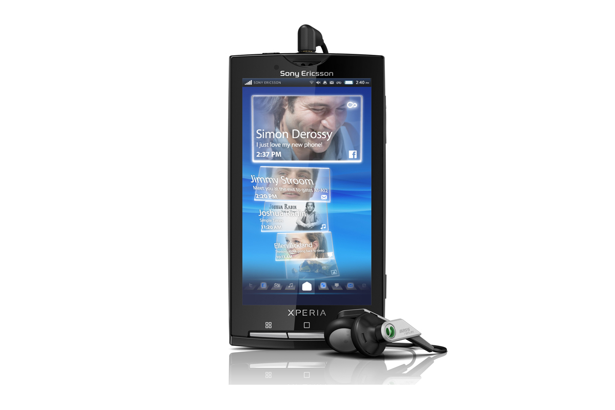
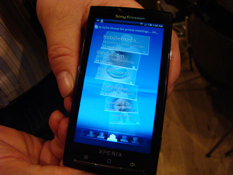
Tapping on a tile will enlarge it and display more content, and swiping a finger to the right or left anywhere on the screen will move to the next icon along the bottom.
Sony Ericsson's Timescape app makes it remarkably easy to manage communications on the Xperia X10. On the contacts screen for example, tapping on a contact's tile will make any and all communications between the user and said contact readily available. Calls, SMS and MMS, emails, Tweets, Facebook status updates and more are each displayed chronologically in a chat-like interface, and any type of aforementioned conversation can be continued from this view.
There's also an "infinity button" that recurs throughout the X10's UI, and it appears on each contact tile. Tapping the infinity button here will bring up an aggregated timeline of any and all communications with a particular contact, all in one single chronological waterfall of tiles.
As one would presume, Mediascape works in much the same way. Photographs, videos and music are presented and sorted in a number of ways, such chronologically by last-accessed and alphabetically. It pulls in a variety of content from services like Flickr, YouTube, PlayNow and more, and combines it with local media content for one centralised flow of multimedia magnificence.
While Mediascape struggled a bit on the X10's pre-release OS, the bigger picture was obvious. Once the lagging is ironed out, Mediascape will be a best-in-class feature where mobile entertainment is concerned.

Pricing and networks haven't yet been announced, but we sincerely hope that Sony Ericsson manages to launch the Xperia X10 with an operator as on a SIM-free basis the X10 will most likely be far out of reach for the majority of interested parties.
This review originally appeared on sister site Know Your Cell.
Sign up today and you will receive a free copy of our Future Focus 2025 report - the leading guidance on AI, cybersecurity and other IT challenges as per 700+ senior executives
Verdict
-
 Acer launches new Channel Partner Portal on 50th anniversary
News The digital platform includes a vast library of training documentation and Acer products, and also tools to compare models
-
 Concerns mount over cognitive impact of extended AI use at work
News Research from Boston Consulting Group backs earlier studies in highlighting the negative cognitive impact of AI at work