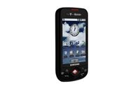
Talking of the keyboard, the Android on-screen QWERTY is well spaced in landscape mode, but a little cramped when using the device in portrait mode. To type comfortably, you'll have to use both hands something that could be dangerous while on the move.
One massive difference between the Galaxy and lighter Galaxy Portal is the lack of storage. The higher-specced Galaxy packs in 8GB of storage, while you'll only be able to load on 180MB of apps, music and video onto the Portal.
At first glance, this may be slightly disappointing, but there is a MicroSD card slot below the battery cover, allowing you to boost that storage by up to 32GB (the Galaxy only has support for 16GB cards). It is a pain to remove the cover every time you want to change cards, but the Galaxy Portal costs substantially less you can snap it up for nothing on a 20 a month contract deal through T-Mobile (17.02 if you're a business customer).
The Samsung Galaxy Portal runs on vanilla Android 1.5, meaning it misses out on a substantial amount of functionality. For one, there are only three home screens on offer. Given the fact that you have the full Android Market at your fingertips, this number is somewhat disappointing.
It's also sad to see that there's no multi touch support, especially when typing and using the browser. Fingers crossed this will come soon enough with an update.

Clare is the founder of Blue Cactus Digital, a digital marketing company that helps ethical and sustainability-focused businesses grow their customer base.
Prior to becoming a marketer, Clare was a journalist, working at a range of mobile device-focused outlets including Know Your Mobile before moving into freelance life.
As a freelance writer, she drew on her expertise in mobility to write features and guides for ITPro, as well as regularly writing news stories on a wide range of topics.
