Google gives search results a new look
Google’s search results page has been overhauled with a new “minimalist” aesthetic.


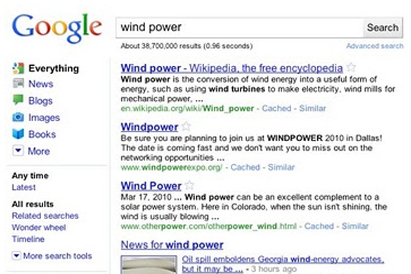
Google has given its search results page a new look, designed to make it as easy as possible for users to find what they want.
The most noticeable change is the move of search tools to the left in a new side panel, rather than at the top of the screen.
Powering the panel are Google's Universal Search technology, the Search Options panel and Google Squared.
"The top section of the new left-hand panel builds on Universal Search by suggesting the most relevant genres of results for your query and letting you seamlessly switch to these different types of results," explained Marissa Mayer, vice president of search products and user experience at Google.
An Everything' option is still the "essential search experience", Mayer said in a blog.
The expandable Search Options panel opens up a range of choices for web surfers, including the option to only get the newest information. Google's technology will suggest the tools that are the most relevant to the query.
Google Squared, meanwhile, scours the web for information and displays it in chart format for easy comparison
Get the ITPro daily newsletter
Sign up today and you will receive a free copy of our Future Focus 2025 report - the leading guidance on AI, cybersecurity and other IT challenges as per 700+ senior executives
As for the search results page's appearance, Google has made slight adjustments to form a "minimalist and whimsical" aesthetic but with a modern feel.
"The new design refreshes and streamlines the look, feel and functionality of Google, making it easier to pinpoint what you're looking for. It's powerful, yet simple," Mayer added.
Tom Brewster is currently an associate editor at Forbes and an award-winning journalist who covers cyber security, surveillance, and privacy. Starting his career at ITPro as a staff writer and working up to a senior staff writer role, Tom has been covering the tech industry for more than ten years and is considered one of the leading journalists in his specialism.
He is a proud alum of the University of Sheffield where he secured an undergraduate degree in English Literature before undertaking a certification from General Assembly in web development.
-
 Asus ZenScreen Fold OLED MQ17QH review
Reviews A stunning foldable 17.3in OLED display – but it's too expensive to be anything more than a thrilling tech demo
By Sasha Muller
-
 How the UK MoJ achieved secure networks for prisons and offices with Palo Alto Networks
Case study Adopting zero trust is a necessity when your own users are trying to launch cyber attacks
By Rory Bathgate