joojoo review
The joojoo tablet is widely considered to be the main threat to Apple's iPad. But does it live up to expectations? We review it to find out.

Bigger and bolder than the iPad, but not polished enough or convenient enough to mount a serious challenge
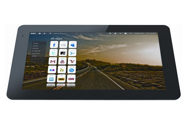
Alas there are areas where the joojoo and iPad differ. And not in a good way. Principally the problems focus on ease of use, but smoothness of operation is also an issue. The first sign of trouble is when you boot it up and try to scroll up and down through the list of website icons on the home page. Instead of animating smoothly up and down, the icons stutter and jerk, and firing up the history or bookmark view (by swiping a single finger left or right) is afflicted by the same geriatric shuffling. It's bizarre when you consider how quickly this device lets you swing between web pages.
Worse is yet to come, however. With such a large screen, you might expect every icon, link and button to be easy to hit, but that's simply not the case. Swipe a single finger down, and the device's context menu that pops up at the top of the screen is too thin, and populated by tiny, cryptic icons you have to really make an effort to tap. This wouldn't be a problem if they were rarely used, but the menu bar represents the joojoo's main control centre: you need it to go back and forward through your browsing history (why no gesture-support?), you need it to go back to the home page, you need it to bring up the multitasking view and you need it to enter a new web address.
Get the ITPro daily newsletter
Sign up today and you will receive a free copy of our Future Focus 2025 report - the leading guidance on AI, cybersecurity and other IT challenges as per 700+ senior executives
-
 CyberOne appoints Microsoft’s Tracey Pretorius to its advisory board
News The threat intelligence leader will provide strategic guidance to CyberOne’s executive team
By Daniel Todd Published
-
 CISA issues warning in wake of Oracle cloud credentials leak
News The security agency has published guidance for enterprises at risk
By Ross Kelly Published
-
 Reports: White House mulling DeepSeek ban amid investigation
News Nvidia is caught up in US-China AI battle, but Huang still visits DeepSeek in Beijing
By Nicole Kobie Published