Acer Liquid Metal review
Acer's latest Android 2.2 smartphone is only just making its way to the shops. Although very reasonably priced, is it worth buying over other smartphones? Read our review to find out.

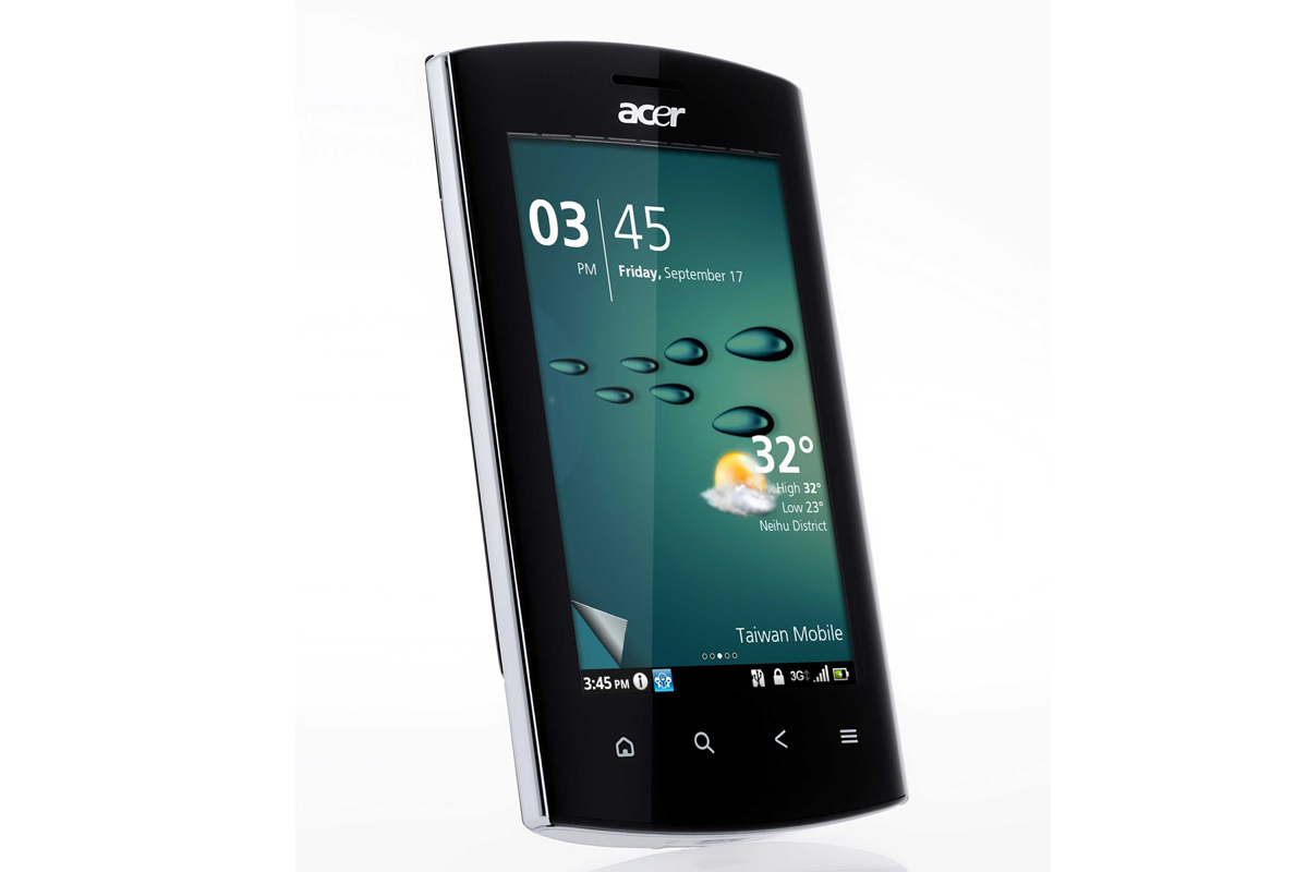
The Acer Liquid Metal runs Android 2.2 and on top of that sits Acer’s Breeze skin. This delivers a rather different take both on accessing widgets and how a home screen is structured. You'll either love it or hate it. You can drop it and use vanilla Android if you’d prefer, though.The screen is vibrant and sharp, and although the processor isn't the fastest available it's fast enough. Plus, the price is rather lower than other leading edge Android smartphones.

Sweep the small, virtual raised corner that sits on each of the widget screens to get into the main part of the interface.
Here you are faced with a main screen divided into three sections. At the bottom are two rows of app shortcuts. Sweep upwards to see the full list ranged across horizontally scrolling screens. The two shortcut rows remain static at the top of the screen, and you can tap and hold to drag any app to this area so that it is available from the main screen.
The upper part of the main screen can be scrolled to the left and right. Scroll left and you can see recently used apps and service, arranged as a carousel of thumbnails. Scroll right and you can see thumbnails of media tunes, pictures and video. The central screen shows the time and date.
In between these two sections is the Android notifications bar. It is a thin strip, but tap it accurately and you get a scrolling array of information and settings options that relate to the contents of the notification bar. You can toggle Wi-Fi and Bluetooth, set alarms, check battery life, set up your portable Wi-Fi hotspot and more. Configuring the Liquid Metal as a portable Wi-Fi hotspot might not be possible though, depending on your network's policies.
It is all a little convoluted, but if you like the system it does offer pretty swift access to a lot of features.
Get the ITPro daily newsletter
Sign up today and you will receive a free copy of our Future Focus 2025 report - the leading guidance on AI, cybersecurity and other IT challenges as per 700+ senior executives

Sandra Vogel is a freelance journalist with decades of experience in long-form and explainer content, research papers, case studies, white papers, blogs, books, and hardware reviews. She has contributed to ZDNet, national newspapers and many of the best known technology web sites.
At ITPro, Sandra has contributed articles on artificial intelligence (AI), measures that can be taken to cope with inflation, the telecoms industry, risk management, and C-suite strategies. In the past, Sandra also contributed handset reviews for ITPro and has written for the brand for more than 13 years in total.
-
 CyberOne appoints Microsoft’s Tracey Pretorius to its advisory board
News The threat intelligence leader will provide strategic guidance to CyberOne’s executive team
By Daniel Todd Published
-
 CISA issues warning in wake of Oracle cloud credentials leak
News The security agency has published guidance for enterprises at risk
By Ross Kelly Published
-
 Reports: White House mulling DeepSeek ban amid investigation
News Nvidia is caught up in US-China AI battle, but Huang still visits DeepSeek in Beijing
By Nicole Kobie Published