Motorola Xoom review: First Look
The Motorola Xoom, the first Android 3.0 Honeycomb tablet, has finally been revealed. Should Apple be worried? We took a closer look.
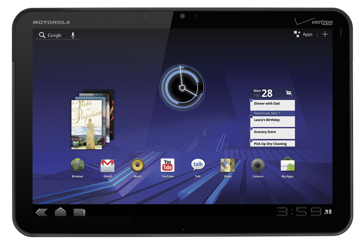
The Motorola Xoom
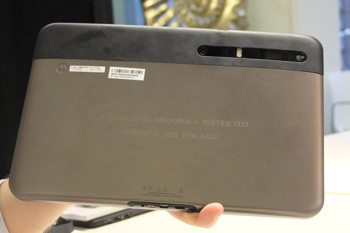
The back of the Motorola Xoom
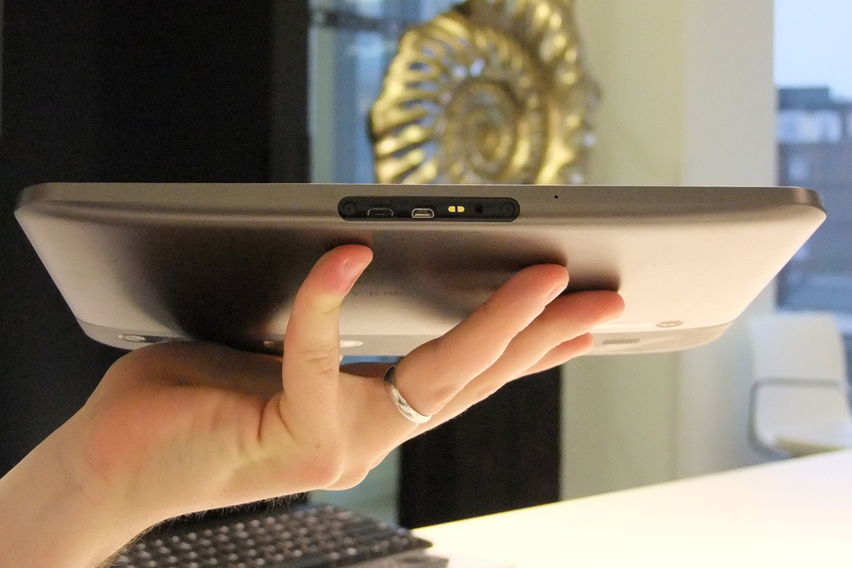
The ports on the bottom of the Motorola Xoom
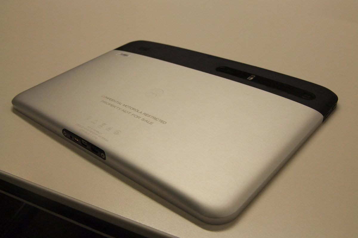
A silver variant of the Motorola Xoom
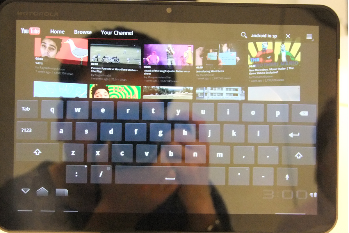
The keyboard in Android 3.0 Honeycomb on the Motorola Xoom
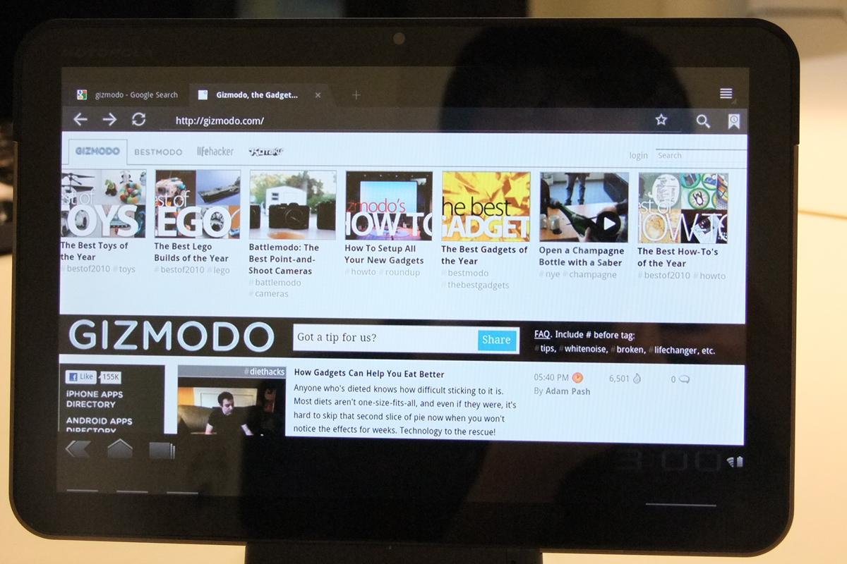
Tabbed browsing in Android 3.0 Honeycomb on the Motorola Xoom
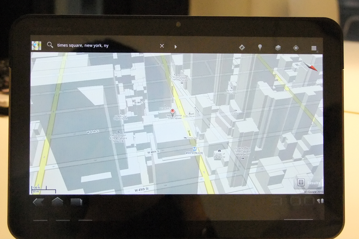
3D Google Maps in Android 3.0 Honeycomb on the Motorola Xoom
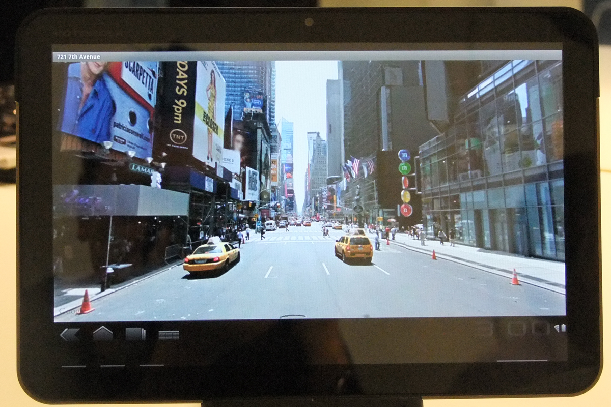
Google Maps Street View in Android 3.0 Honeycomb on the Motorola Xoom
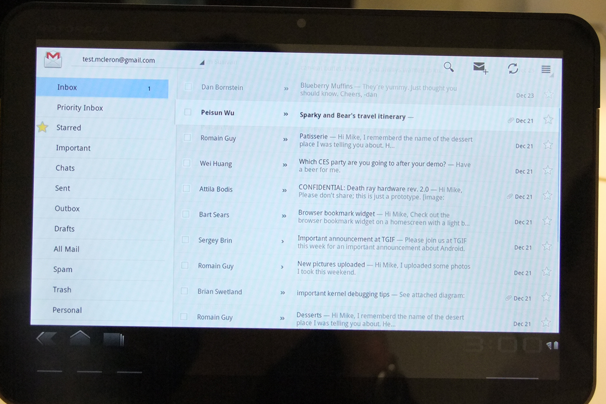
GMail in in Android 3.0 Honeycomb on the Motorola Xoom
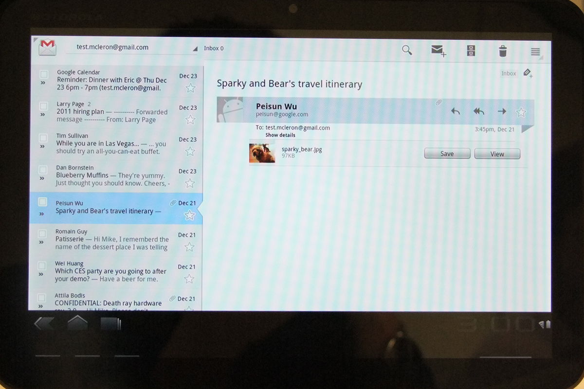
GMail in in Android 3.0 Honeycomb on the Motorola Xoom
The Motorola Xoom is the first Android 3.0 Honeycomb tablet to be announced and we managed to get a sneak peek at the eagerly anticipated slate at Motorola's preview event in London.
At just 740g, the Xoom is heavier than the Samsung Galaxy Tab but is around the same weight as the iPad. It uses the same Nvidia Tegra 2 processor and 1GB of RAM as Motorola's new Atrix smartphone. Motorola claims the 10.1in screen has a resolution of 1,280x800 which sounds a little odd to us we'd expect most screens of that size to have a resolution of either 1,024x600 or 1,366x768.
Thanks to Android 3.0, the Home screen looks disorientating and different if you're used to an Android 2 smartphone but it actually has most of the same user interface elements you'd expect. A taskbar of favourite apps runs along the bottom of the screen, while a Search field and a button listing all the installed apps run along the top. In the middle are widgets which have been redesigned to take advantage of the extra screen resolution. For example, the GMail widget includes a scrollable Inbox list while the Calendar widget lists your appointments for the day.
Many of the bundled Google apps have also been tweaked to make the most of the Xoom's large screen. The web browser has desktop-style tabs and the Incognito privacy mode familiar to Google Chrome users. The YouTube app lists videos on a scrollable 3D wall similar to the Top Sites feature in Apple's Safari web browser. Google Maps now has an optional 3D mode showing the outlines of buildings on streets in over 100 cities including Birmingham and Cardiff, but oddly not London at present.
GMail now shows your list of labels and the contents of your inbox simultaneously in two separate panes. Tapping a message shows a preview of the message alongside the contents of your inbox or selected label. Android 3.0 still has separate apps for GMail and other email accounts, such as Exchange, so we weren't able to see if Exchange users will be able to take advantage of this expanded user interface.
Get the ITPro daily newsletter
Sign up today and you will receive a free copy of our Future Focus 2025 report - the leading guidance on AI, cybersecurity and other IT challenges as per 700+ senior executives
-
 Third time lucky? Microsoft finally begins roll-out of controversial Recall feature
News The Windows Recall feature has been plagued by setbacks and backlash from security professionals
By Emma Woollacott Published
-
 The UK government wants quantum technology out of the lab and in the hands of enterprises
News The UK government has unveiled plans to invest £121 million in quantum computing projects in an effort to drive real-world applications and adoption rates.
By Emma Woollacott Published
-
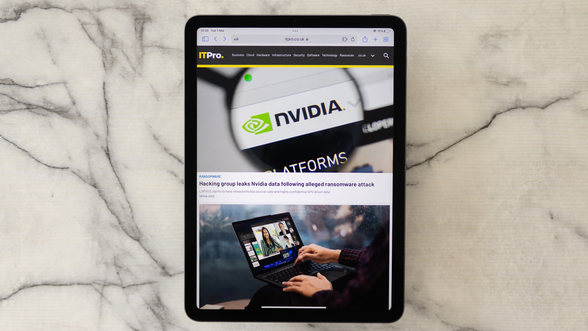 Apple iPad Air (2020) review: The executive’s choice
Reviews With the iPad Air’s most recent redesign, Apple has delivered the best bang-for-buck tablet money can buy
By Connor Jones Published
-
 In praise of the early adopters
Opinion The IT industry needs early adopters like you – and tech that fell by the wayside should still be celebrated
By David Crookes Published
-
 Apple is experimenting with attention sensors to save battery life
News Your next Apple device may shut down if you are not paying attention to it
By Justin Cupler Published
-
 Apple unveils M1-powered iPad Pro and iMac at April 2021 event
News The new Apple Silicon hardware will be available to order from April 30
By Justin Cupler Published
-
 iPad Air 2020 debuts with A14 Bionic chip and USB-C
News Apple touts its latest flagship tablet as the “most powerful” iPad Air ever
By Sarah Brennan Published
-
 Apple reveals iPadOS at WWDC19
News Cupertino's tablet range breaks free of iOS with new dedicated software
By Jane McCallion Published
-
 Best iPad apps for 2019
Best Our collection of the best and most popular iPad apps to download in 2019
By Connor Jones Published
-
 Apple Event: New MacBook Air, iPad Pro and Mac mini launched
News Apple appeases fans with long-requested hardware refreshes
By Adam Shepherd Published