Motorola Xoom 32GB WiFi review
Is Motorola's first Android 3.0 Honeycomb tablet a business must-have or a has-been? Find out in our review.
The Motorola Xoom is a little tricky to judge. The battery life is surprisingly good and it doesn't cost any more than a comparable 32GB WiFi-only iPad 2. It's much heavier than Apple's tablet though and neither the Android 3.0 interface or the Android Market are as impressive as their iOS equivalents. The Xoom isn't as flexible as Asus' rival Eee Pad Transformer Android 3.0 Honeycomb tablet. Asus' tablet has the additional flexibility of a bundled office suite as well as an optional hardware keyboard with USB ports for copying files off flash drives and a full-size SD card slot. As much as we wanted to like the Xoom, if you need a tablet now either the iPad 2 or the Eee Pad Transformer would be better choices.
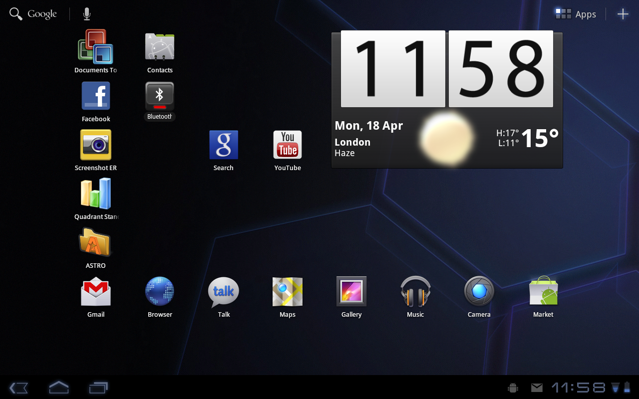
Unlike the very first Android tablets which used smartphone versions of the operating system, the Xoom uses Android 3.0 Honeycomb which is specifically tailored for tablet use. The interface generally feels logically designed, smooth and responsive, although it's still not quite up to the standard of iOS 4 on the iPad 2. For example, pinch-to-zoom and the rest of the interface in general sometimes felt sluggish while the sense of inertia when panning and zooming felt off.

A handy button in the lower left hand corner gives you a list of your five most recently-used apps, although smartphone apps are sometimes mislabelled or have garbled icons. Big widgets let you quickly view snippets of information, such as new emails and upcoming appointments, without leaving the homescreen.
Full-blown apps, such as the Exchange-compatible email and calendar apps, take advantage of the large 10in high resolution 1,280x800 pixel screen. For example, the two-pane email app lets you an keep eye on your inbox even while you're skimming a message. You can flag emails for follow-up and accept or reject Exchange meeting requests, with the calendar app updating automatically. Oddly, the calendar app lacks a list/agenda view which a feature which present in the calendar app on Android phones.
Get the ITPro daily newsletter
Sign up today and you will receive a free copy of our Future Focus 2025 report - the leading guidance on AI, cybersecurity and other IT challenges as per 700+ senior executives
-
 M&S suspends online sales as 'cyber incident' continues
News Marks & Spencer (M&S) has informed customers that all online and app sales have been suspended as the high street retailer battles a ‘cyber incident’.
By Ross Kelly Published
-
 Westcon-Comstor unveils new managed SOC solution for Cisco partners
News Powered by Cisco XDR, the new offering will enable partners to tap into new revenue streams, the company said
By Daniel Todd Published
-
 More than 5 million Americans just had their personal information exposed in the Yale New Haven Health data breach – and lawsuits are already rolling in
News A data breach at Yale New Haven Health has exposed data belonging to millions of people – and lawsuits have already been filed.
By Emma Woollacott Published