HTC Sensation review
HTC's latest dual-core smartphone is here, but is it a true Sensation or a damp squib? Julian Prokaza casts a discerning eye in our review.
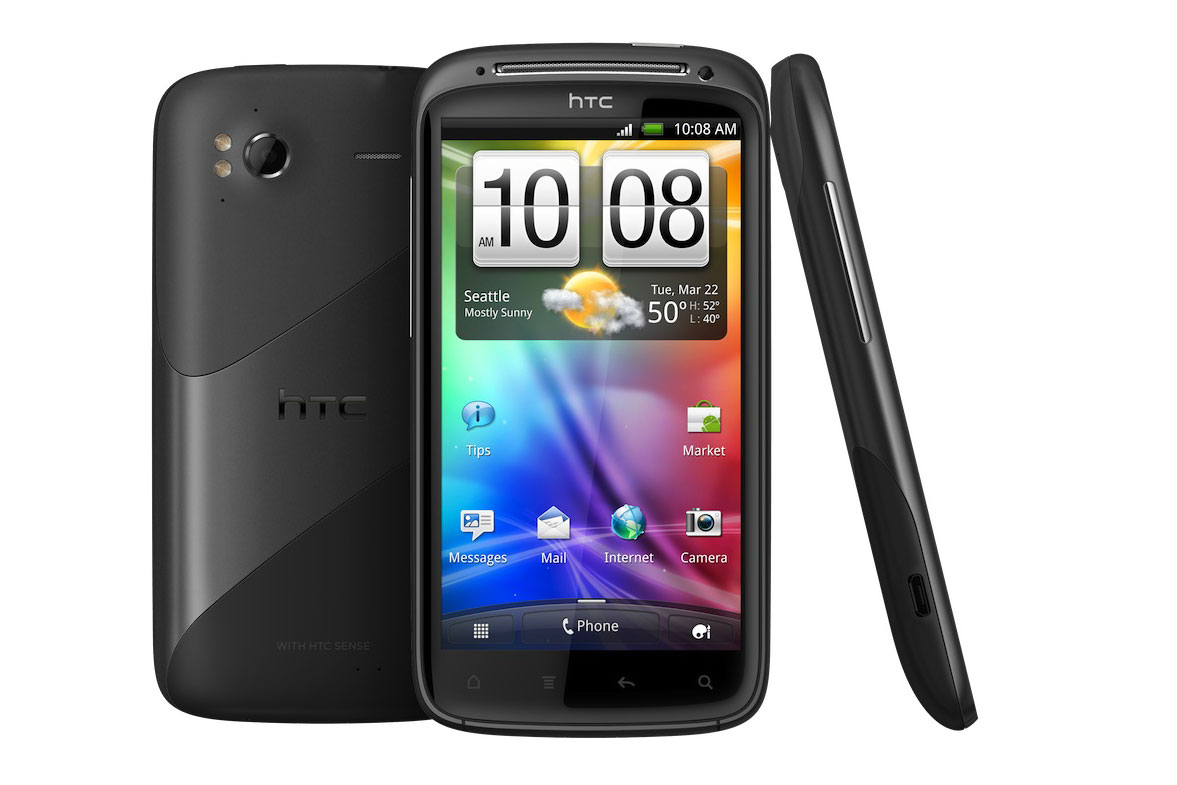
The HTC Sensation looks great, feels great and performs extremely well, but despite its broadly comparable specification, it just isn’t in the same league as the spectacular Samsung Galaxy S II. So, while it’s a highly capable and desirable Android smartphone, the Samsung is still the one we’d spend our money on.

The HTC Sensation

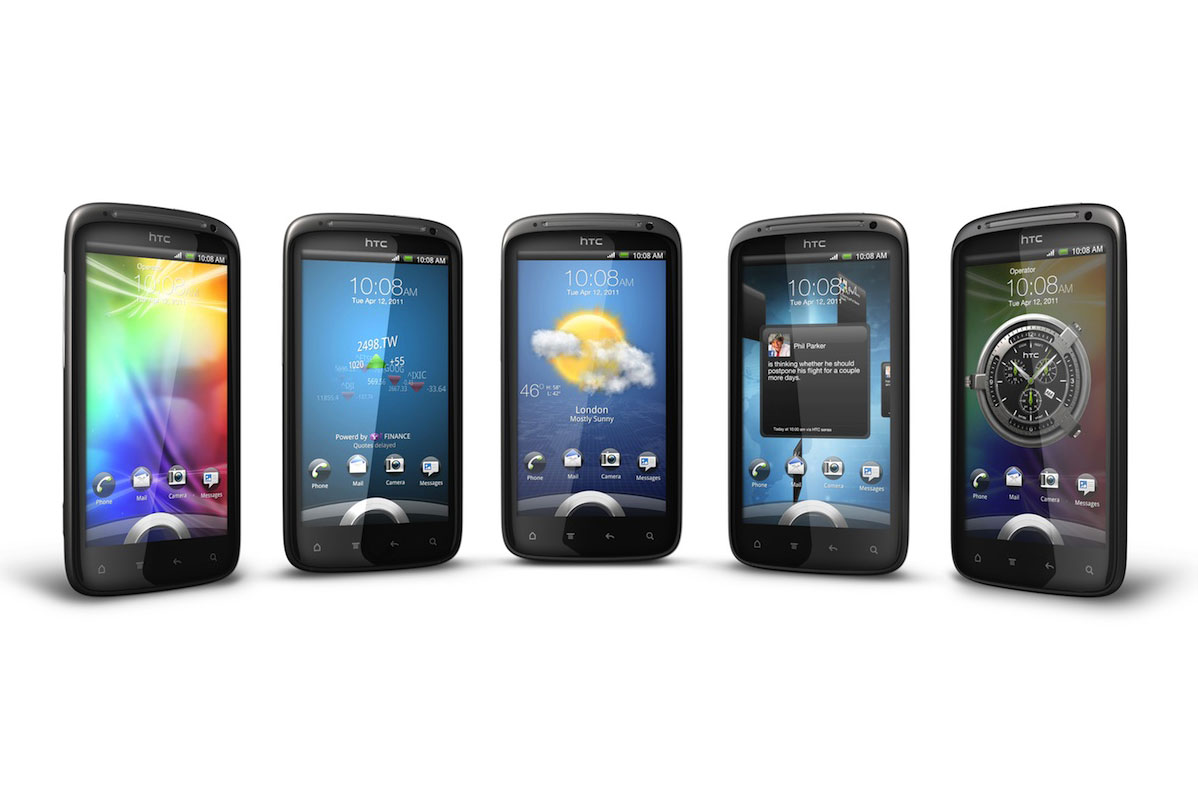
The customised lock screen on the Sensation courtesy of HTC Sense
The Samsung Galaxy S II has raised the bar for Android smartphones by a considerable amount and it's difficult to see how other manufacturers might compete with that slimline sensation and its dual-core 1.2GHz processor. HTC clearly has an idea though, and its new dual-core processor-equipped Sensation smartphone seems purposefully designed to take on Samsung's latest effort.
The anodised aluminium body with part-rubberised coating gives it a substantial, premium feel that the plasticky Galaxy S II sorely lacked.
Fresh from the box, the HTC Sensation makes a very positive first impression. It's almost the same size as the Galaxy II S, but it's a few millimetres thicker and its curvier shape rests nicely in the hand. It's also 30-odd grams heavier than the Samsung smartphone and this, together with the anodised aluminium body with part-rubberised coating, gives it a substantial, premium feel that the plasticky Galaxy S II sorely lacked.
HTC has also taken a different tack with the Sensation's buttons and there are four touch-sensitive areas below its screen rather than the two on the Galaxy S II. This makes little practical difference, but we rather liked the Galaxy S II's clickable Home' button as a convenient alternative way to wake it from standby, but it's the power button on the top edge or nothing on the Sensation.
The 4.3in Corning Gorilla glass screen is the same size as the Galaxy S II's and its rounded shape follows the curved perimeter of the case quite nicely. The glass butts up against the surrounding aluminium rim very precisely too, and the screen also has a curved lip around its edge that acts as a tactile barrier for a swiping fingertip this is the kind of close attention to design detail that we like to see on a high-end smartphone like this.
Get the ITPro daily newsletter
Sign up today and you will receive a free copy of our Future Focus 2025 report - the leading guidance on AI, cybersecurity and other IT challenges as per 700+ senior executives
-
 Cleo attack victim list grows as Hertz confirms customer data stolen – and security experts say it won't be the last
News Hertz has confirmed it suffered a data breach as a result of the Cleo zero-day vulnerability in late 2024, with the car rental giant warning that customer data was stolen.
By Ross Kelly Published
-
 Women show more team spirit when it comes to cybersecurity, yet they're still missing out on opportunities
News While they're more likely to believe that responsibility should be shared, women are less likely to get the necessary training
By Emma Woollacott Published
-
 OpenAI wants developers using its new GPT-4.1 models – but how do they compare to Claude and Gemini on coding tasks?
News OpenAI says its GPT-4.1 model family offers sizable improvements for coding, but tests show competitors still outperform it in key areas.
By Ross Kelly Published