HTC Flyer review
HTC's first Android tablet is not only smaller and lighter than the iPad 2, it can be used with a pressure-sensitive stylus too. The Flyer didn't soar high in Julian Prokaza's affections though - read on to find out why.
The HTC Flyer is an interesting and largely successful attempt at a 7in Android tablet, but it needs Android 3.0 to unlock its potential. A better-suited operating system and a more responsive stylus won’t fix the bigger problem though - the Flyer really needs to cost less than the iPad 2, not more.
Anyone with an aversion to Apple has had a long wait for a serious iPad alternative, but new Android-powered tablets from a number of manufacturers look promising. That said, we weren't overly impressed by the recently reviewed 10.1in Motorola Xoom , if only because it wasn't different enough from the iPad 2, unlike the unique 10.1in Asus Eee Pad Transformer. Like Asus and the Transformer, HTC has deployed a couple of new ideas in its first tablet, the Flyer.
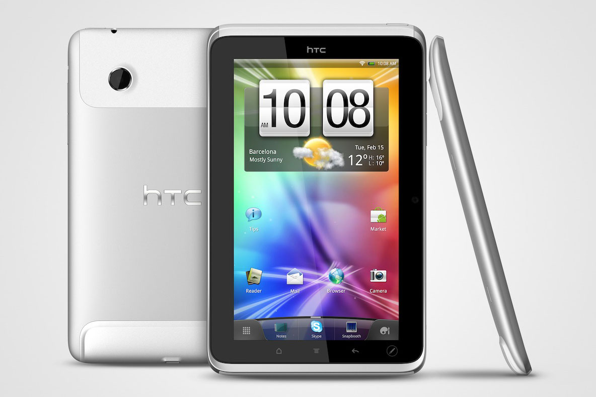
There's only so much that can be done with a tablet's physical design and HTC has opted to go down the iPad route with the Flyer, complete with curved aluminium back. It's not a bad looking device, but the white plastic caps at either end of the case do look and feel a little cheap. The top cap does come off to reveal the SIM card slot on 3G-equipped models.
At 13cm wide in portrait mode, the HTC Flyer is easy enough to grasp between the thumb and fingers of one (medium-size) hand, but the narrow bezel makes it tricky to hold securely in any other way without getting a thumb over the screen. This isn't a problem in landscape mode though, thanks to a slightly wider bezel on the shorter two sides and curved case edges that afford some extra purchase; these also keep the screen lifted off a hard surface when the Flyer is placed face-down.

The HTC Flyer has an aluminium unibody design which will feel familiar to iPad fans.
A similar neat design touch is that the four touch-sensitive Android OS buttons that run along the bottom of the screen are duplicated on the left side or the bottom, when the Flyer is in landscape orientation. The other' set is disabled according to which way the tablet is being held, too.
Sign up today and you will receive a free copy of our Future Focus 2025 report - the leading guidance on AI, cybersecurity and other IT challenges as per 700+ senior executives
-
 Trump's AI executive order could leave US in a 'regulatory vacuum'
News Citing a "patchwork of 50 different regulatory regimes" and "ideological bias", President Trump wants rules to be set at a federal level
By Emma Woollacott Published
-
 Microsoft Excel is still alive and kicking at 40 – and it's surging in popularity as 82% of finance professionals report ‘emotional attachment’ to the spreadsheet software
News A recent survey found Gen Z and Millennial finance professionals have a strong “emotional attachment” to Microsoft Excel
By Emma Woollacott Published
-
 LastPass hit with ICO fine after 2022 data breach exposed 1.6 million users – here’s how the incident unfolded
News The impact of the LastPass breach was felt by customers as late as December 2024
By Emma Woollacott Published