Head to Head: Microsoft Office 2010 vs Open Office 3.3
For many an office suite is just as essential as the computer it runs on. But should you continue investing in Microsoft Office or choose the free OpenOffice instead? Karl Wright gets down to business and finds out in our review.
Presentations
Microsoft PowerPoint is the most popular presentation software available so it's no surprise that OpenOffice's presentations component, Impress, closely mimics Microsoft's program. Thankfully Impress does a good job of imitating PowerPoint. It allows you to create master slides and use them to build a presentation, with custom transitions, add speaker's notes and so on. You can build animations that appear on the click of a mouse, or after the specified time. And you can export to both PDF and Flash - the latter is rather nifty and is something that PowerPoint can't do.

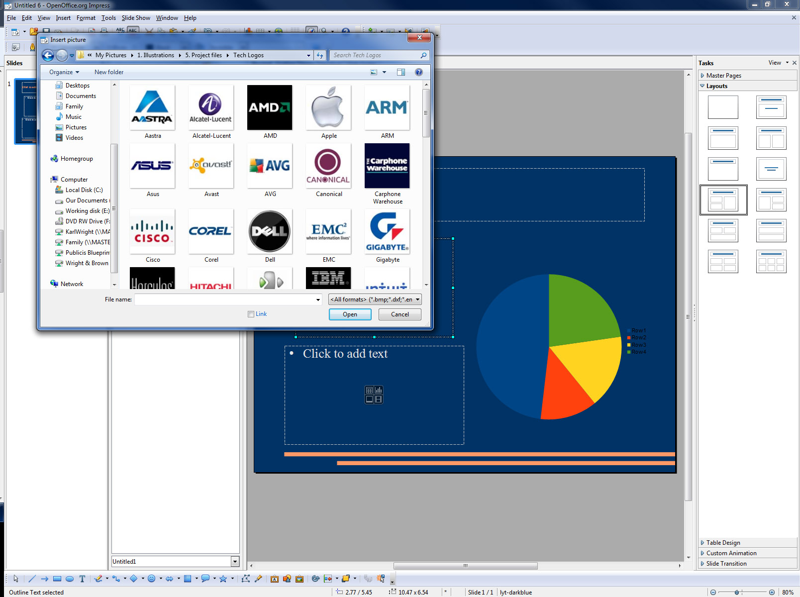
With the new content definition icons it's easy to quickly add text, charts, images or even video to your Impress slides.
New this time around in Impress is the ability to define the content of a slide in a single click. When you add a text box to a slide or open a template that already contains a text box in the middle of the box are four icons, one each to represent a table, a chart, a picture or a movie. Just click on the button for the type of content you want to add and follow the wizard routine to get started. If you just want to create text, you click into the empty space at the top of the text box. That's the only new feature for Impress this time around.
Good as Impress is, however, PowerPoint is better. It provides a range of templates and themes that help the user achieve quite sophisticated effects without any design skills. If you change your mind and decide you don't like the template you've been using, just select a new one in the Design tab and it will instantly be applied to your entire presentation.
While you can do something similar in Impress, there are far fewer templates on offer and they're neither as well designed nor as sophisticated; with, for instance, title pages looking more or less identical to normal presentation pages. Effects in PowerPoint such as transitions are also smoother and less cheesy than in Impress, whose transitions sometimes look like something from Beadle's About.
Winner: Microsoft PowerPoint - Cheesy transitions aside, Impress has lots of good features and is easy to use so you'll be able to put together a good-looking presentation. However you can achieve the same results, or better, in PowerPoint with less work.
Get the ITPro daily newsletter
Sign up today and you will receive a free copy of our Future Focus 2025 report - the leading guidance on AI, cybersecurity and other IT challenges as per 700+ senior executives
-
 Cleo attack victim list grows as Hertz confirms customer data stolen
News Hertz has confirmed it suffered a data breach as a result of the Cleo zero-day vulnerability in late 2024, with the car rental giant warning that customer data was stolen.
By Ross Kelly
-
 Lateral moves in tech: Why leaders should support employee mobility
In-depth Encouraging staff to switch roles can have long-term benefits for skills in the tech sector
By Keri Allan