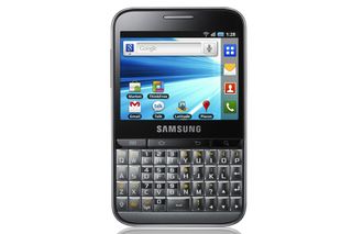
With a mere 320 x 240 pixels at its disposal, the Galaxy Pro can only manage a rather rough-looking image. To make things worse, there's no multitouch.
Sadly, this low resolution screen also stymies some of the apps, particularly the web browser. Body text on standard web sites is often completely illegible and double-tapping to zoom into a column of text usually results in it being magnified too much to fit on the screen. Worse still, the web browser used on the Galaxy Pro doesn't seem to perform any kind of on-the-fly text reformatting to rectify this, which means many pages need constant left and right scrolling to read. Just to make things worse, there's no multi-touch, which means Android's zoom in/out buttons are the only way to take finer control over page magnification and they usually zoom in and out by too great an amount for comfortable webpage viewing.
Surprisingly for a mere 3.15-megapixel camera, photos snapped with the Samsung Galaxy Pro really aren't that bad as long as there's sufficient light (there's no flash). Exposure is a little hit and miss, and colours tend to be washed out, but there's little noise. Shutter lag of up to a second while the autofocus sorts itself out can lead to shots turning out unnecessarily blurry, but trick modes like panorama and smile' (where the shutter stays shut until the subject says cheese') might be useful enough to compensate for this.


