The Home Screen where all the apps are stored works very differently from competing operating systems. Apps are grouped together as clusters and can be collapsed into a single icon or expanded so all icons are visible. Clusters can be placed anywhere on the Home Screen and multiple clusters can be expanded simultaneously. Clusters are created simply by dragging and dropping apps on top of each other, similar to folder creation in iOS. It looks unique, but at first glace it also looks very messy and confusing, although there is a Photoshop Navigator-style overview for quickly jumping to a particular part of the Home Screen.
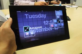
A webOS-style system tray in the status bar at the top of the screen gives access to small widgets for toggling WiFi and other common tasks. Another feature reminiscent of webOS is the universal search, where a typed in keyword can be searched for on the Grid10 or online using various search engines. The lock screen has the interesting twist of using your signature to login rather than a numeric code. A lot of animations are strewn throughout the interface, sometimes unnecessarily so. When rotating the screen, instead of simply rotating the screen image, there's a flip transition. It's eye-catching, but we suspect Fusion Garage may have gone overboard with the number of flashy animations.
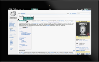
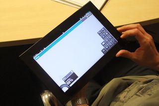
Copy and paste appears to work in a similar fashion to Android Honeycomb, but a unique dial interface appears in various places, such as in the web browser. Selecting text brings up a dial for copying text or using it as a search keyword. Tabs, instead of displayed across the top of the screen, are grouped together around a dial, although the miniature thumbnails can be hard to see. Another interesting interface twist is that toolbars can collapse into a single icon, much like the app clusters on the Home Screen.
Get the ITPro. daily newsletter
Sign up today and you will receive a free copy of our Focus Report 2025 - the leading guidance on AI, cybersecurity and other IT challenges as per 700+ senior executives
