Nokia Lumia 800 review
The first Windows Phone from Nokia has finally arrived, but is this smartphone the shot in the arm Nokia so desperately needs or a shot in the foot? Julian Prokaza finds out in our review.
The Nokia Lumia 800 is by far one of the best looking Windows Phone 7 smartphones we’ve seen so far, but its allure is diluted somewhat by its fuzzy PenTile matrix display and an unlocked price that puts it in the same territory as the iPhone 4S.

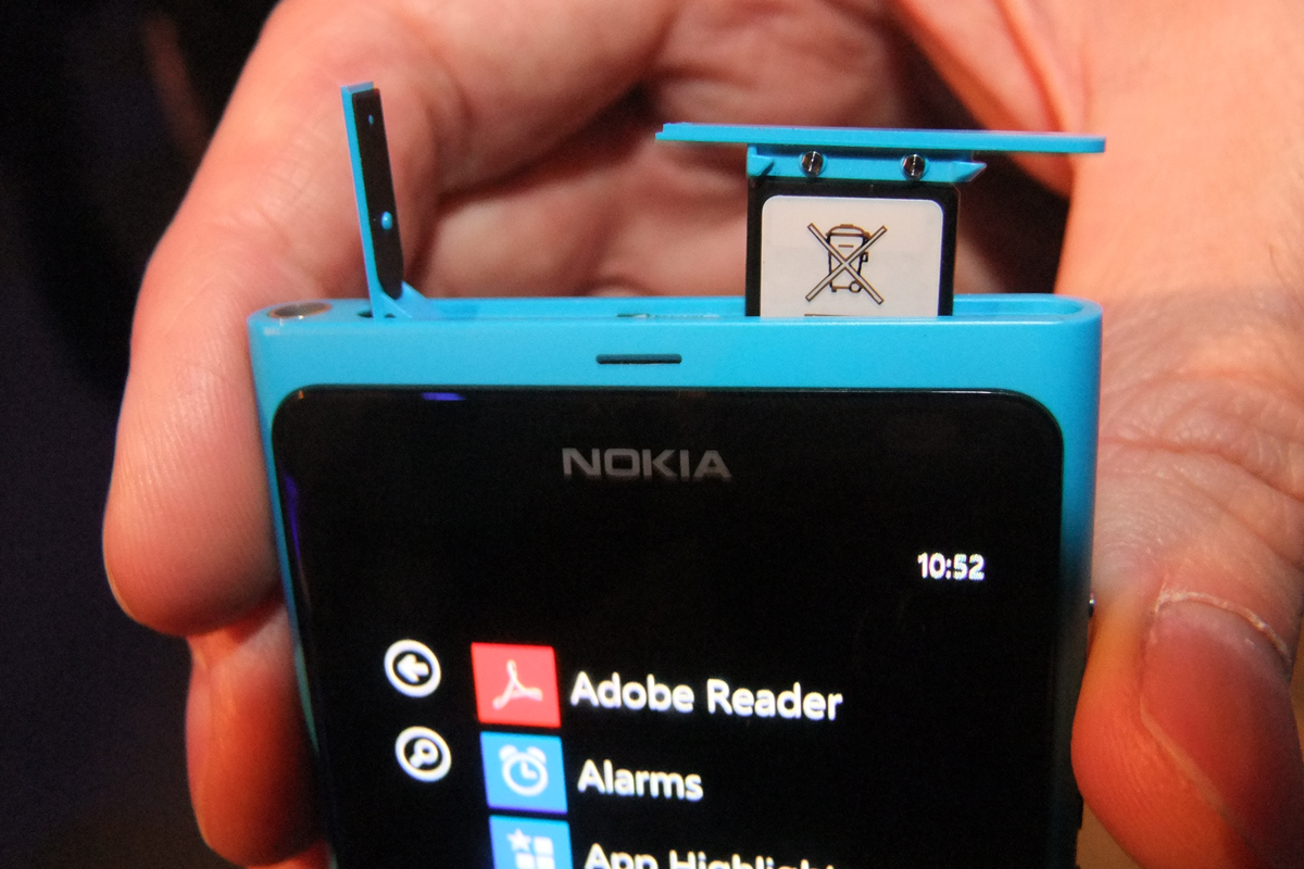
The micro USB2 port and microSIM card slot are protected by clever interlocking covers that take a little figuring out.
The Corning Gorilla glass screen is another striking aspect of the Lumia 800's design. It extends right to the edges of the case and is raised slightly, thanks to the rounded lip on its perimeter and a gentle curve from top to bottom. It's a lovely piece of sleek design and it looks quite stunning, at least with the Lumia turned off.
Turned on, however, and the screen isn't quite so nice. Its 3.7in diagonal certainly makes it a good fit for one-handed use and the capacitive multitouch sensors works under the curved glass work wonderfully well. Its 480 x 800 pixel resolution should make for a sharp image at the size screen too, but this is not the case, thanks to Nokia's decision to use a PenTile matrix display.
Unlike the repeating pattern of red/green/blue (RGB) subpixels used by standard LCD displays, PenTile matrix displays instead use a red/green/blue/green pattern (RGBG). So, despite a PenTile matrix screen sporting an apparent 480 x 800 resolution, it actually contains one third fewer subpixels than the same resolution RGB display, which makes it cheaper to manufacture. It also makes it an inferior display with poorer image quality.
The step-down in quality isn't readily apparent when viewing images and the AMOLED display used on the Lumia 800 is certainly bright and vibrant when it's displaying photos. Unfortunately, the lesser actual pixel count makes it much less adept at displaying text and the Lumia 800 suffers from visible fuzz' that's made all the more obvious by Windows Phone 7's heavy reliance on text for its UI.
Get the ITPro daily newsletter
Sign up today and you will receive a free copy of our Future Focus 2025 report - the leading guidance on AI, cybersecurity and other IT challenges as per 700+ senior executives
-
 M&S suspends online sales as 'cyber incident' continues
News Marks & Spencer (M&S) has informed customers that all online and app sales have been suspended as the high street retailer battles a ‘cyber incident’.
By Ross Kelly Published
-
 Westcon-Comstor unveils new managed SOC solution for Cisco partners
News Powered by Cisco XDR, the new offering will enable partners to tap into new revenue streams, the company said
By Daniel Todd Published
-
 More than 5 million Americans just had their personal information exposed in the Yale New Haven Health data breach – and lawsuits are already rolling in
News A data breach at Yale New Haven Health has exposed data belonging to millions of people – and lawsuits have already been filed.
By Emma Woollacott Published