Lenovo ThinkPad Tablet review
Is the stylus-equipped ThinkPad Tablet the business tablet we've all been waiting for, or is Lenovo coasting on the illustrious ThinkPad name? Read our review to find out.
We had high hopes for the ThinkPad Tablet, but overall it's disappointing. It doesn't feel like a distinctively designed tablet aimed specifically at businesses, like the Cisco Cius or the Motorola ET1, but more like yet another half-hearted Android consumer tablet with a few token business features. Increasing the poor responsiveness of the interface and more third-party app support for the stylus would go a long way to fixing this, but until that happens there are few reasons to choose the ThinkPad Tablet over the iPad 2 or any other big-name Android tablet.
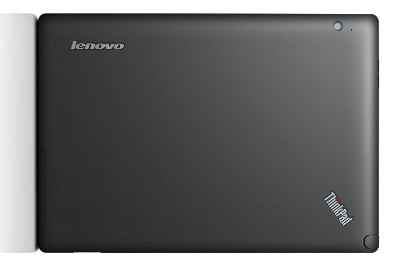
Following the release of the iPad, many tablets adopted names that are some variation of pad: TouchPad, ViewPad, EeePad and so forth. One brand name that has long preceded the iPad is ThinkPad Lenovo's long-lived line of laptops. The Chinese computer giant has finally released a tablet under the ThinkPad name, but ironically it looks like a larger version of the Blackberry Playbook thanks to its soft-to-the-touch matte rear. It's not especially eye-catching, but it does feel very sturdy and looks stylish in an understated way.
The interface feels sluggish despite the Nvidia Tegra 2 dual-core processor.
Everyone who sets eyes on the ThinkPad Tablet assumes it runs Windows 7, but it actually uses Android 3.1 Honeycomb. However, the interface feels sluggish despite the Nvidia Tegra 2 dual-core processor. Swiping between home pages, scrolling and panning web pages and other seemingly simple tasks all felt frustratingly laggy. We suspect this poor performance is due to Lenovo's own additions to the standard Android interface, since benchmark scores of 1449 in Quadrant and 2041ms in SunSpider show the underlying hardware itself is fast.

Lenovo's main modification is a large five-icon grid sitting in the centre of the first home screen. Each icon launches an app, such as an e-reader or movie player, although these can be changed to any app of your choice. The globe icon in the middle always launches the stock Android web browser, while two smaller icons let you change the launcher's settings and the settings for the OS itself. Unless you have particularly poor eyesight, we see little benefit in this widget over simply dragging and dropping standard app icons onto the home screen.
Sign up today and you will receive a free copy of our Future Focus 2025 report - the leading guidance on AI, cybersecurity and other IT challenges as per 700+ senior executives
-
 Microsoft and NCSC issue alerts over hacker campaigns targeting WhatsApp, Signal messaging apps
News Microsoft warns about a sophisticated attack that starts with WhatsApp messages, while the NCSC says such incidents are on the rise
By Nicole Kobie Published
-
 Advania UK strengthens senior leadership team with double appointment
News Sabrina Harris has been named as the IT services provider’s new chief financial officer, while Tara Allison becomes chief marketing officer
By Daniel Todd Published
-
 Cisco Wireless CTO: Mastering connectivity is the key to driving AI success and enterprise productivity – but beware of the ‘wireless AI paradox’
News Enterprises are ramping up wireless connectivity investment as AI-related network demands grow
By Ross Kelly Published