Sony Tablet P review
Sony's dual screen Android tablet is distinctive but is it a clever must-have or a gimmick? Kevin Pocock finds out in our review.
The Tablet P is an intriguing and promising device let down by some awkward functionality and, ultimately, lack of proper support for its unique dual screens. At this price we'd expect far more refined features that take better consideration of user needs.
This problem with the gap between the screens isn't a one off. The lack of any bundled productivity apps or security features mean that you may need to venture to the Android Market to acquire them, and there you could have a tough time on your hands. Oddly, the Market app itself only occupies the top screen rather than flowing over both, making navigation a chore. Even If you do manage to progress, you will find that not all apps take kindly to the Tablet P. Whether or not an app takes advantage of, or even works well with the two screens is a hit and miss affair.

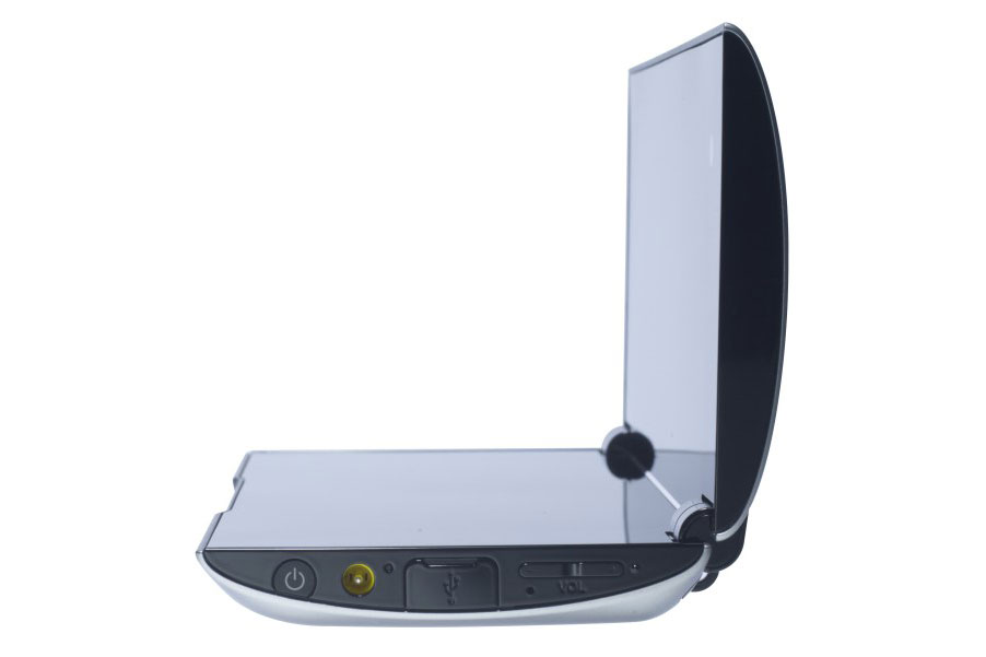
The hinges give a reassuring amount of resistance when opening and closing.
This disadvantage could have been balanced out with some additional Sony-developed features, such as using different apps on each display, but sadly these aren't present. Sony's modifications of the standard Android Honeycomb interface are limited to some redundant shortcuts to the web browser and other stock apps on the homescreen and an even more redundant favourites screen that is little better than the standard Android home screens.
The Tablet P does feel sturdy and well built, and the hinges give a reassuring amount of resistance when opening and closing. The outer, matt grey, casing gives very little when we applied some slight pressure, although regrettably it does appear somewhat prone to marks and scratches. This shouldn't be a problem as the grey panels are technically replaceable with differently coloured panels, although these weren't yet available at the time of writing.
Get the ITPro daily newsletter
Sign up today and you will receive a free copy of our Future Focus 2025 report - the leading guidance on AI, cybersecurity and other IT challenges as per 700+ senior executives
-
 CyberOne appoints Microsoft’s Tracey Pretorius to its advisory board
News The threat intelligence leader will provide strategic guidance to CyberOne’s executive team
By Daniel Todd Published
-
 CISA issues warning in wake of Oracle cloud credentials leak
News The security agency has published guidance for enterprises at risk
By Ross Kelly Published
-
 Reports: White House mulling DeepSeek ban amid investigation
News Nvidia is caught up in US-China AI battle, but Huang still visits DeepSeek in Beijing
By Nicole Kobie Published