Motorola Xoom 2 review
The original Xoom didn’t quite deliver on the promise of an Android tablet capable of competing with the iPad, but has Motorola got it right second time around with the retooled Xoom 2? Kevin Pocock puts it through its paces.
The Motorola Xoom 2 is one of the best Android tablets currently available — it’s stylish, well made and packs a performance punch. It’s not without its foibles and the specification changes from the previous model don’t make much sense, but it’s still one of the more viable alternatives to the Apple iPad.
Motorola unveiled its Xoom tablet back at CES 2011, but although it showed promise, we weren't overly impressed by the ungainly hardware and felt that Android 3 was a little lacking when compared to iOS on the iPad 2.
Twelve months on and with Android 4.0 poised to remedy many of its predecessor's shortcomings, Motorola has launched an updated Xoom will hopefully do the same the Xoom 2.

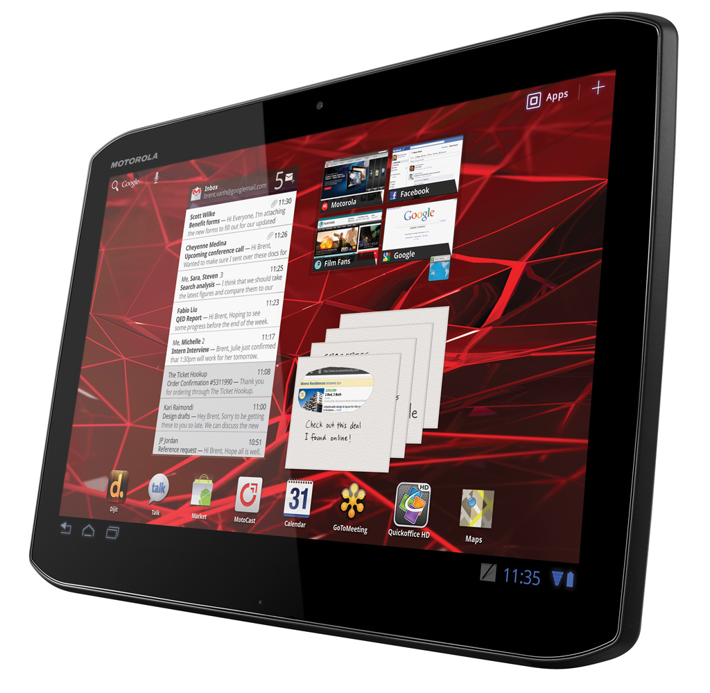
Although it has essentially the same design as the Xoom, Motorola has updated the Xoom 2 with a shape that reflects that of its RAZR smartphone, with angled corners replacing the usual generic gentle curves.

Motorola has also managed to make the Xoom 2 a few millimetres thinner and over 100g lighter, which addresses two of our main complaints about the earlier hardware, and the tablet is now much easier to hold in one hand.

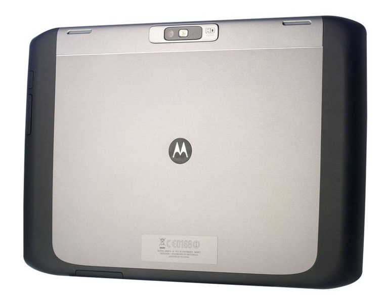
A firm grip is also helped by the rubbery strip that rubs around the edge and back of the Xoom 2, and the anodised aluminium rear feels solid enough should the tablet slip out of the hand.
Get the ITPro daily newsletter
Sign up today and you will receive a free copy of our Future Focus 2025 report - the leading guidance on AI, cybersecurity and other IT challenges as per 700+ senior executives
-
 CyberOne appoints Microsoft’s Tracey Pretorius to its advisory board
News The threat intelligence leader will provide strategic guidance to CyberOne’s executive team
By Daniel Todd Published
-
 CISA issues warning in wake of Oracle cloud credentials leak
News The security agency has published guidance for enterprises at risk
By Ross Kelly Published
-
 Reports: White House mulling DeepSeek ban amid investigation
News Nvidia is caught up in US-China AI battle, but Huang still visits DeepSeek in Beijing
By Nicole Kobie Published