Microsoft OneNote for Android and iPad review
With mobile versions of OneNote now available for both Android and iPad, tablet users have an easy way to access their desktop notes and clippings when on the move. As Julian Prokaza discovers though, one of these apps is not like the other.
Sign up today and you will receive a free copy of our Future Focus 2025 report - the leading guidance on AI, cybersecurity and other IT challenges as per 700+ senior executives
You are now subscribed
Your newsletter sign-up was successful
OneNote mobile apps compared
Of the two tablet apps, OneNote for iPad is by far the better looking and the easiest to use. The app's interface bears little resemblance to that of OneNote for Windows, but it does take full advantage of the iPad's larger screen and isn't simply a scaled-up version of the iPhone app.
Notebooks are shown either as a pop-up list when the iPad is in portrait mode, or as a permanent left-hand sidebar in landscape. Tapping a notebook then opens its sections alongside, then tapping a section reveals its pages and sub-pages.
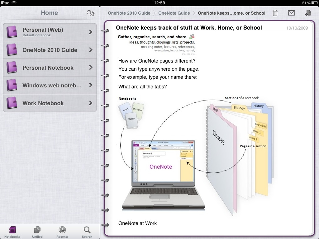
OneNote for iPad bears little resemblance to the Windows application, but is good-looking and very easy to use.
OneNote for Windows leaves all other notebooks, sections and pages in view when a particular page is being edited, the iOS app just show the pages and sub pages. This keeps the limited-resolution screen free from clutter and makes for a simpler user experience, but it does mean that lots of tapping is required to navigate up and down the notebook's hierarchical structure just to look at pages in other sections and notebooks.
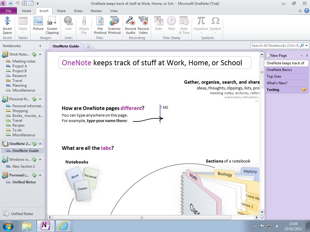
Both mobile apps reproduce most synced desktop content very accurately, but inked notes are not supported.
OneNote for Android, on the other hand, is simply the smartphone app write large and its simple interface looks particularly utilitarian on a tablet.
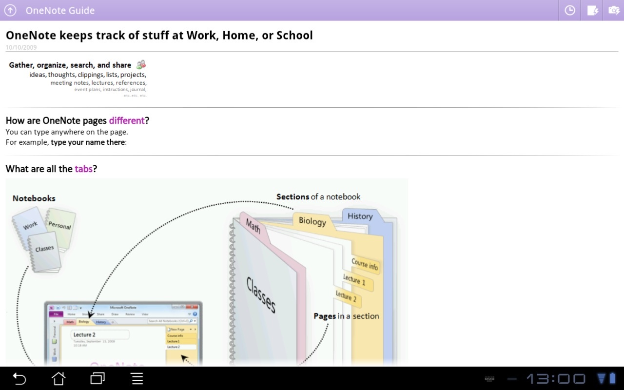
OneNote for Android is extremely utilitarian and lacks the user-friendly design of the iPad app.
Sign up today and you will receive a free copy of our Future Focus 2025 report - the leading guidance on AI, cybersecurity and other IT challenges as per 700+ senior executives
-
 Salesforce targets telco gains with new agentic AI tools
News Telecoms operators can draw on an array of pre-built agents to automate and streamline tasks
-
 Four national compute resources launched for cutting-edge science and research
News The new national compute centers will receive a total of £76 million in funding
-
 Apple iPad Pro 12.9in (2021) review: A giant leap for Apple silicon
Reviews Paired with a 120Hz display with incredible colour accuracy, the iPad Pro is more deserving of its name than ever
-
 Apple iPad (2021) review: The best entry-level iPad
Reviews Although pointing more to the past than the future, this iPad succeeds where it matters
-
 Apple iPad Pro 12.9in (Apple M1, 2021) review: Falls just short of greatness
Reviews More of a laptop alternative than ever with a stupendous display but iOS still has flaws
-
 Microsoft Office for iPad gets mouse and trackpad support
News The iOS app update also brings a new start screen and a ribbon of feature menus
-
 The 8th-generation iPad debuts with the A12 Bionic chip
News Apple claims it's latest entry-level iPad is three times faster than the top Android tablet
-
 Apple iPad Pro 12.9in (2020) review: Believe the hype
Reviews The most expensive and most ambitious iPad yet
-
 Apple confirms serious bugs in iOS 13.5
News No fix is available yet for the heavy battery drain and log-in issues
-
 Apple iPad mini 5 (2019) review: If it ain’t broke...
Reviews Almost four years on, the new iPad mini is still every bit as good as always