Motorola Motoluxe XT615 review
Hot on the heels of the RAZR comes the mid-range Motorola Motoluxe, which still packs a few surprising features considering the price. Julian Prokaza finds out if it’s as cheerful as it is cheap.
Although certainly one of the better mid-range Android smartphones currently available, the Motorola Motoluxe’s relatively slow processor, limited app storage and mediocre camera take the edge of its appeal. Unless an upgrade to mid-range Android smartphone is urgently needed, we’d be inclined to wait and see what other manufacturers release in the next few months.

Motorola Motoluxe

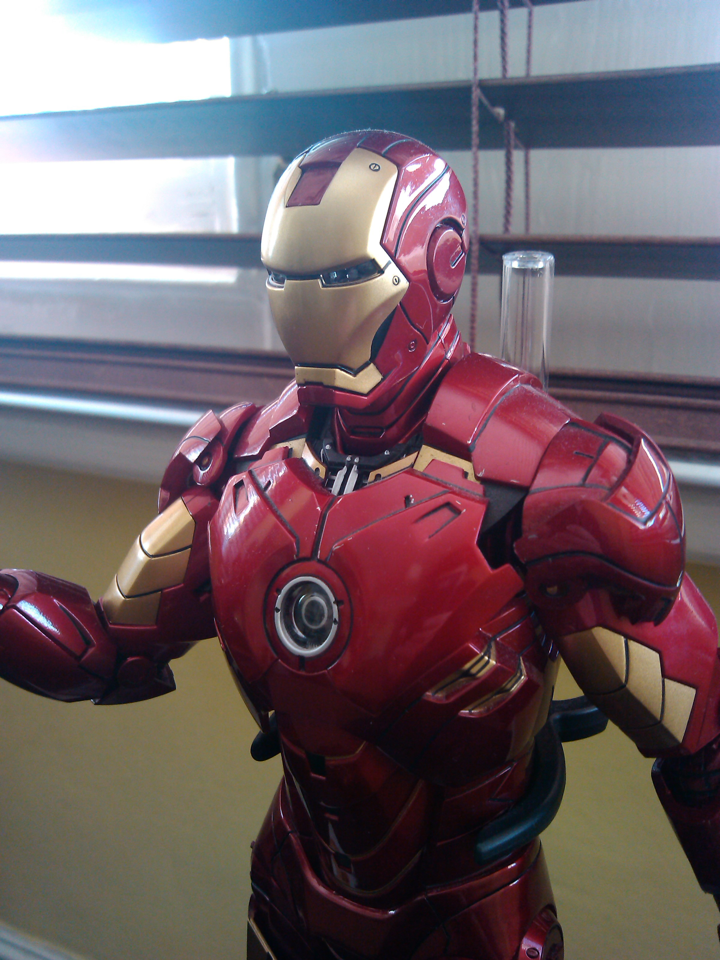
Motorola Motoluxe test shot

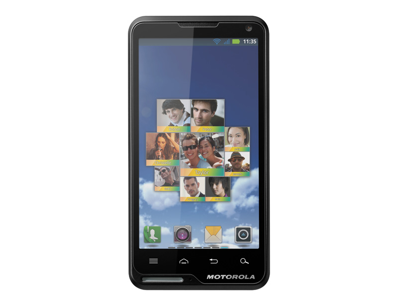
Motorola Motoluxe - front

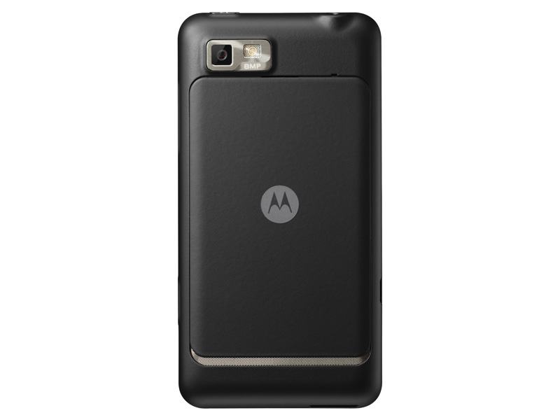
Motorola Motoluxe - back
Mid-range Android smartphones are hardly in short supply, but the Motorola Motoluxe bucks the trend with a screen that's bigger and a camera that's higher-resolution than anything else available for 220.
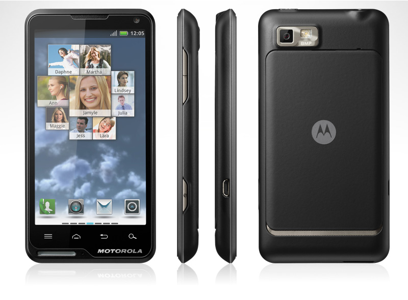
Despite the reasonable price, it doesn't look like Motorola has cut any corners. The Motoluxe is a relatively lightweight and slender smartphone with almost exactly the same dimensions as the iPhone 4/4S, but it still manages to avoid aping Apple's design too closely.
Design and display
The plastic case has a matte black rubberised coating that is easy to grip and that resists greasy finger marks. The removable back plate that covers the battery, SIM and microSD card slots is similarly treated metal.
The volume buttons on the right side are a little too recessed for our liking though, as is the camera shutter release button, which has the added annoyance of lacking any kind of tactile clicky' feedback. The 3.5mm headphone socket sits on the top edge, well away from the power button.
The Motoluxe packs in a reasonably bright 4in screen
Although it has essentially the same dimensions as the iPhone 4S, the Motoluxe has a slightly bigger 4in screen. The extra 0.5ins comes from the increased height of its widescreen 854 x 480 aspect ratio, and the top and bottom bezels are quite narrow as result.
This is about as large a smartphone screen as we're comfortable using with one hand, but the relative narrowness of the Motoluxe's frame makes it easy enough to stretch a thumb over.
Motorola hasn't deployed any newfangled display technology on the Motoluxe, but its standard TFT screen is bright, and remains legible even in bright daylight. The combination of relatively high resolution and relatively small size (at least compared to some of the more recent Android monsters) also means the display is crisp, although its 245ppi isn't as high as the iPhone 4/4S's 326ppi.
The usual four Android OS buttons sit below the screen or touch-sensitive areas, in this case. These are picked out with clear icons that glow white when the Motoluxe is in use. There's also a lanyard loop built into the bottom right-hand corner of the case that incorporates a large LED. The former probably won't be that useful to many, but the three-colour LED gives a very clear indication of message alerts when silent mode is active and it's a nice change over the pinprick-size LEDs that other smartphones use for this purpose.
Get the ITPro daily newsletter
Sign up today and you will receive a free copy of our Future Focus 2025 report - the leading guidance on AI, cybersecurity and other IT challenges as per 700+ senior executives
-
 Westcon-Comstor and Vectra AI launch brace of new channel initiatives
News Westcon-Comstor and Vectra AI have announced the launch of two new channel growth initiatives focused on the managed security service provider (MSSP) space and AWS Marketplace.
By Daniel Todd Published
-
 Third time lucky? Microsoft finally begins roll-out of controversial Recall feature
News The Windows Recall feature has been plagued by setbacks and backlash from security professionals
By Emma Woollacott Published
-
 The UK government wants quantum technology out of the lab and in the hands of enterprises
News The UK government has unveiled plans to invest £121 million in quantum computing projects in an effort to drive real-world applications and adoption rates.
By Emma Woollacott Published