Web design guru Nielsen slams "misguided" Windows 8 interface
Former Sun Microsystems engineer flags usability issues in Microsoft's new flagship operating system.
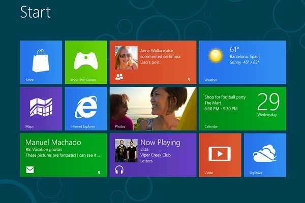
Web usability expert Jakob Nielsen has become the latest industry watcher to criticise Microsoft's new Windows 8 operating system for being difficult to use.
Nielsen, a former Sun Microsystems engineer who specialised in making the vendor's enterprise software easier for people to use, enlisted the help of 12 "experienced" PC users to test Windows 8 on a PC and Surface RT tablet.
In a long and detailed post on his Alertbox blog, Nielsen shared the group's experiences of using the software, shedding light on several areas he claims could cause problems for users.
For instance, he starts the post by taking issue with the software giant's decision to offer end users a choice between using a tablet-focused Start menu and more traditional desktop screen.
I happen to think Windows 7 is a good product and Windows 8 is a misguided one.
"The two environments work differently, making for an inconsistent user experience," wrote Nielsen.
He is not the first industry watcher to take umbrage against the design of Windows 8, as Microsoft co-founder, Paul Allen, recently admitted to finding the operating system "confusing."
Sign up today and you will receive a free copy of our Future Focus 2025 report - the leading guidance on AI, cybersecurity and other IT challenges as per 700+ senior executives
He also took issue with Windows 8's live tiles feature, which provides users with a summary of the most up to date information from within an app.
This feature works well with weather, calendar and email apps, he said, but the same cannot be said for many others.
In some cases, the ever changing appearance of these apps can make it difficult for users identify them, and can also be distracting for users.
"The theory, no doubt, is to attract users by constantly previewing new photos and other interesting content within the tiles," he wrote.
"But the result makes the Surface Start screen into an incessantly blinking, unruly environment that feels like dozens of carnival barkers yelling at you simultaneously."
Windows 8's new Charms feature, which consists of a panel of icons that users can slide in from the right side of the screen and use to share or search for content, was also scrutinised.
"The Charms work poorly at least for new users. Because [they] are hidden, our users often forgot to summon them, even when they needed them," said Nielsen.
"Furthermore, the Charms don't actually work universally because they're not true generic commands...Enough disappointments and users will stop trying a feature."
He said the operating system's shortcomings are nothing a "modest redesign can't fix", and said he has "great hopes" for Windows 9 on mobile devices.
"The underlying problem is the idea of recycling a single software UI for two very different classes of hardware devices," he added.
"It would have been much better to have two different designs: one for mobile and tablets, and one for the PC."
In his summing up of the operating system's features, he described Windows 7 as a "good product", but described its successor as a "misguided" one.
"I derived these conclusions from first principles of human-computer interaction theory and from watching users...One doesn't have to hate or love a company in order to analyse its [user interface] designs," he concluded.
-
 AI coding tools are booming – and developers in this one country are by far the most frequent users
News AI coding tools are soaring in popularity worldwide, but developers in one particular country are among the most frequent users.
-
 Cisco warns of critical flaw in Unified Communications Manager – so you better patch now
News While the bug doesn't appear to have been exploited in the wild, Cisco customers are advised to move fast to apply a patch
-
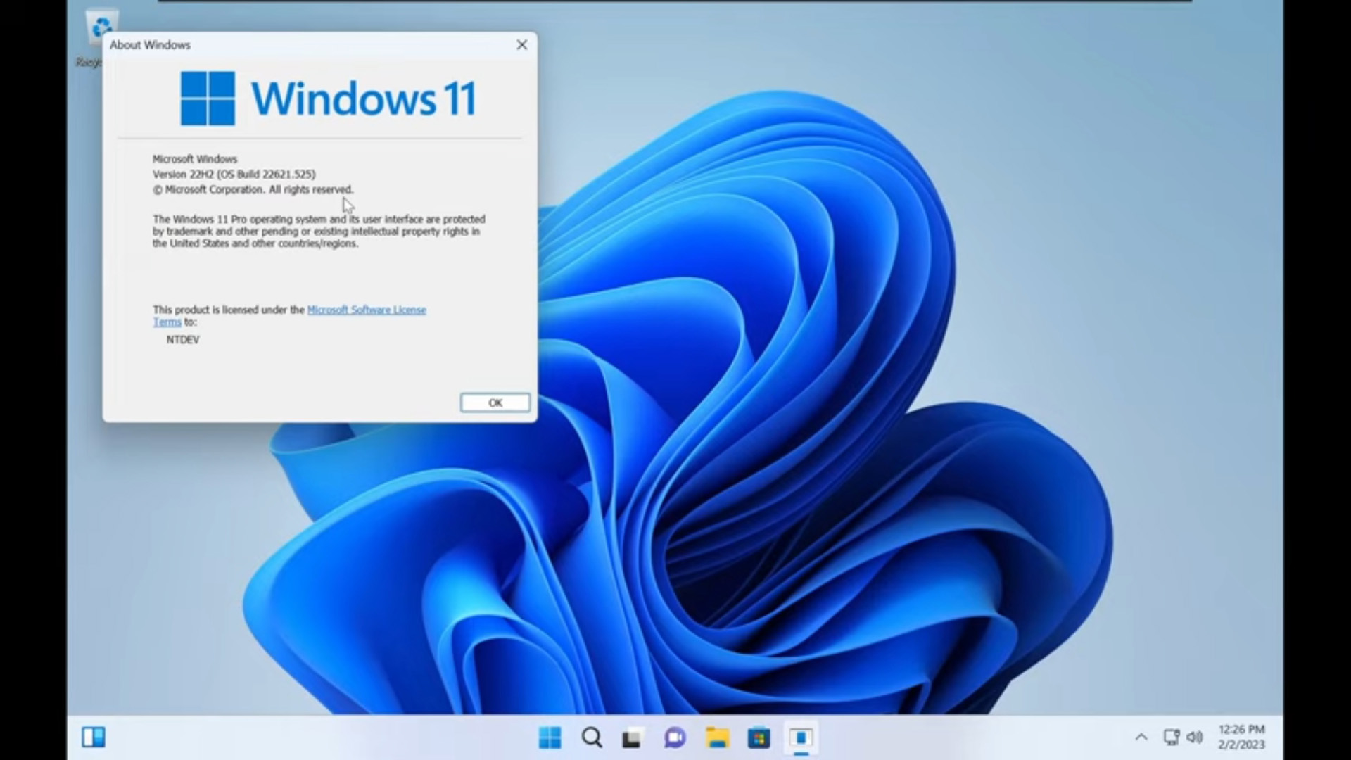 Tiny11 review: Windows 11 with only 2GB of RAM
Review A version of Windows 11 for older machines that don't meet the full requirements
-
 Red Hat Enterprise Linux becomes foundational operating system for Cohesity Data Cloud
News New strategic partnership between Red Hat and Cohesity aims to drive innovation in the data security and management space
-
 Ubuntu shifts to four-week update cycle
News Critical fixes will also come every two weeks, mitigating the issues involved with releasing prompt patches on the old three-week cadence
-
 AlmaLinux follows Oracle in ditching RHEL compatibility
News Application binary compatibility is now the aim with 1:1 now dropped
-
 How big is the Windows 10 cliff-edge?
ITPro Network With some comparing the upcoming Windows 10 end of life to Windows XP, we ask members of the ITPro Network for their insight
-
 Everything you need to know about the latest Windows 11 updates - from bug fixes to brand-new features
News Two new cumulative updates are on the way and will be installed automatically on Windows 10 and Windows 11 machines
-
 How to download a Windows 11 ISO file and perform a clean install
Tutorial Use a Windows 11 ISO to install the operating system afresh
-
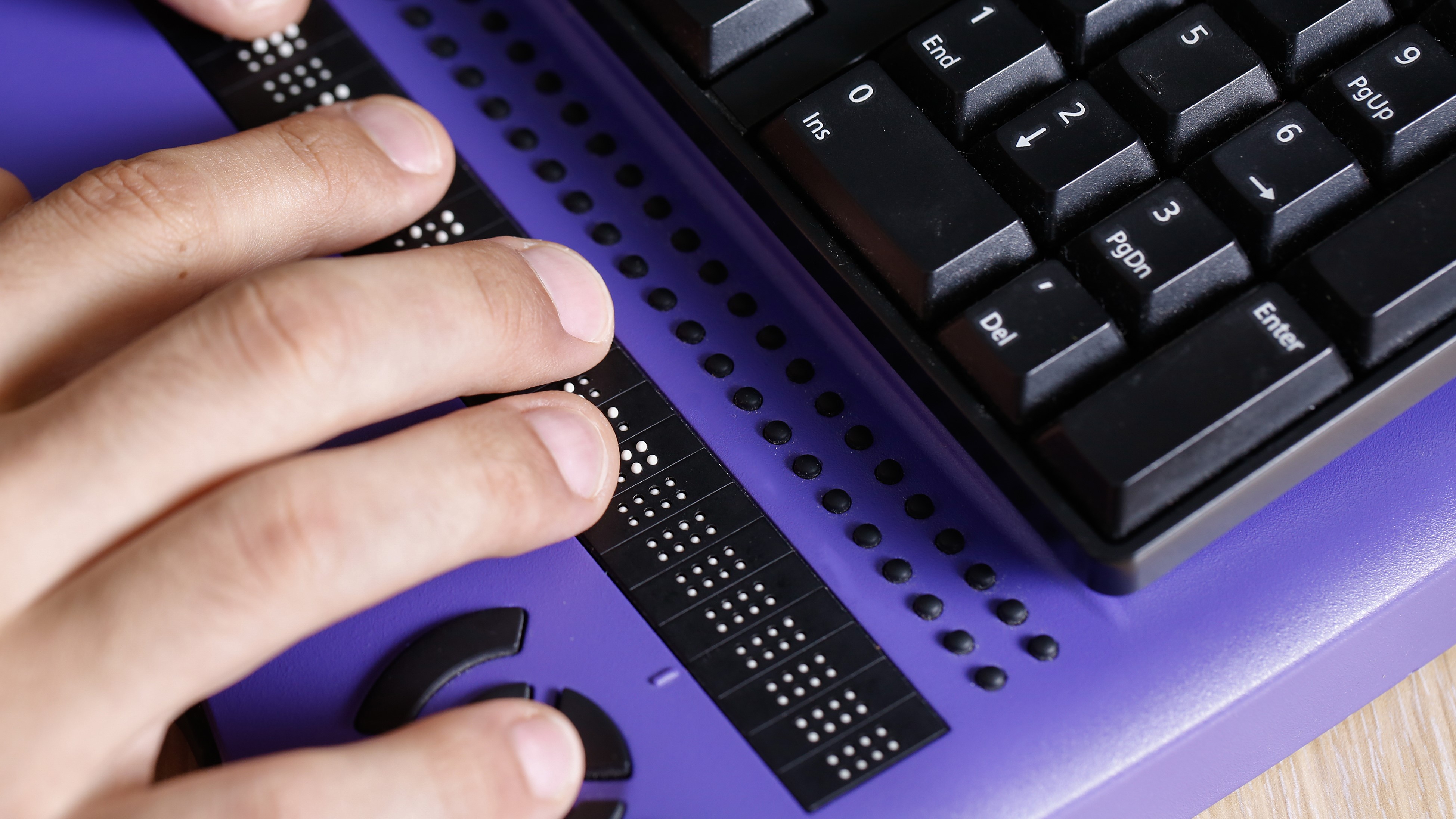 We could all benefit from better Windows and macOS accessibility features
Opinion Today’s accessibility features can help you work through a nasty injury, but there’s still plenty of room for improvement