Android 6.0 Marshmallow vs 5.0 Lollipop head-to-head
Sweeter than ever

Android 6.0 Marshmallow is the software that'll power almost every new Android phone and tablet of 2016. Any changes it makes will affect millions.
Marshmallow is less of a drastic change than Android 5.0 Lollipop was, but there are still numerous functional and visual changes that not only continue what Google started with Lollipop's Material UI. On top of this is greater clarity in the system's security, a much more wide-ranging set of abilities for the Google Now personal assistant and more detailed battery management. Here's how Android 6.0 Marshmallow stacks up next to Android 5.0 Lollipop.
Google Now
The most significant change in Marshmallow is how Google Now works. Now on Tap scans whatever is on-screen and gives you additional, contextual information. It can be used anywhere in Android, including third-party apps, simply by long-pressing the Home button
For example, if you're reading a web page or an email about a restaurant then activating Now on Tap will show you directions on how to get there, a link to the menu and an option to call the restaurant directly. If you're viewing tweets about your favourite band, Now on Tap will give you direct links to the band's Facebook page and any music videos on YouTube.
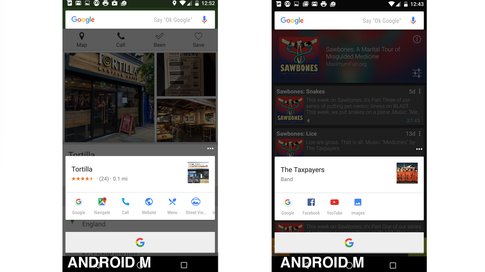
It tends to take a second or two to load, and does not always come up with useful results, but it is very impressive when it works. Now on Tap makes Google Now even more useful than before and is effectively a short cut to performing a web search instead of constantly switching between a search page in Chrome and whatever app you're using.
Google hasn't forgotten Google Now's voice-activated roots and the usefulness of voice control when you're driving or if you have a disability. Unlike Lollipop, the personal assistant in Marshmallow now responds to the Ok, Google' voice command on the home screen without the need for any other interaction such as a button press. It's not yet clear which Android phones will be compatible with this hands-free voice control, but it's almost certainly bound to be wider than the compatibility list of the similar hands-off Hey Siri' feature in iOS 9 which only works with the new iPhone 6s and 6s Plus. Older iPhones can also use this feature when connected to a power source.
Now on Tap could still use some improvement - it could be faster and could use image analysis and OCR to find contextual information in pictures. Even so, Google Now is even better than it was before.
Homescreens
Android Lollipop marked a fairly substantial change in the appearance of Google's mobile OS, and that remains the visual framework for Marshmallow. Google calls this look Material Design and its aim is to give the system a more consistent look based on the card' metaphor first introduced in Google Now.
There are really no major changes to the layout of Android 6.0 Marshmallow's homescreens. The icons are similar, the way app folders look is virtually the same and the preinstalled widgets have not changed. Android 6.0 Marshmallow's face is clearly designed to appear familiar after the more jarring changes from Android 4.4 KitKat to 5.0.
Apps drawer
However, this familiarity is upturned with the apps drawer. From a half-second glance, it may appear unchanged, but Android M 6.0's apps drawer is different.
Ever since the first version of Android back in 2008, the drawer has used horizontally-scrolling pages of apps that mirror the basic mechanics of the home screen pages. That has changed: the apps drawer now scrolls vertically. It's non-paginated and apps are arranged alphabetically.
While quite a dramatic shift, there's plenty of precedent for it. Windows Phone uses a similar apps drawer style, as does the HTC Sense custom Android skin. As with Android Lollipop, there's no customisation available here. The app icons are always arranged alphabetically, app folders aren't allowed in this part of the OS and icons can't be hidden', as Samsung allows in its custom Android skin.
If nothing else, this new arrangement speeds up navigation of large app collections. Scrolling flies by at quite a speed. By thumbing the very right side of the screen, you can skim through your app by letter' with apps organised into alphabetical groups.
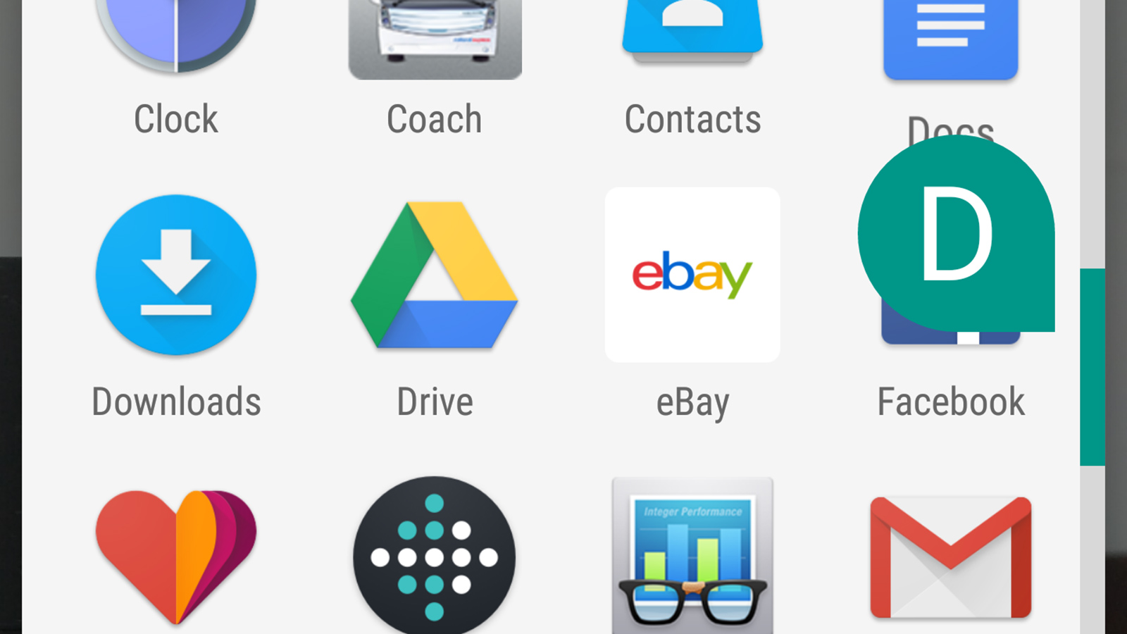
More useful for everyday app juggling are the shortcuts at the top: the search bar and the frequently used' shortcuts. The top row of app icons is reserved for your most-used apps. Rather than being your four last-used apps, this section auto-fills using an algorithm that appears to balance those most used' and most recently used'.
Above these shortcuts is a search bar. It searches your installed apps and, if it comes up short, suggestions from the Google Play store. It lacks visual panache, but works well enough.
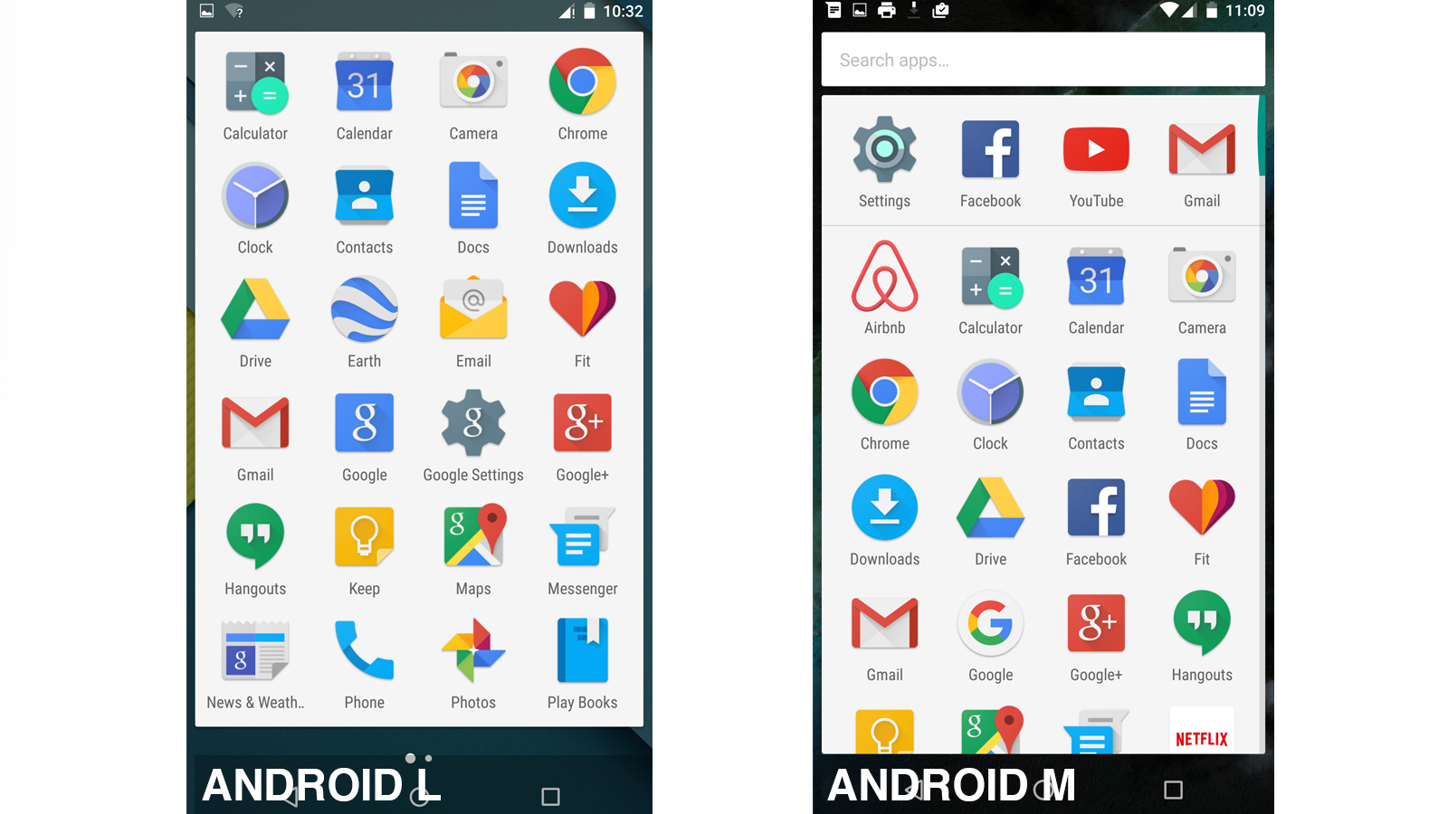
The combined effects of the additional navigation elements in the Android Marshmallow 6.0 apps drawer make it appear more complicated compared to Lollipop. This is a shame since the visual purity of Lollipop was a big part of its appeal, but the functionality improvements in Marshmallow are worth having.
Lock screen
There are a few minor changes to Android's lock screen. Its layout has not changed, but the font of the clock display has. The clock text is a little thicker than before, and the longer date text below has been capitalised.
Android Marshmallow also allows a user-typed tagline to sit below the date, most likely to be used to read Dennis Publishing's phone' or something similarly banal. A fairly long string can be inputted here, but only a single line appears, the text scrolling in ticker-tape style. The visual reins on Android Marshmallow are pretty taut.
Volume controls and Do Not Disturb
One of the more contentious parts of Android Lollipop was its dumping of a standard silent' mode in favour of the Do Not Disturb system. Although useful and designed to avoid accidentally silencing an important alarm, it was also somewhat more convoluted to use.
Pressing a volume button brings up a plain volume slider, which changes the level of general system sounds. A pull-down drawer holds the alarms' and media' volume sliders. This is much simpler than Lollipop where pressing a volume button immediately displayed the Do Not Distrub panel.
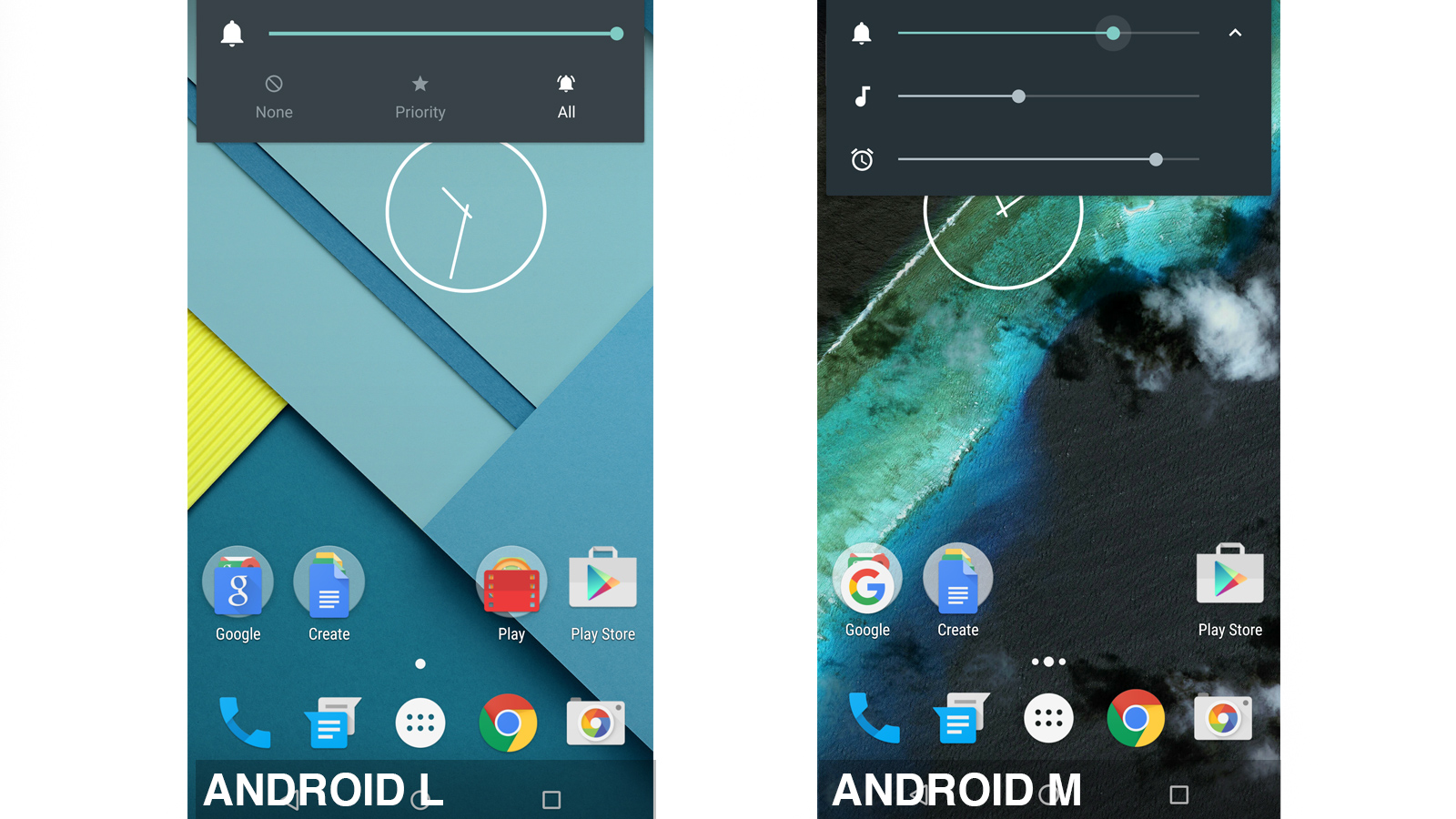
Do Not Disturb still exists and also lives in the pull-down drawer. Its features remain largely unchanged, with options to completely silence the phone for a certain period of time available. A further dig in the settings reveals further options for choosing priority' alerts that can still get through despite your Do Not Disturb preferences.
It remains a bit of a labyrinth, but the new onion-like arrangement of this feature makes it easier to use.
Battery efficiency
Android Marshmallow also increases the amount of control you have over energy usage. With Lollipop, the battery saver mode can be switched on and off: that's it.
Now, each app can be opted in or out of standard power optimisation, which happens all the time, not just when battery saver mode is switched on. By default, all apps are opted in automatically. While Android doesn't details what's involved in this optimisation', it essentially throttles background processes and their use of network data. The new Doze feature shuts off almost all activity, including background processes, when your phone is in standby mode to save even more power.
As before, the full-on battery saver mode is only intended for emergencies rather than general use. It restricts background data, processor speed and background processes, while lighting up the top and bottom of the display in orange just so there's no confusion about whether it is turned on or not. Battery Saver is clearly a cut-down Android experience, but it could come in handy in a pinch.
We'll have to run further tests before we can say conclusively whether Marshmallow really is more power efficient than Lollipop, but the early signs are promising.
RAM usage and performance
Efficient memory management is obviously important given the number of budget Android phones that have 1GB of RAM or less. It's also an issue for high-end phones with plentiful memory given the memory leak issues that plagued some Nexus devices running Lollipop. ART, the application runtime first introduced in Lollipop, has allegedly been refined to reduce memory usage and improve performance.
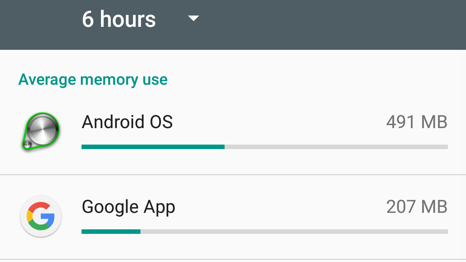
The jury is still out on these alleged ART improvements until we can test Marshmallow on a wider range of device configurations. Google has also introduced a new memory management section in the Settings app. This displays the memory usage of installed apps over the last 3-to-24 hours, making it easier to identify any that are clearly taking up more than their fair share. Unlike many third-party memory managers, it's only for identifying misbehaving apps rather than stopping them from running.
Google has also tweaked some of the animations in Marshmallow so it at least feels faster subjectively. For example, the new app load animations make it appear the app has been fully loaded even while it's still churning away in the background.
Security
Lollipop introduced several crucial security features including a version of Samsung's Knox software, whole device encryption enabled by default and automatic phone unlocking if you have an Android Wear smartwatch.
Android Marshmallow introduces a simple new way for you to see whether it has received the latest security patches or not - a date stamp when the operating system's security was last updated. It's called Security Patch Level, and is found in the Settings menu.
Google's stated aim is to provide a security update each month. Samsung and LG have already signed up to this scheme, but it's currently unclear which of their devices will receive these monthly security updates. Even then, both manufacturers have noted that security update availability is still subject to the whims of the mobile network companies, so Google's Nexus range are still the only Android phones guaranteed to get them as soon as possible.
At least all Marshmallow devices will be able to use the new app permissions scheme which is much more robust than Lollipop's. It lists each kind of permission, such as access to the camera, internal storage, microphone, your contacts listing and so on. Tap one and it shows you which apps are allowed to use that permission.
Lollipop (and prior versions of Android) prompted you to approve permissions access the first time you downloaded an app resulting in lengthy lists of permission requests that few people paid enough attention to. Marshmallow takes a more iOS-like approach, prompting you to grant access to a permission only when an app first asks for it. You're more likely to notice when a potentially rogue app asks for an inappropriate permission this way and, like Marshmallow's new memory manager, adds an extra bit of transparency that's very welcome.
Perhaps the most biggest security change for device manufacturers, though, is system-level support for fingerprint scanners. While a few Android phones have had fingerprint readers for a couple of years now, Google has only just added official, standardised support for them within Android Marshmallow. We should thus see a far greater number of Android devices with built-in fingerprint readers than we ever did with Lollipop and KitKat.
Conclusions
Android 6.0 Marshmallow is a modest update compared to 5.0 Lollipop. There are still plenty of noteworthy changes though, even if Google's promises regarding battery life and memory usage don't pan out. Now on Tap, a refined Do Not Disturb and a more sensible approach to permissions makes Marshmallow a no-brainer upgrade. If your device is lucky enough to get it, don't hesitate it's a significant improvement over Lollipop.
Verdict
Some improvements remain to be proven, but Android Marshmallow is nonetheless the best version of Google's mobile OS so far
Get the ITPro daily newsletter
Sign up today and you will receive a free copy of our Future Focus 2025 report - the leading guidance on AI, cybersecurity and other IT challenges as per 700+ senior executives
-
 Bigger salaries, more burnout: Is the CISO role in crisis?
In-depth CISOs are more stressed than ever before – but why is this and what can be done?
By Kate O'Flaherty Published
-
 Cheap cyber crime kits can be bought on the dark web for less than $25
News Research from NordVPN shows phishing kits are now widely available on the dark web and via messaging apps like Telegram, and are often selling for less than $25.
By Emma Woollacott Published
-

 OnePlus 3 review
Reviews The big and shiny phone that’s more than just an HTC wannabe
By Clare Hopping Published
-
 Samsung Galaxy S7 review: classy but outclassed
Reviews The S7 can't match newer competition
By Adam Shepherd Published
-

 HTC 10 review: HTC 10 about to be phased out and HTC 11 incoming?
Reviews The HTC 11 has been hinted at in an official Facebook post
By Alan Lu Published
-
 Android Marshmallow 6.0: One-third of Android devices still run on Marshmallow
Rumours Despite gains by Nougat, Android Marshmallow is still running on 31% of devices
By Dale Walker Published
-
 Sony Xperia XA review
Reviews The smartphone that’s Xtremely Average
By Alan Lu Published
-
 Vodafone Smart Platinum 7 review
Reviews The network own-brand phone that looks surprisingly luscious
By Alan Lu Published
-
 Google Nexus 6P review: king of the Android phablets?
Reviews How does the Nexus 6P measure up against the likes of LG and Samsung's flagships?
By Andrew Williams Published
-
 Lenovo Moto G4 Plus review
Reviews How does it differ from the normal fourth generation Moto G?
By Alan Lu Published