Best data visualisation tips and tools
We explain how to get the most out of data visualisation and the top tools for the job


Big data is as important to business as oil once was and it's transforming companies around the world. But how insights are gleaned from data is actually subjective and we need different ways to view it. This is where data visualisation comes in.
It's a way of seeing data through graphical representation, like charts or graphs. Often colours and patterns are used to create maps with the data, which highlights trends or irregularities in a dataset. For example, Google, in collaboration with Staman Design, a data visualisation design studio, used the trajectory, velocity and density of data moving around the globe to create virtual maps.
However, it's not all pretty pictures or just dressing up a graph so it's easier on the eyes. Effective visualisation is a delicate balancing act, the data and the visuals need to work together to tell a story; a stunning graph may be short on actual insight, whereas an invaluable chart may be a little dull to look at.
To help you analyse your data, there are a number of tools on offer. We've rounded up some of the best available...
Top data visualisation tips
Choose the right graphic for the data
If you're attempting to highlight a trend decrease, increase, drops in service which fit into a pattern or the distribution of services in the UK, you need to select the correct way of displaying data.
Trend graphs, such as those that show profit increase or revenue decrease, should be displayed on a line graph that shows the upwards/downwards trend. Comparison data needs to appear side-by-side in order to highlight any trends and scatter graphs should be your go-to visualisation for distribution data.
Get the ITPro daily newsletter
Sign up today and you will receive a free copy of our Future Focus 2025 report - the leading guidance on AI, cybersecurity and other IT challenges as per 700+ senior executives
Keep it simple!
Try to keep the visualisations simple - don't cram too much information into them. If it gets to the point where it's too complicated, try splitting the data into multiple charts or visualisations.
Additionally, you could also use colour, size and position of data to show what's the most important. The most important aspect is that your visualisation needs to be understood from a glance - your audience shouldn't need a PhD to decipher it.
Don't let the creative get the better of you
It may seem important that graphics look good but it's crucial that it makes sense and can be understood easily. Let the data do the work in a simple manner instead of investing your efforts into the way it's presented. In data visualisation, you shouldn't have to explain what's happening. If you spend too long obsessed with how it looks you will end up wasting precious energy and time. This completely goes against the purpose of the data in the first place.
Ensure there's a hierarchy
All data should have a hierarchy, highlighting the most important data and ignoring the data that doesn't matter (or at least, making it less dominant). Be ruthless and only show what's necessary or what illustrates your point.
RELATED RESOURCE
Top data visualisation tools
QlikView is a business intelligence application that helps businesses create tailor-made data visualisations of their business to address their major business challenges. The web-based software exposes often hidden insights within organisations and the relationships between data points to help firms identify how they need to change to meet their objectives.
Many of these insights aren't available through traditional query-based tools, the company explains, offering more detailed visualisations that can be understood by anyone, however advanced they are at data analysis and however much they already understand data (or not as the case may be).
What's great about QlikView is that the UI is simple to use and offers guides to help even the least tech-savvy people navigate around the data and identify key insights. Everything can be easily shared between other staff and team members, making it a great option for everyone within an organisation, provided you have the enterprise edition rather than the free personal edition that only works on a local machine.
QlikView also eradicates the need for specialised IT staff or data analysts because everything happens automatically, collating the data from multiple data sources at the same time to convert the information into visual representations.
QlikView Personal Edition is free to use, but doesn't operate from a server, while the enterprise edition is charged on a per-user or per-server basis.
Plot.ly takes the data you want to visualise from your cloud platform, spreadsheet or via manual upload and turns it into visualisations contributed by the open source community. The data can be analysed using any number of tools including Python, Matlab, Javascript or Jupyter and is then transformed into graphics that can then be shared onto a webpage, exported, turned into a presentation or a dashboard for everyone to access.
Like Plot.ly, DataHero analyses your data and allows you to turn it into key business insights using a drag and drop interface. You can import data from your existing cloud services, combining information from different sources and storing it in one place. The insights can be shared with others in the organisation from a single dashboard, offering everything in one place.
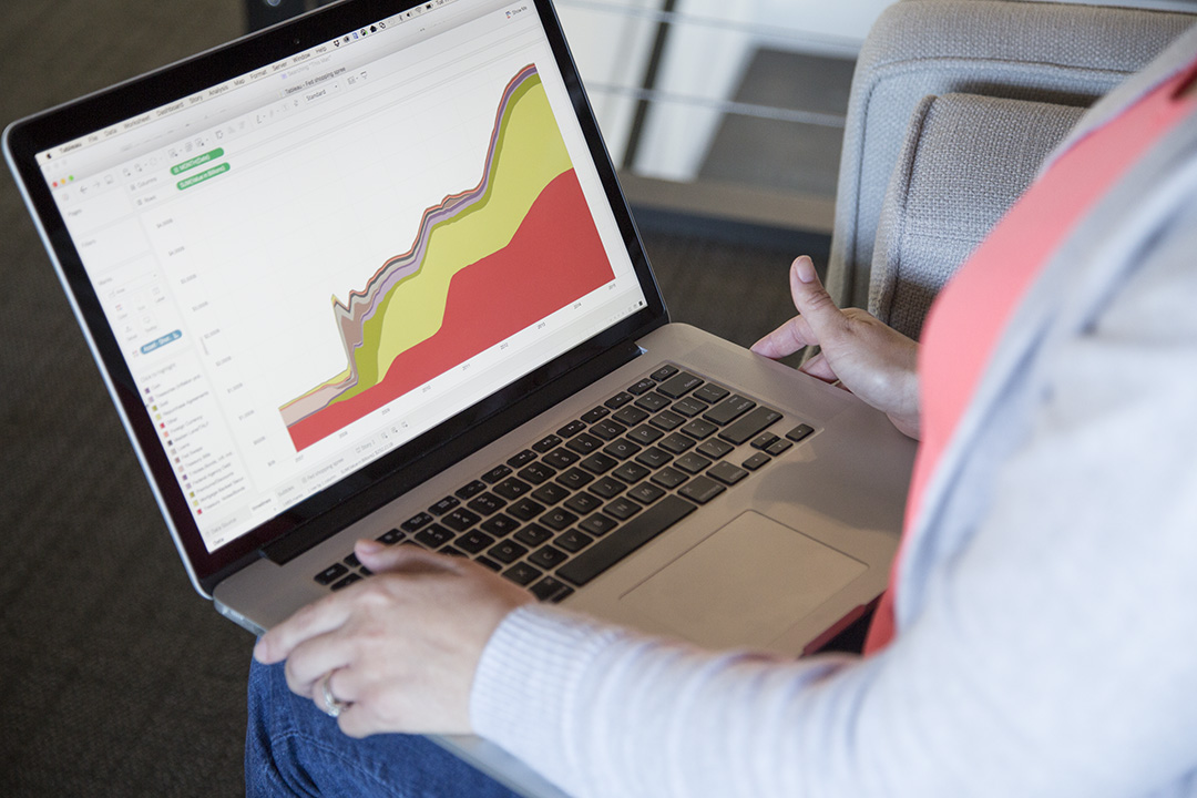
Tableau can connect with almost any database to extract the important data and turn it into visualisations to help show trends and vital information to make better business decisions. The interactive graphics make it easier for everyone to explore the key points, inspiring "lightbulb" moments, the company says. The visualisations are beautiful and UI is simple to use, making it a platform open for everyone, not just data scientists.
Visual.ly is a step up from the normal input data - spout out graphic interface. It's a whole community of designers that will turn data into something totally immersive and unlike anything else in existence. It's designed mostly to create infographics or social content for the public arena rather than visualisations to show management, but if you're looking to move your business to the next level, it's worth a peek.
Bobby Hellard is ITPro's Reviews Editor and has worked on CloudPro and ChannelPro since 2018. In his time at ITPro, Bobby has covered stories for all the major technology companies, such as Apple, Microsoft, Amazon and Facebook, and regularly attends industry-leading events such as AWS Re:Invent and Google Cloud Next.
Bobby mainly covers hardware reviews, but you will also recognize him as the face of many of our video reviews of laptops and smartphones.
-
 Why keeping track of AI assistants can be a tricky business
Column Making the most of AI assistants means understanding what they can do – and what the workforce wants from them
By Stephen Pritchard
-
 Nvidia braces for a $5.5 billion hit as tariffs reach the semiconductor industry
News The chipmaker says its H20 chips need a special license as its share price plummets
By Bobby Hellard
-
 Put AI to work for talent management
Whitepaper Change the way we define jobs and the skills required to support business and employee needs
By ITPro
-
 More than a number: Your risk score explained
Whitepaper Understanding risk score calculations
By ITPro
-
 Four data challenges holding back your video business
whitepaper Data-driven insights are key to making strategic business decisions that chart a winning route
By ITPro
-
 Creating a proactive, risk-aware defence in today's dynamic risk environment
Whitepaper Agile risk management starts with a common language
By ITPro
-
 How to choose an HR system
Whitepaper What IT leaders need to know
By ITPro
-
 Sustainability and TCO: Building a more power-efficient business
Whitepaper Sustainable thinking is good for the planet and society, and your brand
By ITPro
-
 What is small data and why is it important?
In-depth Amid a deepening ocean of corporate information and business intelligence, it’s important to keep things manageable with small data
By Steve Cassidy
-
 Microsoft's stellar cloud performance bolsters growth amid revenue slump
News The tech giant partly blames unstable exchange rates and increased energy costs for the slowdown
By Rory Bathgate