
Sign up today and you will receive a free copy of our Future Focus 2025 report - the leading guidance on AI, cybersecurity and other IT challenges as per 700+ senior executives
You are now subscribed
Your newsletter sign-up was successful
A picture tells a thousand words. It's an old adage but when it comes to interpreting data, it's an important one. It's a simplistic saying but the fact is, trying to get a handle on a mass of intricate detail is often better done visually than verbally.
It's a phenomenon that's well known. According to Lynell Burmack, author of the book Visual Literacy, information that is reinforced visually is more likely to be retained. "Unless our words, concepts, ideas are hooked onto an image, they will go in one ear, sail through the brain, and go out the other ear. Words are processed by our short-term memory where we can only retain about 7-bits of information (plus or minus two). Images, on the other hand, go directly into long-term memory where they are indelibly etched"
The trouble with handling numbers is that, unless you're a mathematical whizz-kid, it can be very hard to see recognisable patterns in a mass of digits. We often see this in business when the people whose job it is to access and analyse the data and produce the figures may not be the same people charged with interpreting it and acting upon it.
To show just how costly this gap could be, take the example of the mortgage company described in the book, Keeping up with the Quants. In this description of the power of numbers, analytics professor, Thomas Davenport sets out the true story of how an analyst from the unnamed mortgage company presented his bosses with figures showing the extent to which the firm was exposed to defaulters: his advice was not acted upon and the company ended up losing millions.
Whose fault was this? The head of mortgages was quick to point the finger, "If the analyst showed me a model, it wasn't in terms I could make sense of. I didn't even know his group was working on repayment probabilities."
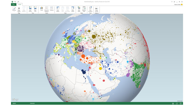
The phrase "wasn't in terms I could make sense of" speaks volumes here. If the data had been presented as an image where the bad risks had been highlighted, or even more starkly, where the company itself was shown to be in financial trouble, it might have concentrated minds.
Having the data itself is nothing. What's needed is a way to make it come alive'; to have that impact on managers, where in Burmack's words, they become indelibly etched'. There needs to be a way to present the numbers, the raw data, in a graphical form.
Sign up today and you will receive a free copy of our Future Focus 2025 report - the leading guidance on AI, cybersecurity and other IT challenges as per 700+ senior executives
To make a story out of those numbers is a particular skill and has led to the creation of a new job within some organisations the data visualisation specialist. This is someone whose role is to present information in a meaningful way: to ensure that vital trends aren't being missed.
Even if there's not a requirement for a single individual to work in this area, companies are painfully aware that there's a disconnect at the moment between the analysts who are often the ones pulling the raw data together and the business analysts who want to do something meaningful with it.
To bridge this gap, Microsoft has been working on ways to improve the visualisation functions of some of its offerings. In July 2013, the company brought out Power BI, a new BI suite designed to enhance the data visualisation features of Microsoft software.
The suite comprises a range of products, some of which previously existed and some of which are new, but all provide a way for organisations to present data in a more attractive manner.
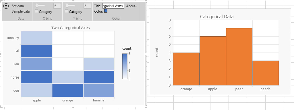
The most notable of these is Power View, an interactive data exploration and visualisation tool, included with SQL Server and SharePoint. The product works by taking data from PowerPivot files or from SQL Server and allowing users to concoct interactive visual presentations. It offers a way for users to compare different charts if you're using different sets of figures. It also offers geographical presentation by using Bing maps and can be used to demonstrate key performance indicators.
The company has now gone one stage further and incorporated Power View as part of Microsoft Excel 2013 to enable Excel users to make the most of this feature.
This makes sense as Excel is probably the first port of call when it comes to business intelligence. Some of the visualisation features may be limited it has a default set of colours and lines for example - but it's still a powerful tool when it comes to providing data insights.
Power Query (formerly known as Data Explorer) allows users to integrate data from other sources into Excel for further manipulation and exploration. For example, it would be possible to combine sales figures with product supply information. Or combine your own company's figures with publicly available data for example, an insurance company could look at its own policy data with regional crime figures.
Power Map is a function previously known as GeoFlow that employs 3D imaging to plot data points on a big map file. Using the software, a user can visualise each data point as a column, stacked column or heat map point. In addition, users can interact with the software as they would within a normal maps environment in other words, by using latitude and longitude references or by using post/zip codes.
Again, this could be used in conjunction with public data to provide regional figures, offering a way to look at information across different geographic regions.
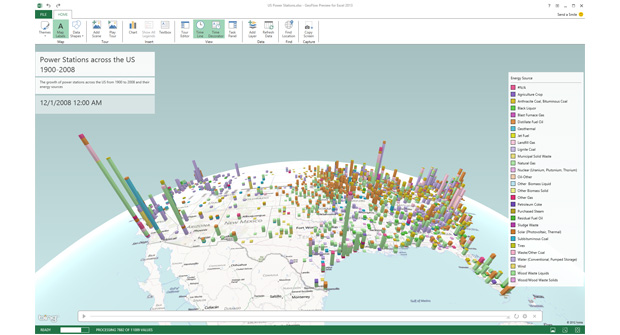
As an indication of how powerful this software is, Mark Dodd from Microsoft partner, Consolidata, demonstrates the way Power Map presents data. First of all, he describes how a user gathers a mass of data that needs to be plotted against geographic variables.
To do this, Power Map, makes use of another older Microsoft product, PowerPivot. This is software that allows very large volumes of related, multi-table data to be used for calculations. PowerPivot files can be handled by SharePoint, so they could be a resource used by many people as the files are held within a server. PowerPivot can also be used with an SSAS Tabular model, also hosted on a server.
Dodd points out that Power Map offers three ways of presenting data: column, bubble and heat map and gives examples of geographic descriptions of sales by postcode and by gender, explaining that a user has a choice of data aggregation.
Whatever the software, one of the key aspects of business intelligence is the drive towards cloud, partly explained by this requirement to share information. The cloud is fast emerging as a viable option for enterprises and Microsoft has launched Microsoft Office 365 to bring cloud services to a new generation of users.
Power BI for Office 365 provides extensions to the Office 365 suite that allows customers to deliver models and visualisations into the Office 365 cloud environment and synchronise these with on-premise data sets.
By using Power BI for Office 365, users will have the chance to play with, organise and manage that data, wherever they are: whether that be in the office, at home or in a coffee shop. Using a cloud-based spreadsheet will help to crack one of the biggest problems faced by analysts working on figures how can employees ensure that they're working on the master worksheet: it's easy to lose track when so many changes have been made and different copies of the same file are being mailed between participants in a discussion. A central copy makes things much clearer.
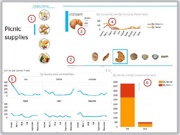
Microsoft has taken further steps, though. Earlier this year, it made some additions to its OfficeStore, which enabled users of Excel and Office to improve the way they handled the presentation of data, perfecting the visualisation process.
Recently, Microsoft has been exploring some other areas and new visualisation types. There have been four new releases, all emerging from the Microsoft Visualisation for Business and Entertainment (VIBE) initiative.
Histogram, which last month became VIBE's first visualisation release, shows the distribution of data via a bar graph of data-point frequency. Such visualisations are commonly used by scientists, and this add-in makes it far easier to create them in Excel.
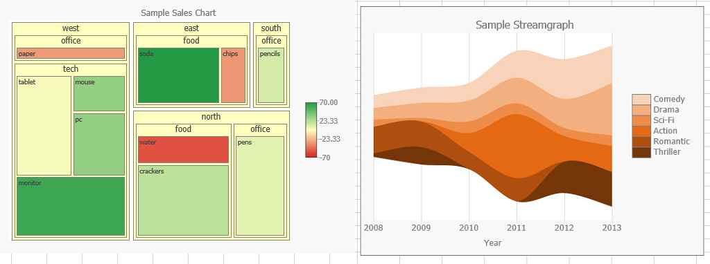
A related app, Histogram 2D, examines the distribution of two values with a visualisation also known as a density plot. Another app, Treemap, as its name suggests, allows Excel users to create treemaps based on their own data (Treemapping is a way of presenting information as a set of nested data). The last tool being offered is Steamgraph, an application that allows users to examine data volume over time.
These are more specialist tools, though: going beyond the limits of what most business executives would be looking for.
The main thrust of the changes that are being proposed by Microsoft is to aid the drive towards easier visualisation. There's an ever-growing amount of data out there - according to IDC, the total amount of data in the world will increase from 2,596 exabytes in 2012 to a whopping 7,235EB by 2017 and companies will look to do more with that information. Digging into this data is going to be a high priority for many organisations.
The company that wants to make real headway in visualisation of data does need to get a firm idea of what information needs to be conveyed. It can't be a question of finding data and using the Microsoft product of choice to deliver a more visual representation.
The mistake is in thinking that visualisation is only about the technical knowledge of a piece of software, it goes much deeper than that. According to data visualisation expert, Nathan Yau, author of the most definitive books on the topic, anyone wanting to go down the visualisation route needs to have a clear thought in his or her head. Introducing his new book, Data Points, he writes "We often think of visualisation as a design and programming task, but the process starts further back with the data ... you have to understand the data its trends and patterns, along with its flaws and imperfections and the rest follows."
So, to get started, a company needs to have a clear idea what it wants to measure; how it's going to obtain those figures, what software it's primarily going to use and how best to illustrate those figures: a line chart, pie chart, data flow diagram or whatever. And of course, it also needs to decide what software is best for its needs will Excel be enough? Will you need the additional capabilities of SQL Server? Is there a need for cloud software.
But choosing the right software is only half the story: The real challenge is making those figures count and it's not going to be through obtuse numbers, it will be through graphs, maps, illustrations, infographics and pie charts. The well-informed company of today will be the smart company of the future.
ITPro is a global business technology website providing the latest news, analysis, and business insight for IT decision-makers. Whether it's cyber security, cloud computing, IT infrastructure, or business strategy, we aim to equip leaders with the data they need to make informed IT investments.
For regular updates delivered to your inbox and social feeds, be sure to sign up to our daily newsletter and follow on us LinkedIn and Twitter.
-
 Channel partners are sleepwalking into an AI code generation trap
Industry Insights Channel partners risk security failures by deploying AI code tools without proper validation
-
 Observability will be key to agentic AI safety, says Microsoft Security exec
News Agentic AI adoption will require a re-evaluation of enterprise risk management, according to Microsoft corporate VP
-
 Put AI to work for talent management
Whitepaper Change the way we define jobs and the skills required to support business and employee needs
-
 More than a number: Your risk score explained
Whitepaper Understanding risk score calculations
-
 Four data challenges holding back your video business
whitepaper Data-driven insights are key to making strategic business decisions that chart a winning route
-
 Creating a proactive, risk-aware defence in today's dynamic risk environment
Whitepaper Agile risk management starts with a common language
-
 How to choose an HR system
Whitepaper What IT leaders need to know
-
 Sustainability and TCO: Building a more power-efficient business
Whitepaper Sustainable thinking is good for the planet and society, and your brand
-
 What is small data and why is it important?
In-depth Amid a deepening ocean of corporate information and business intelligence, it’s important to keep things manageable with small data
-
 Microsoft's stellar cloud performance bolsters growth amid revenue slump
News The tech giant partly blames unstable exchange rates and increased energy costs for the slowdown

