It’s time to bring Spotify Wrapped to the workplace
Data analytics is big business - so why aren’t more companies learning from the best?


The end of the year should be a period for reflection, looking back over what we’ve accomplished during the last 12 months and thinking about the lessons we can apply to the forthcoming year. The best way to do this is through data, and when it comes to packaging data-driven insights in a fun and accessible format, there’s one clear winner.
If your social media feeds are anything like mine, you’ll have seen a slew of people sharing their ‘Spotify Wrapped’ results over the last few weeks. For those unfamiliar with this annual ritual, around this time of year, Spotify crunches through the vast reams of data it collects on its users’ listening habits and collates them into a fun little report for each individual user, showing what bands and genres they listened to most that year.
Spotify has essentially cracked the code to making mass data collection not only acceptable but fun, and each year, the flurry of activity as people share their results gives the company a healthy dose of free organic marketing. This isn’t, of course, a new observation, and neither is the idea that more services should copy it; Netflix, Twitter, YouTube, and basically every other online content platform have the capacity to offer users the same kind of insights into their habits. It remains surprising that to date, no other platform has made much of an effort to duplicate this obviously winning formula.
What’s even more interesting, however, is that no business software vendors have tried it either. SaaS tools of varying stripes have an all but unassailable foothold within modern IT, and as part of their continued operation, they have to monitor a huge number of data points covering a wide range of areas. The resulting data gives vendors everything they need to build reports highlighting a number of interesting trends and stats across every business.
Collaboration services like Slack, for example, could offer both individual stats (such as how many messages you send compared to coworkers, who you message the most, and how many new channels you joined that year) as well as organisation-wide figures like how many messages your company sends per day, the average number of GIFs shared per week, and so on.
Google – the reigning champion of data-driven business – could go even further for Workspace customers, collating data from across products like Google Calendar, Google Docs and Google Meet to show how many documents you shared with colleagues, the number of emails you opened without responding to, and how much time you spent that year in meetings compared to other staff.
This extends to technical staff as well, who are already highly metric-driven through tools like Trello and Jira. It’s not that much of a stretch to picture a ‘Jira Wrapped’ report showing a team’s average ticket completion time, or how many new tickets were opened that year compared to last year. GitHub already has an unofficial version of this – courtesy of developers Himanshu and Ishan Sharma – showing each GitHub user’s commits and pull requests for the last 12 months.
Get the ITPro daily newsletter
Sign up today and you will receive a free copy of our Future Focus 2025 report - the leading guidance on AI, cybersecurity and other IT challenges as per 700+ senior executives
RELATED RESOURCE

Admittedly, this concept isn’t without its perils. Without due consideration, this process could veer into the territory of overly invasive employee surveillance and behaviour monitoring, depending on what data points are being tracked. With that having been said, however, much of this information is already used by companies for KPI measurement and staff performance reviews. Presenting it in a more engaging, interactive style could, therefore, alleviate some of the apprehension and dread that can often accompany this process, as well as giving staff an opportunity to gain some perspective on their own methods, behaviours and processes that they may not otherwise recognise.
As well as being a fun way for employers to give staff insight into their activity, these reports could also provide useful indicators for organisations to base decisions on. Data-driven transformation continues to be a goal for many companies, and organisation-wide stats based on their staff’s tool usage could tell them whether they need to invest in more automation to speed up manual processes, where certain teams or departments may be under-resourced, and if de-emphasising meetings in favour of shorter email or IM updates might free up workers’ time for more productive tasks.
The fact is that all of this data already exists, and is surfaced in various ways throughout the tools in question, but it’s too sporadic and hard to find at present. Distilling it into an annual bite-sized roundup not only makes it more useful for both employees and businesses, it also provides a tangible benefit to the data-harvesting that most SaaS platforms carry out by default. If cloud vendors really want to embed data-driven thinking into their customers’ organisations, then their new years’ resolution should be to follow Spotify’s lead, and give us a reason to care about it.
Adam Shepherd has been a technology journalist since 2015, covering everything from cloud storage and security, to smartphones and servers. Over the course of his career, he’s seen the spread of 5G, the growing ubiquity of wireless devices, and the start of the connected revolution. He’s also been to more trade shows and technology conferences than he cares to count.
Adam is an avid follower of the latest hardware innovations, and he is never happier than when tinkering with complex network configurations, or exploring a new Linux distro. He was also previously a co-host on the ITPro Podcast, where he was often found ranting about his love of strange gadgets, his disdain for Windows Mobile, and everything in between.
You can find Adam tweeting about enterprise technology (or more often bad jokes) @AdamShepherUK.
-
 Should AI PCs be part of your next hardware refresh?
AI PCs are fast becoming a business staple and a surefire way to future-proof your business
By Bobby Hellard
-
 Westcon-Comstor and Vectra AI launch brace of new channel initiatives
News Westcon-Comstor and Vectra AI have announced the launch of two new channel growth initiatives focused on the managed security service provider (MSSP) space and AWS Marketplace.
By Daniel Todd
-
 Five must-have data integration capabilities for your cloud data warehouse
Whitepaper Data integration tools that are easy to use, flexible, scalable, and able to work across multiple environments seamlessly
By ITPro
-
 The Forrester Wave: Top security analytics platforms
Whitepaper The 11 providers that matter most and how they stack up
By ITPro
-
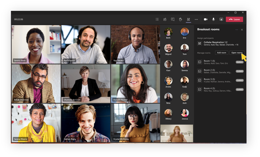
 Every Microsoft Teams update from Ignite 2020
News UI improvements, feature updates, new functionality, and a glimpse at Teams' future on Android
By Dale Walker
-
 Microsoft aims to simplify security portfolio with Defender rebrand
News Move coincides with updates for Azure Sentinel, Azure Defender, and Defender for Endpoint
By Dale Walker
-
 Microsoft now has a managed service for adding chat tools to existing apps
News The Azure Communications Service lets developers add chat functionality ‘in minutes using a few lines of code’
By Dale Walker
-
 Google Cloud scores FA digital transformation partnership
News St George's Park will receive a big tech upgrade with a view to enhance player performance
By Connor Jones