Microsoft Office 2013 review
Word, Excel, Outlook and PowerPoint get the touchscreen treatment, cloud storage and a bunch of new features.

It's still the most comprehensive suite available - but do you need it? The most convincing argument we can think of for upgrading to Office 2013 will be for those that want to use Microsoft Office on a tablet. Office 2013's gesture supporting user interface is a definitely a big selling point, perhaps even pushing tablets into credible productivity devices rather than glamorous clip boards.
-
+
Clean interface; Multitude of templates; Inline replies for Outlook; Cloud syncing
-
-
Touch experience is mixed; Office 2010 is still adequate for majority of users

Office 2013 is the most dramatic change Microsoft has made its core product since the introduction of the Ribbon.
The standout feature of Office 2013 is the inclusion of gesture support and an on-screen keyboard you can actually type on. This will sit well with organisations looking to deploy tablets as more than mere document viewers.
It is obvious that Microsoft's design cues came from the Metro scheme used for Windows 8 Phone. However those worried about a tiled interface can rest easy as there isn't a Live Tile in sight. The firm has retained its default colour schemes between Office 2013 applications with Word using blue and white while Excel uses green and white, and on the whole the firm uses a lot of white to create what is a pleasant and uncluttered interface.
The suite is available to download now from Microsoft and can be installed alongside an existing Office installation. Before we dive into the individual pieces of software - we run through the key features:
Key features of Office Professional 2013
- Keep track of comments in Word docs and mark them as done with the new reply button.
- Pull PDF's into Word.
- New tools recognise your pattern and auto-complete data within Excel.
- Share your PowerPoint presentation over the web by sending a link to it or using the free Office Presentation Service.
- Embed Excel spreadsheets, diagrams, audio clips, videos, and other media into OneNote.
- All OneDrive users receive 15GB of free online storage, with more available to purchase if required.
Word 2013
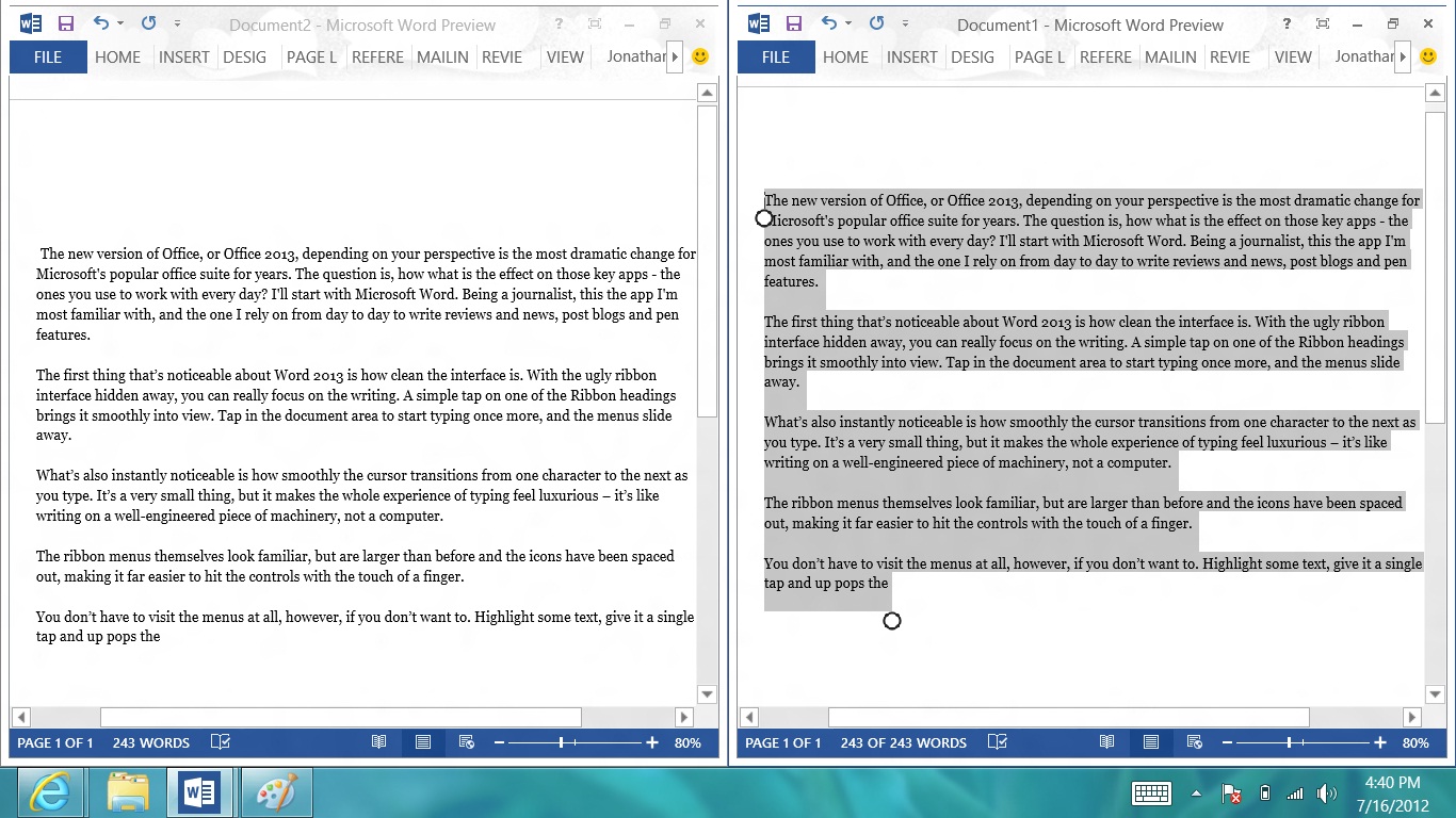
The first thing you'll noticeable about Word 2013 is how clean the interface is. With the ugly Ribbon interface hidden away once you start typing, you can focus on the writing. A simple tap on one of the Ribbon headings brings it smoothly into view. Tap in the document area to start typing once more, and the menus slide away.

One nice touch is the responsiveness of the cursor; it transitions instantaneously from one character to the next as you type. It's a small thing, but it makes the whole experience of typing feel luxurious it's like writing on a well-engineered piece of machinery, not a word processor.
There is a new Read Mode strips this down further while still allowing comments to be added as you read. This is particularly useful in conjunction with the new ability to scribble "inked" comments on a document with a stylus.
Ribbon remains
It's good to see that Microsoft hasn't completely started again, though. The Ribbon menus remain, and they're organised in the familiar way. Although the look is dramatically different overall, existing users will not feel completely out of their depth. The key difference is that buttons are a little larger than before and have been spaced out, making it far easier to hit the controls with the touch of a finger than on Office 2010.

Embedding content
The Insert option allows you to search for online videos using Bing from within Word. You can also embed video code into the documents and then play them within the app too.
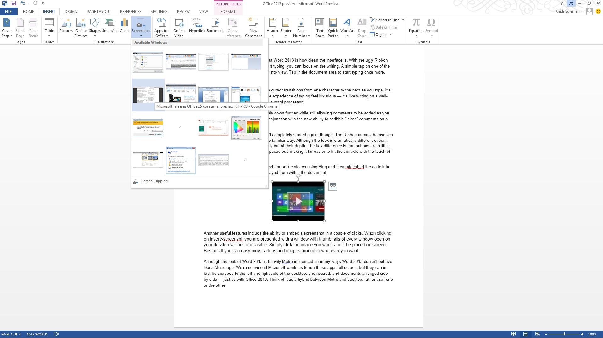
Another useful feature includes the ability to quickly embed a screenshot. Clicking Insert>screenshot will bring up a window with thumbnails of every window app on your desktop. Simply click the image you want, and it will be placed on screen. Best of all you can easy move videos and images around to wherever you want.

Touch
Perhaps the biggest problem to overcome in working with Word 2013 is the split between touch control and using it with a keyboard and mouse. In some cases, the hybrid approach works well: highlight a section and tap it with a finger, and the context menu that appears is horizontal, squeezing neatly between the onscreen keyboard and the top of the screen; right click the selection with a mouse and the context menu displays vertically.
In other cases, it can be incredibly irritating. Tap the screen whilst you're typing with a keyboard and up pops the onscreen keyboard, only to disappear once you start typing again. We hope there's some way of disabling this behaviour, but this sort of user intervention shouldn't be necessary.
And it isn't all rosy when it comes to touch control either. Although the Ribbon buttons are nicely spaced out and fairly large, but other controls are tiny. The windowing controls are too small, as are the icons on the Quick Access Toolbar in the top-left corner and the zoom controls and view shortcuts found in the bottom right corner although these look as if they're intended for mouse users, as zooming with touch can be achieved with a simple pinch of the fingers.
Overall, we like the minimalism of the Metro-inspired interface more than expected, and it's good news that Microsoft isn't forcing the full-screen approach of Metro on users. On the other hand, combining touch with keyboard and mouse use raises a number of irritating problems, and some of the touch controls don't appear to be wholly suited to tablets, which could be a problem for users of Surface, which will come with the new Office Suite built in.
Get the ITPro daily newsletter
Sign up today and you will receive a free copy of our Future Focus 2025 report - the leading guidance on AI, cybersecurity and other IT challenges as per 700+ senior executives
Barry Collins is an experienced IT journalist who specialises in Windows, Mac, broadband and more. He's a former editor of PC Pro magazine, and has contributed to many national newspapers, magazines and websites in a career that has spanned over 20 years. You may have seen Barry as a tech pundit on television and radio, including BBC Newsnight, the Chris Evans Show and ITN News at Ten.
-
 ‘Phishing kits are a force multiplier': Cheap cyber crime kits can be bought on the dark web for less than $25 – and experts warn it’s lowering the barrier of entry for amateur hackers
News Research from NordVPN shows phishing kits are now widely available on the dark web and via messaging apps like Telegram, and are often selling for less than $25.
By Emma Woollacott Published
-
 Redis unveils new tools for developers working on AI applications
News Redis has announced new tools aimed at making it easier for AI developers to build applications and optimize large language model (LLM) outputs.
By Ross Kelly Published
-
 Google layoffs continue with "hundreds" cut from Chrome, Android, and Pixel teams
News The tech giant's efficiency drive enters a third year with devices teams the latest target
By Bobby Hellard Published