Microsoft Office 2013 review
Word, Excel, Outlook and PowerPoint get the touchscreen treatment, cloud storage and a bunch of new features.
It's still the most comprehensive suite available - but do you need it? The most convincing argument we can think of for upgrading to Office 2013 will be for those that want to use Microsoft Office on a tablet. Office 2013's gesture supporting user interface is a definitely a big selling point, perhaps even pushing tablets into credible productivity devices rather than glamorous clip boards.
-
+
Clean interface; Multitude of templates; Inline replies for Outlook; Cloud syncing
-
-
Touch experience is mixed; Office 2010 is still adequate for majority of users

Outlook 2013
Once you get over the whitewashed interface and start fiddling with Outlook 2013, new features start to emerge.
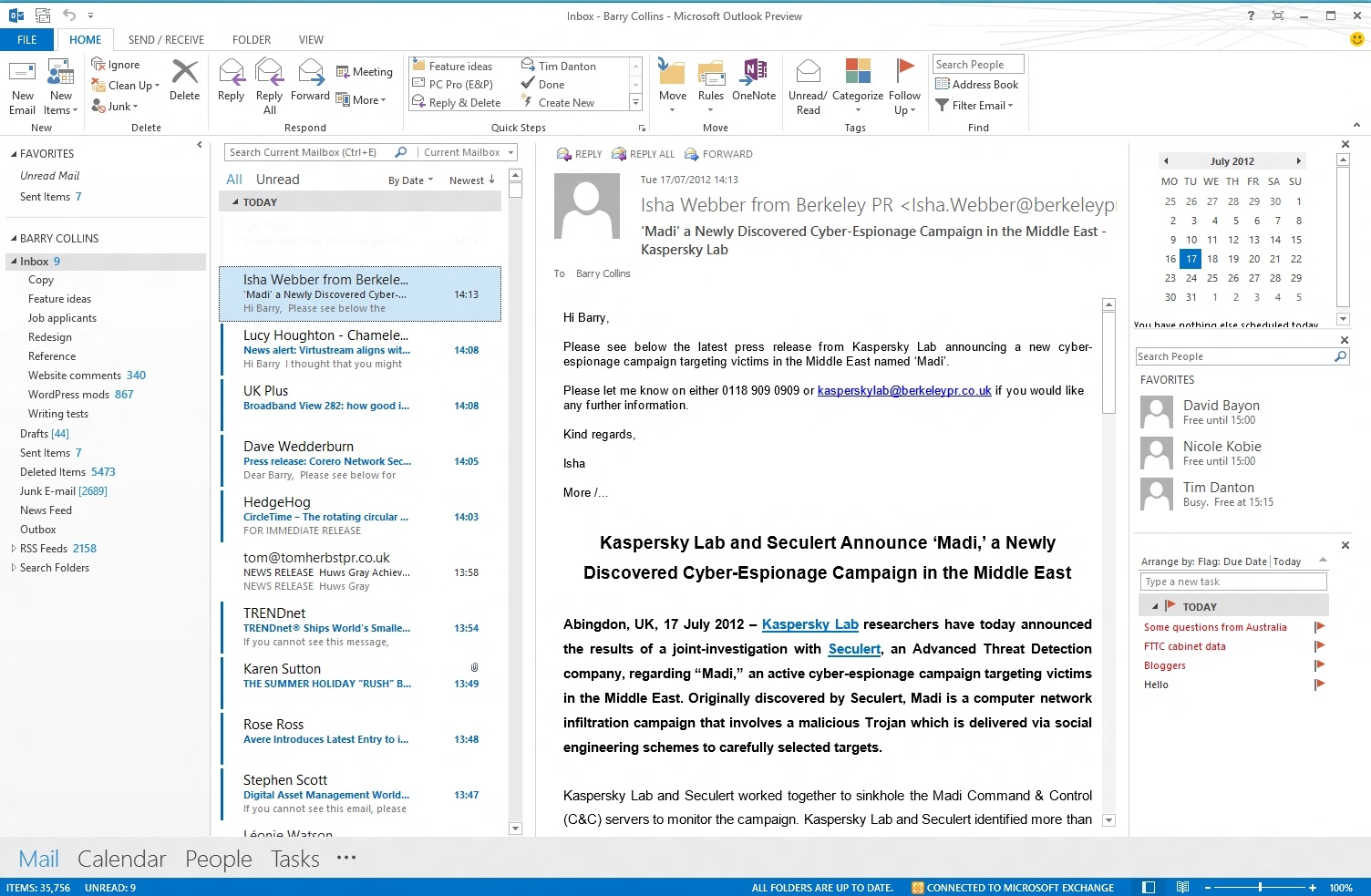
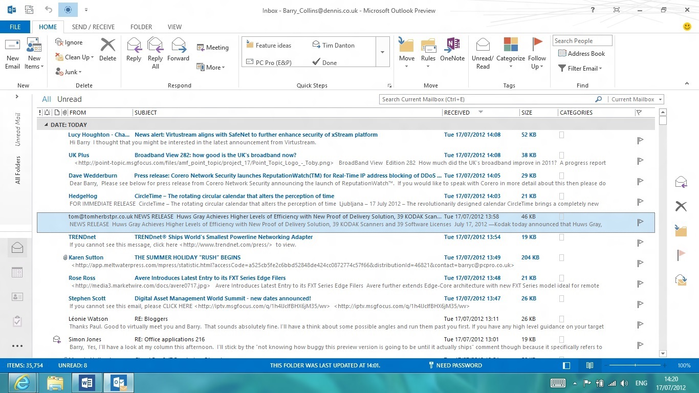
Visually, the email view looks similar to the Mail app for Windows 8 Metro. Unread emails are highlighted with a blue bar, with the currently selected message highlighted in a dull grey. As with the rest of the Office 2013 apps, the ribbon interface can be tucked away if not needed, and if you're only reading, replying to or forwarding messages, it's certainly superfluous.
If you've got the Reading Pane open, you can take advantage of the new Inline Replies feature, which allows you to reply to a message from within the Reading Pane itself, with your reply entered at the top of the incoming message.
Outlook 2013 takes advantage of Windows 8's new notifications system, alerting users to new messages in their inbox with a pop-up in the top right corner of the screen. We prefer the more discreet System Tray alerts of Office 2010, but it's something which may grow on us.
Other mail features include Site Mailboxes, an Exchange-based feature that allows you to create a shared mail folder, calendar and task list for everyone in a particular team, which could prove handy for businesses that have employees clustered on particular projects.
Calendar
Attempting to access your Calendar exposes another Metro-inspired element of the new Outlook the new navigation menu. Switching between Mail, Calendar, People (previously Contacts) and Tasks is now performed by left-clicking on the relevant option at the foot of the page. When in Mail, you can also hover over the Calendar option to see a pop-up containing details of your forthcoming appointments, although you can still have a pervasive mini Calendar running down the right hand side of the screen, if you prefer.
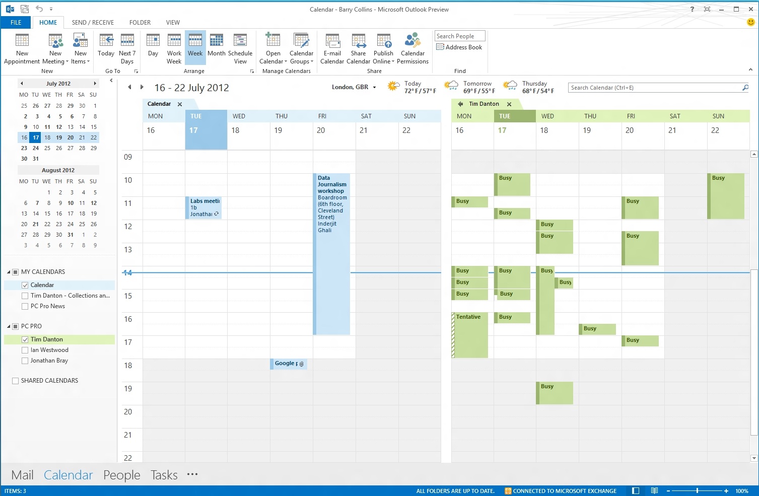
Very little else has changed with the Calendar. A new bar marks the time of day across your Calendar presumably for those who finds clocks and watches a little high maintenance. A mini weather forecast is also embedded in the Calendar view. Apparently it's going to rain for the next few days
People
Metro rears its head once more, with People now replacing Contacts in the Outlook menu. As with the Windows 8 app, contacts are amalgamated from social services such as LinkedIn, as well as your various address books. This is also meant to automatically pull in photos of your email correspondents from the social networks.
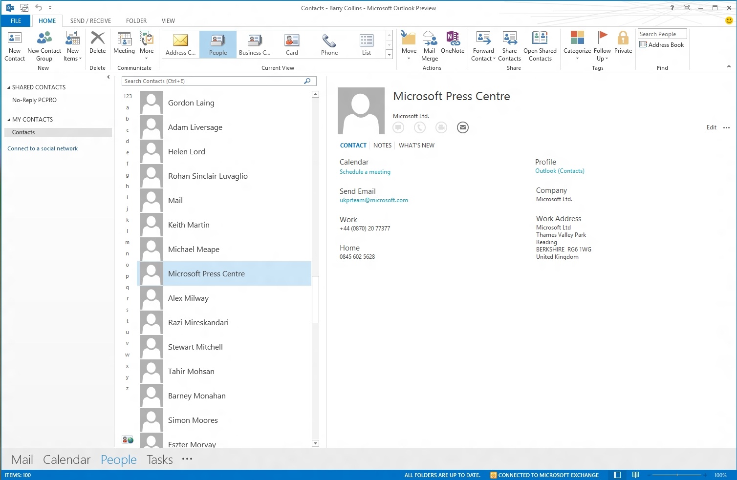
Favourite People can also be added to the To-Do Bar running down the right-hand side of the Outlook window, allowing you to see at a glance if/when your team members are free for a meeting.
Touch
Outlook 2013 includes a Touch mode that theoretically makes it easier to navigate on a tablet. The buttons and commands on the ribbon are still far too small for our liking, and we're really not sure we'd want to use Outlook on a tablet without a stylus or keyboard/trackpad to hand.
There are some hidden touch gestures that work quite well, though. Pinch to zoom on the Calendar view, for example, neatly switches between day, week and month views.
Get the ITPro daily newsletter
Sign up today and you will receive a free copy of our Future Focus 2025 report - the leading guidance on AI, cybersecurity and other IT challenges as per 700+ senior executives
Barry Collins is an experienced IT journalist who specialises in Windows, Mac, broadband and more. He's a former editor of PC Pro magazine, and has contributed to many national newspapers, magazines and websites in a career that has spanned over 20 years. You may have seen Barry as a tech pundit on television and radio, including BBC Newsnight, the Chris Evans Show and ITN News at Ten.
-
 Cleo attack victim list grows as Hertz confirms customer data stolen – and security experts say it won't be the last
News Hertz has confirmed it suffered a data breach as a result of the Cleo zero-day vulnerability in late 2024, with the car rental giant warning that customer data was stolen.
By Ross Kelly Published
-
 Women show more team spirit when it comes to cybersecurity, yet they're still missing out on opportunities
News While they're more likely to believe that responsibility should be shared, women are less likely to get the necessary training
By Emma Woollacott Published
-
 OpenAI wants developers using its new GPT-4.1 models – but how do they compare to Claude and Gemini on coding tasks?
News OpenAI says its GPT-4.1 model family offers sizable improvements for coding, but tests show competitors still outperform it in key areas.
By Ross Kelly Published