Microsoft Office 2013 review
Word, Excel, Outlook and PowerPoint get the touchscreen treatment, cloud storage and a bunch of new features.
It's still the most comprehensive suite available - but do you need it? The most convincing argument we can think of for upgrading to Office 2013 will be for those that want to use Microsoft Office on a tablet. Office 2013's gesture supporting user interface is a definitely a big selling point, perhaps even pushing tablets into credible productivity devices rather than glamorous clip boards.
-
+
Clean interface; Multitude of templates; Inline replies for Outlook; Cloud syncing
-
-
Touch experience is mixed; Office 2010 is still adequate for majority of users

PowerPoint 2013
PowerPoint's 2013 has been given the Metro treatment too. Gone are the title bar and borderless windows. The Ribbon is still there but larger, making touch control possible.
And, as you'd expect, support for touch navigation has been introduced, with swipe and pinch gestures allowing users to manipulate slides in an immediate and intuitive manner, while creating or delivering presentations.
It isn't all about touch and the look and feel, though; PowerPoint 2013 has a number of significant improvements and new features, too. The most significant of these is the new Presenter View, and it's set to dramatically alter the way presentations are delivered.
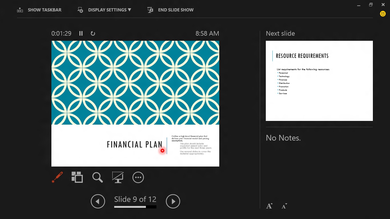
The idea behind this is to give the presenter more control over the slideshow when delivering a presentation. Hook your laptop or tablet up to a second screen, activate the new view and, while all the viewer sees is the slide, the presenter gets a dashboard displaying not only the current slide, but also a thumbnail of the next slide in the stack, notes on the current slide and a number of extra controls.
The current slide can still be manipulated as usual from this view swiped aside, zoomed and annotated but the controls add an extra dimension. A laser pointer mode lets you highlight areas for attention, either with the mouse or by prodding the screen. Pen and highlighter tools offer similar ways of bringing your audience's attention to specific areas of the slide on screen. A click or tap brings an overview up the whole slide stack, and there's a timer so you can keep an eye on whether you're over-running.
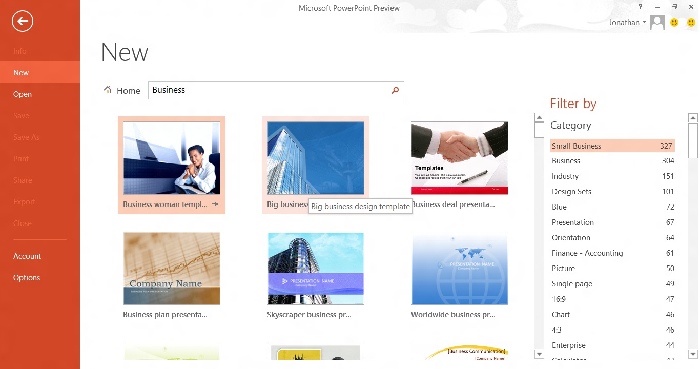
As with Word and Excel, the first time you fire up the new PowerPoint you'll be faced with a splash screen displaying a series of templates. These are stored online and downloaded on-demand, and can be searched by keyword or browsed by category. That's a helpful feature, but the big change here is that the many more templates are available as 16:9 aspect ratio slides, which makes them better suited to today's modern laptop screens.
Creation tools
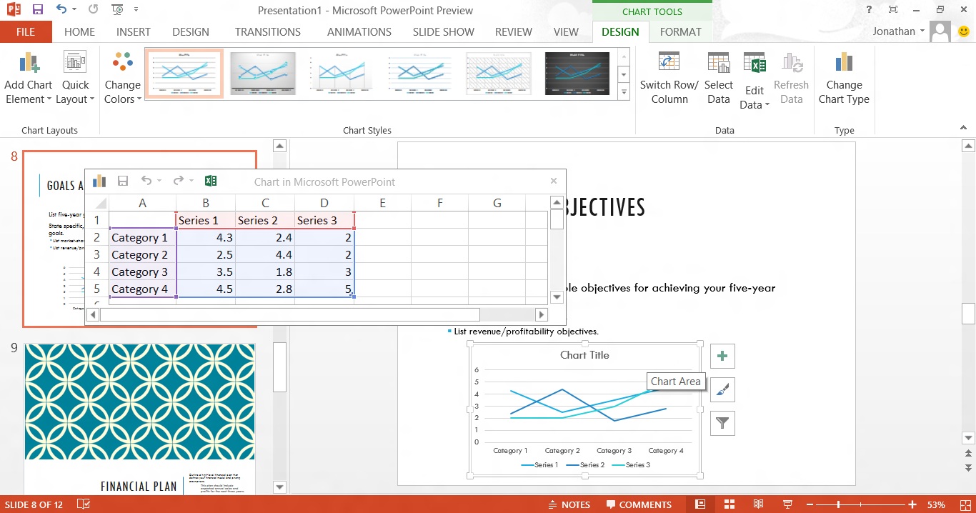
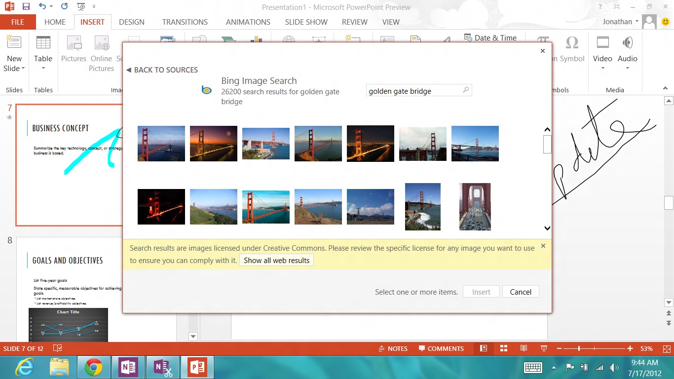
The shape creation tools have been extended and simplified, and photographic content can now be drawn in directly from online sources, including Bing image search, Office.com Clip Art, Flickr, Facebook and SkyDrive. The Bing search is particularly impressive in that by default it prioritises images licensed under Creative Commons, making it a doddle to legally embellish what might otherwise be flat, lifeless slides.
Collaboration
Finally, collaborative tools have been improved in PowerPoint, with enhanced comments that appear alongside slides as they do in Word, complete with the ability for others to reply to those comments.
Aside from the user interface change, which Microsoft has brought to all the Office apps, then, it isn't a huge upgrade. But the changes that have been made appear to have been well thought out and all add to PowerPoint's usability and efficiency. We particularly like the Presenter View mode.
Microsoft's goal with PowerPoint 2013 appears to have been to make life easier for presenters and give them the opportunity to look good in front of colleagues and clients.
Get the ITPro daily newsletter
Sign up today and you will receive a free copy of our Future Focus 2025 report - the leading guidance on AI, cybersecurity and other IT challenges as per 700+ senior executives
Barry Collins is an experienced IT journalist who specialises in Windows, Mac, broadband and more. He's a former editor of PC Pro magazine, and has contributed to many national newspapers, magazines and websites in a career that has spanned over 20 years. You may have seen Barry as a tech pundit on television and radio, including BBC Newsnight, the Chris Evans Show and ITN News at Ten.
-
 Cleo attack victim list grows as Hertz confirms customer data stolen – and security experts say it won't be the last
News Hertz has confirmed it suffered a data breach as a result of the Cleo zero-day vulnerability in late 2024, with the car rental giant warning that customer data was stolen.
By Ross Kelly Published
-
 Women show more team spirit when it comes to cybersecurity, yet they're still missing out on opportunities
News While they're more likely to believe that responsibility should be shared, women are less likely to get the necessary training
By Emma Woollacott Published
-
 OpenAI wants developers using its new GPT-4.1 models – but how do they compare to Claude and Gemini on coding tasks?
News OpenAI says its GPT-4.1 model family offers sizable improvements for coding, but tests show competitors still outperform it in key areas.
By Ross Kelly Published