Windows 8 vs Mac OS X Mountain Lion head-to-head review
A comprehensive look at the UI, software, security and business features to see which OS is top dog.

The battle between Windows and OS X is one of the fiercest in technology, with advocates from both sides insisting their OS is superior.
Both have their advantages, and we aim to help you find out which is best suited to your needs. We've used Windows 8 and Mac OS X Mountain Lion as the basis for our comparison. With upgrades including Windows 8.1 and OS X Mavericks due to land later this year, we've also included features you can expect in the forthcoming releases.
User Interface
Most PC users have grown up with the classic Windows desktop UI, including the Start menu, taskbar and windows. That's all changed with Windows 8: the desktop is hidden behind the touch-focussed Start screen, and the Start button was scrapped in the initial release.
Windows 8 is one of the biggest changes in the history of the OS, and a clear indication of Microsoft's intentions to try and modernise the UI. The focus is on the large finger-friendly Live Tiles and finger-friendly menus.
Microsoft is addressing scathing feedback with the Windows 8.1 update.
The desktop remains largely unchanged, to the relief of power users. Microsoft's changes mean the new OS works well with touchscreen devices but, for business users without touch functionality, it's awkward: the Start screen is tricky to use with a mouse and keyboard, the Start screen's full-screen apps aren't conducive to multi-monitor working, and we're no fans of switching between the Start screen and the desktop.
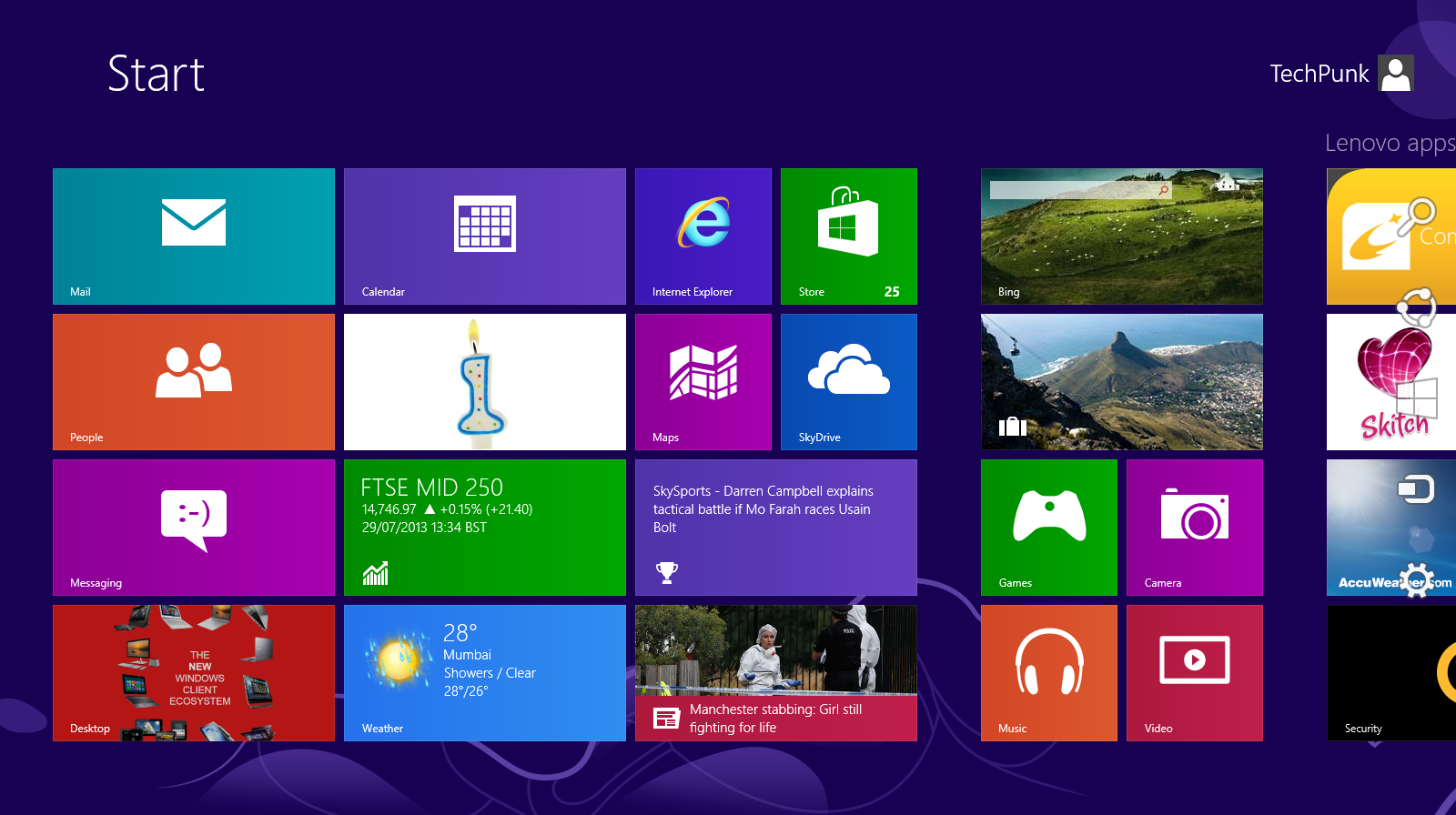
Thankfully, Microsoft has listened to some of the scathing feedback and changes will be released in the autumn via a Windows 8.1 update.
Get the ITPro daily newsletter
Sign up today and you will receive a free copy of our Future Focus 2025 report - the leading guidance on AI, cybersecurity and other IT challenges as per 700+ senior executives
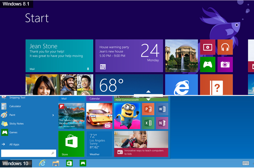
The free update will allow Windows 8 to boot directly to the desktop, which bypasses the Start screen entirely. A Start button has been added, although it's still impotent compared to the original. A left-click allows users to jumps back between the Start screen and desktop. A more useful right-click brings up a set of shortcuts to access features such as the Control Panel or Task Manager. However, the list of programs appears gone for good.
The Start screen itself hasn't been left alone, with more versatile split-screen options to aid multitasking, more Live Tile sizes and better search.
The end result should be an OS that's a more comfortable mix between traditional Windows and the touch-focussed future, even if it's more of a compromise than Microsoft would like. That means Windows 8.1 will be much easier to use for office workers who use keyboard and mouse, prefer multiple monitors and like to work with several applications at once.
Apple doesn't make sweeping changes to OS X, instead introducing incremental upgrades every year. The latest version retains the familiar taskbar full of icons at the bottom of the screen, and the OS remains based on a traditional desktop full of windows. The Finder app is used to navigate documents, applications and the file system, and a bar at the top of the screen houses notifications, networking information and menus unique to each application. Ironically, some Windows users may feel more at home with OS X than Windows 8, at least initially.
The current version, Mountain Lion, introduced the Notification Center, Messages app and automatic application updates. MobileMe was replaced by iCloud, which handles storage and synchronisation of email, contacts, photos across OS X and the iOS platforms.
Mavericks is the next version of OS X and it will be the first to be named after Californian places rather than big cats. Multiple display will support be upgraded, the Mission Control app supports multiple workspaces, and Finder now works with tabs. Mavericks will also add iBooks and iMaps apps to the desktop, and brings several other tweaks including interactive notifications and an encrypted iCloud Keychain. The latter aims to encrypt passwords, save them and then automatically populate them.
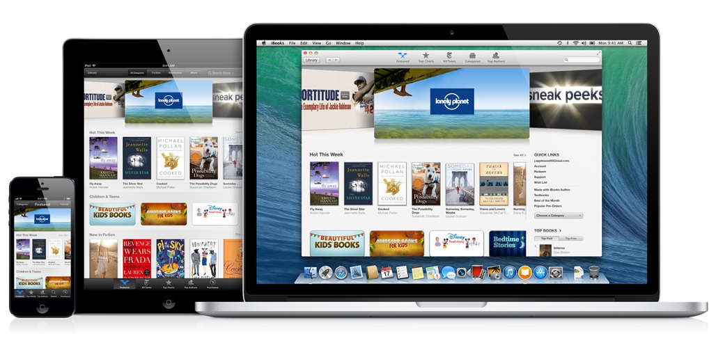
It's no coincidence that many of OS X's latest features have been borrowed from iOS, but OS X's UI is firmly rooted to keyboards and mice. Concessions to touch have been made, but they've sensibly been left on trackpads: slick gestures can be used to scroll, zoom and open the Mission Control app.
If Microsoft wasn't introducing the upgrades with Windows 8.1 then Apple would be taking home the prize in this category. But Microsoft's changes including boot-to-desktop, more Start screen versatility and the return of a Start button give Redmond the edge. Just.
WINNER: Microsoft
Mike Jennings has worked as a technology journalist for more than a decade and has been fascinated by computers since childhood, when he spent far too long building terrible websites. He loves desktop PCs, components, laptops and anything to do with the latest hardware.
Mike worked as a staff writer at PC Pro magazine in London for seven years, and during that time wrote for a variety of other tech titles, including Custom PC, Micro Mart and Computer Shopper. Since 2013, he’s been a freelance tech writer, and writes regularly for titles like Wired, TechRadar, Stuff, TechSpot, IT Pro, TrustedReviews and TechAdvisor. He still loves tech and covers everything from the latest business hardware and software to high-end gaming gear, and you’ll find him on plenty of sites writing reviews, features and guides on a vast range of topics.
You can email Mike at mike@mike-jennings.net, or find him on Twitter at @mikejjennings
-
 Cleo attack victim list grows as Hertz confirms customer data stolen
News Hertz has confirmed it suffered a data breach as a result of the Cleo zero-day vulnerability in late 2024, with the car rental giant warning that customer data was stolen.
By Ross Kelly
-
 Lateral moves in tech: Why leaders should support employee mobility
In-depth Encouraging staff to switch roles can have long-term benefits for skills in the tech sector
By Keri Allan
-
 Windows 10 vs Windows 8.1: Which was the best operating system?
Vs We rate Windows 10 vs Windows 8.1 in a number of key categories for professional use
By Barry Collins
-
 Windows 10 vs Windows 8.1 vs Windows 7 - Microsoft OS head-to-head
Vs We pit Microsoft's most popular operating systems against each other to see which is the greatest of all time
By Mike Passingham
-
 macOS Sierra UK release date, price, features: Night Shift mode returns with macOS Sierra 10.12.4 beta 8
Rumours The tech will reduce blue light from your screen at night time
By Jane McCallion
-
 Dell Latitude 12 Rugged Tablet review
Reviews Dell's military-grade tablet wasn't rugged enough to survive IT Pro's Adam Shepherd
By Adam Shepherd
-
 OS X 10.11 El Capitan release date and features: Is it worth upgrading?
News OS X 10.11.6 update released for developer and public beta testing
By Maggie Holland
-
 Apple MacBook Retina 12in review - 'a superb choice, but challenging to fit into how you work'
Reviews Apple upgrades specs and adds rose gold model for 2016 MacBook Retina 12in
By Alan Lu
-
 Critical vulnerability discovered in OS X
News Built-in security measures no match for Zero Day flaw, claims security firm
By Jane McCallion
-
 Apple 13-inch MacBook Pro With Retina Display (Early-2015) review
Reviews A Broadwell upgrade provides impressive battery life for Apple’s business laptop.
By Cliff Joseph