Windows 10 - What's in the latest preview?
Microsoft adds in core functionality but there's still work to be done

The internal Microsoft codename for this latest build of Windows 10 was "Awesome". With the HoloLens headset still locked inside Microsoft's labs and the Cortana voice assistant unable to understand British accents, this codename seems a little premature, but there are signs the operating system is beginning to come together.
A fresh Start
From the moment you fire up Build 9926, it's clear that Microsoft's engineers haven't been flicking paper aeroplanes around the office for the past couple of months: this a long stride forward from the last major build released in November. That's most evident in the Start menu, which has once again been revamped.
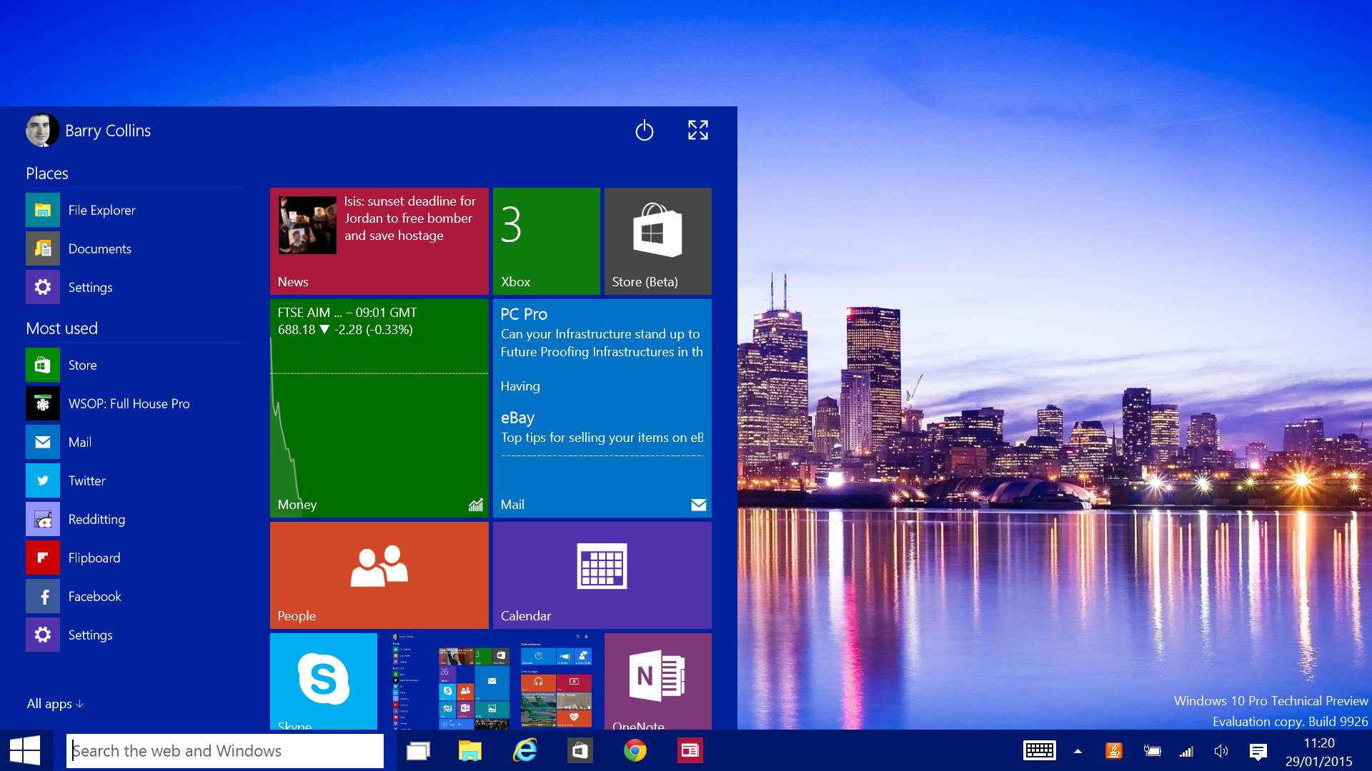
The overwhelming public appetite for the return of the Start button, coupled with Microsoft's desire to retain Windows 8's live app tiles, resulted in an awkward hybrid of the two in early builds of Windows 10. Now, after some refinement, the Start menu is beginning to take shape. The live tiles are still appended to the right of the Start menu, but they now scroll vertically, allowing you to add more tiles without the menu expanding to cover the entire screen, as it did in earlier builds.
A maximise button in the top-right corner allows you to make the Start menu full screen, if you prefer.
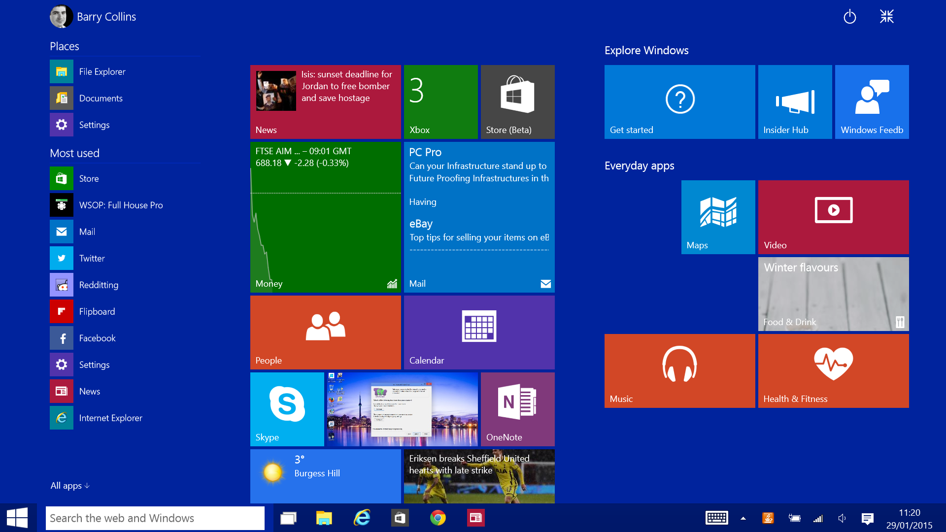
Build 9926 also sees the debut of Continuum Mode, where Windows 10 adapts the Start menu and behaviour of apps depending on which device you're using, or whether you're using a hybrid device as a tablet or a laptop.
Unplug the keyboard from a Surface tablet, for example, and Windows 10 prompts the user to enter Tablet Mode, where the Start menu goes full screen and all apps default to full screen mode, too. With a keyboard attached, Windows 10 lapses back to the condensed Start menu and apps open within resizeable windows, just like normal desktop apps of old. It makes using Windows Store apps on desktop PCs and laptops far more practical, whilst hybrid devices owners finally get the best of both worlds.
Get the ITPro daily newsletter
Sign up today and you will receive a free copy of our Future Focus 2025 report - the leading guidance on AI, cybersecurity and other IT challenges as per 700+ senior executives
Microsoft has also brought search out of hiding, now placing a search bar alongside the Start button on the taskbar. This is a unified search bar, used to scour for everything from apps, documents, photos and the web. Given that Microsoft has only afforded search results a small pop-up window, we found we often had to be very specific with our search terms to get the desired item to appear.
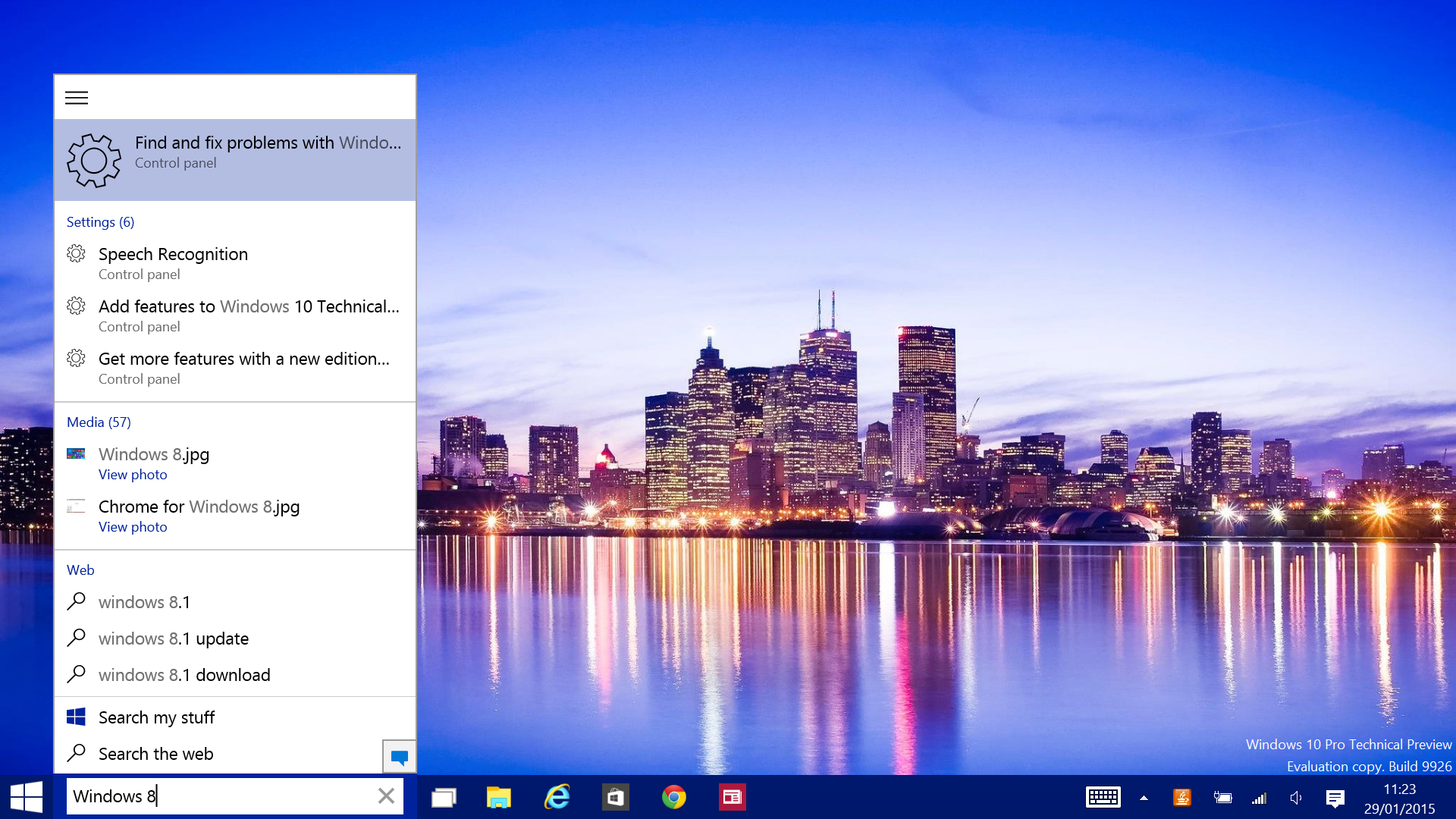
This search menu will also eventually house Microsoft's voice assistant, Cortana, although currently she's only available to those who choose US English as their default language. Her ability to transcribe our spoken commands was patchy when we switched our language settings to give it a go, but we'll reserve judgement until Microsoft officially supports our Home Counties drawl.
A side effect of the new search bar is that there's now less room on the taskbar for pinned applications. You can still squeeze around a dozen in there on Full HD screens, which should be fine for most people, but power users may resent the restriction. The good news is the search bar can be reduced to a small icon if it's too much of an imposition.
New notifications
Like the Start menu, notifications is something Microsoft has been endlessly fiddling with ever since the launch of Windows 8, but again it seems to have finally stumbled in the right direction. The new Notifications panel appears on the far right of the screen, and is opened by either clicking on the speech bubble icon next to the clock or by swiping in from the right-hand side on touchscreens.
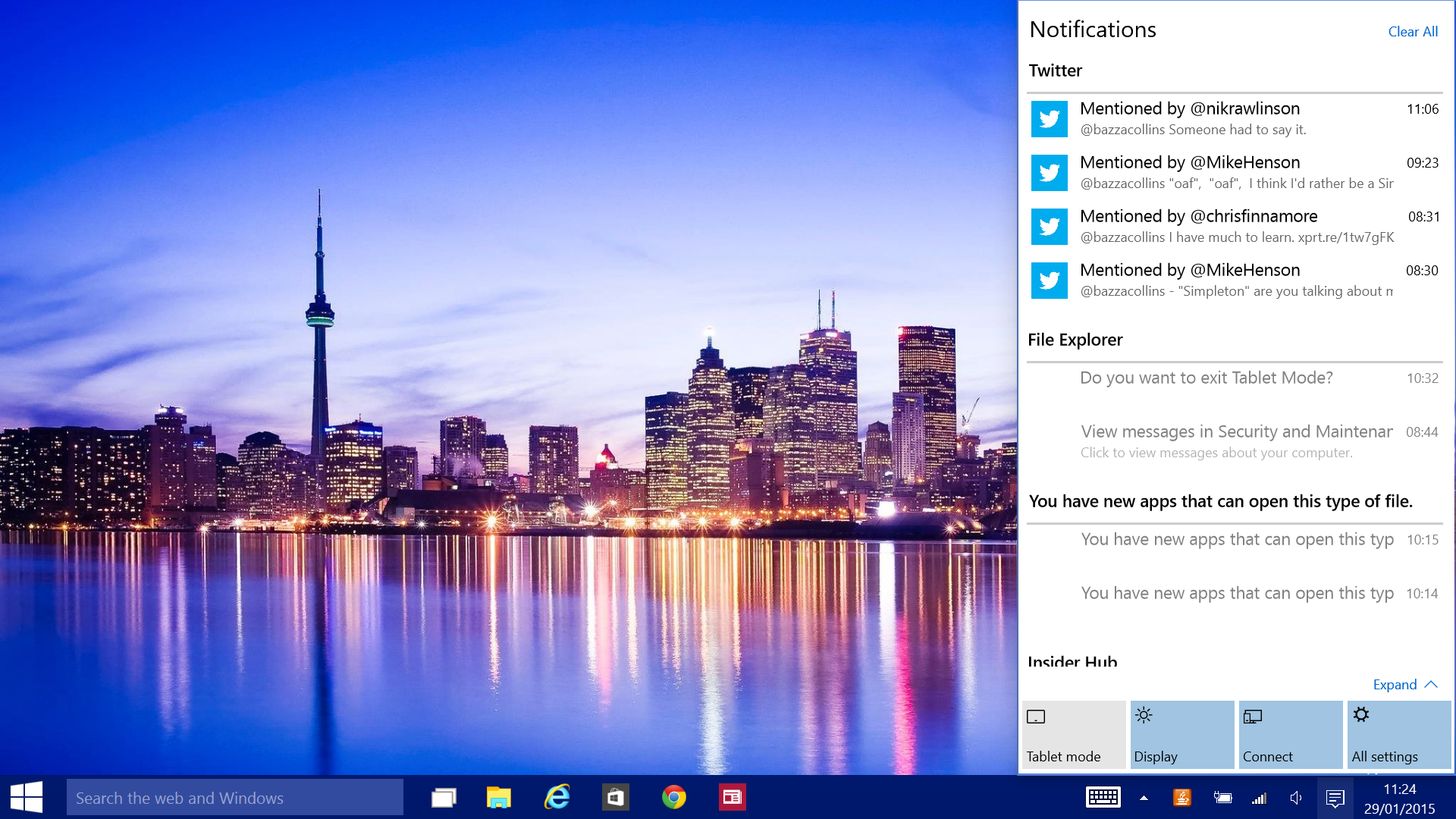
By default, you'll get Notifications for everything from Twitter alerts, to security reminders, to those excruciatingly annoying Java updates, making the Notifications panel a little too noisy for our liking. However, we like the design and you can dive into the Notifications settings and turn off alerts from disruptive Windows Store apps. Better still, the Notifications effectively replace the loathsome Charms, with buttons to alter the display, connection and other settings now housed at the bottom of the Notifications panel.
Explorer revamp
Windows Explorer has also been under the Microsoft designers' gaze. The Favourites section that appeared in the top right of the Windows 8 Explorer has been replaced with Quick Access, which automatically selects commonly used folders to make them more accessible although why this same list of folders is then duplicated as Frequent Folders in the main Explorer window is baffling. If Windows neglects one of your commonly used folders, you can choose to pin it to the Quick Access menu, making it easier to reach.
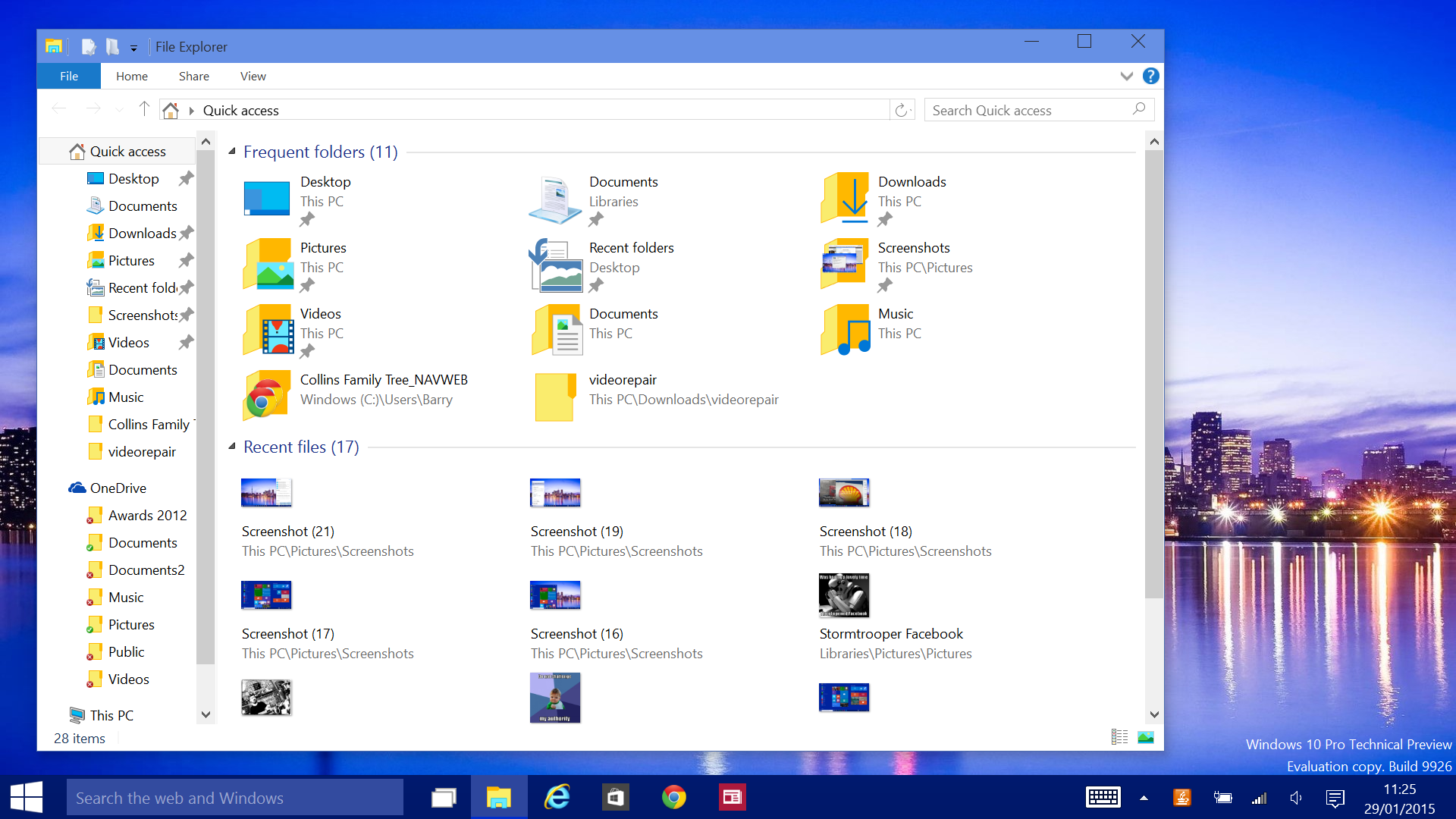
Explorer's also been given a visual overhaul, with brash new folder icons and other visual tweaks. Disappointingly, it's no less fiddly to navigate when using a touchscreen. Why do the folder icons and back/forward buttons not automatically boost in size when you enter Tablet Mode, for example? Microsoft's had four years to get its head around these problems, but still struggles to make important parts of Windows touch-friendly.
The Settings menu has been given a visual overhaul and has been fleshed out with a more comprehensive set of features. One that stands out in particular is Storage Sense, which allows you to fence off new apps and games to memory cards or external storage, to preserve disk space on devices that come with low capacity SSDs. It can also be used to change the default save location for documents, photos and music.
Yet, even with this expanded library of settings, the Control Panel remains in place, duplicating some settings and handling some unique settings of its own. We hope Microsoft migrates everything to the main Settings menu by launch time to avoid further confusion.
Verdict
With Build 9926, it feels like Microsoft is edging closer to a finished product. Yet, with Cortana, the new Spartan browser and some of the more interesting consumer features (such as the option to stream Xbox games to Windows 10 devices) still absent, there's plenty of work to do before Microsoft can even think about signing this code off. It may even be a push to meet the autumn launch deadline.
Even with all these prospective features to arrive, does it feel like Windows 10 will be a game changer for businesses? We think IT managers will be far more willing to upgrade PCs and laptops to Windows 10 than they were to Windows 8, so in that sense it's currently looking like job done'. Are companies or their staff suddenly going to swap iPads for Windows 10 tablets? That's much harder to conceive. Awesome, sad to say, it is not.
Barry Collins is an experienced IT journalist who specialises in Windows, Mac, broadband and more. He's a former editor of PC Pro magazine, and has contributed to many national newspapers, magazines and websites in a career that has spanned over 20 years. You may have seen Barry as a tech pundit on television and radio, including BBC Newsnight, the Chris Evans Show and ITN News at Ten.
-
 Cleo attack victim list grows as Hertz confirms customer data stolen
News Hertz has confirmed it suffered a data breach as a result of the Cleo zero-day vulnerability in late 2024, with the car rental giant warning that customer data was stolen.
By Ross Kelly
-
 Lateral moves in tech: Why leaders should support employee mobility
In-depth Encouraging staff to switch roles can have long-term benefits for skills in the tech sector
By Keri Allan
-
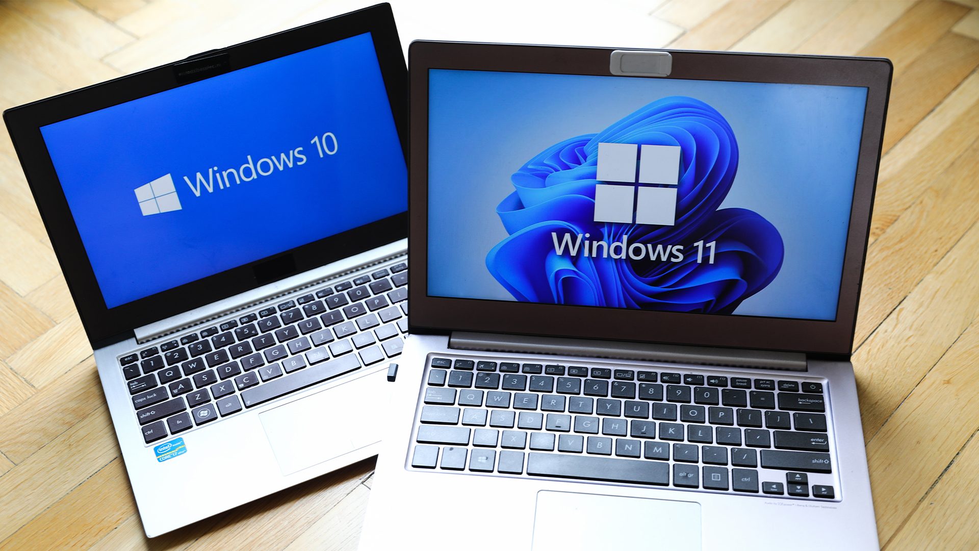 Dragging your feet on Windows 11 migration? Rising infostealer threats might change that
News With the clock ticking down to the Windows 10 end of life deadline in October, organizations are dragging their feet on Windows 11 migration – and leaving their devices vulnerable as a result.
By Emma Woollacott
-
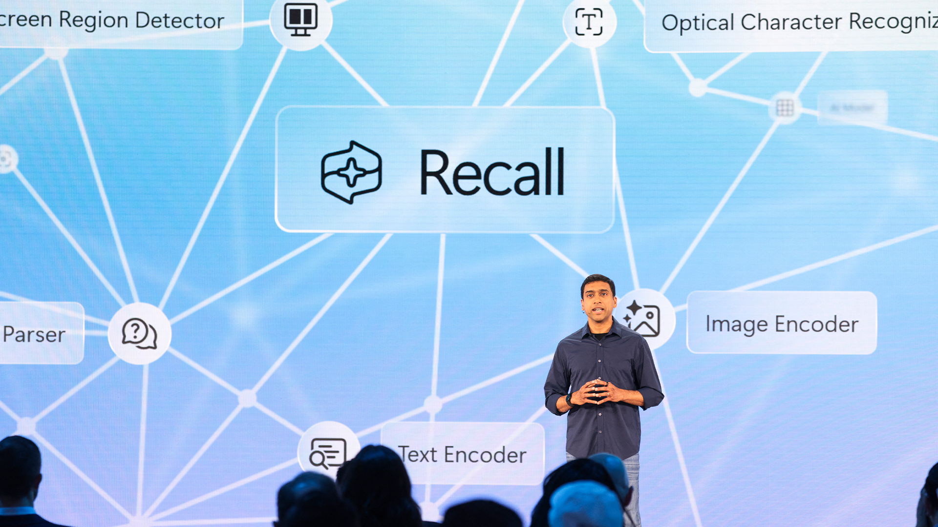 Recall arrives for Intel and AMD devices after months of controversy
News Microsoft's Recall feature is now available in preview for customers using AMD and Intel devices.
By Nicole Kobie
-
 With one year to go until Windows 10 end of life, here’s what businesses should do to prepare
News IT teams need to migrate soon or risk a plethora of security and sustainability issues
By George Fitzmaurice
-
 Microsoft is doubling down on Widows Recall, adding new security and privacy features – will this help woo hesitant enterprise users?
News The controversial AI-powered snapshotting tool can be uninstalled, Microsoft says
By Nicole Kobie
-
 Microsoft patches rollback flaw in Windows 10
News Patch Tuesday includes protection for a Windows 10 "downgrade" style attack after first being spotted in August
By Nicole Kobie
-
 Companies “wary” of Windows 11 migration challenges as Windows 10 EOL draws closer
News A recent study shows that only a fraction are running Windows 11, despite a rapidly-approaching end of life deadline
By George Fitzmaurice
-
 New Windows vulnerability could repeatedly trigger the blue screen of death on millions of devices
News Attackers could exploit the Windows vulnerability to repeatedly crash machines and trigger a blue screen of death, according to researchers at Fortra
By Solomon Klappholz
-
 Here’s how much Windows 10 could cost if you don’t upgrade this year
News Windows 10 extended security updates will cost users dearly, with prices rising incrementally each year.
By George Fitzmaurice