Microsoft Office 2016 for Mac review
A long overdue update, but it's still not quite at the same level as the Windows version.
There’s a lot to like about Office 2016 for Mac and certainly an improvement on the 2011 suite — even with the many omissions and shortcomings, both standalone and compared to the Windows suite. So Mac Office 365 subscribers have little reason to delay a download, and the interface parity of the Mac and Windows versions should make both 2016 suites appealing to business users, too.
-
+
Streamlined UI is easy to grasp; UI consistency with Office 2016 for Windows; Integrated (though limited) cloud storage support
-
-
Still missing features found in the Windows version; Collaborative features inconsistent across applications; Limited VBA support; OS X 10.10-support only
It's been five years since Microsoft last launched a new version of Office for OS X, which makes it long overdue an update not least since a tablet version of the productivity suite has debuted in the meantime. As it turns out, Microsoft is updating both Mac and Windows versions of Office at more or less the same time for the first time in, well, ever with Office 2016 for Mac and Office 2016 for Windows released within weeks of each other.
Interface changes
Mac users have arguably had an easier time with Office than their Windows brethren over recent years, though that's largely due to the lack of updates. Microsoft's Ribbon UI made its first appearance on OS X with Office 2011, but its implementation was very diluted. Windows users, on the other hand, have been subject to countless cosmetic tweaks that last resulted in a ruthlessly flattened and desaturated interface.
Thankfully, Office 2016 for Mac continues this trend and not a great deal has changed, interface-wise, beyond a general streamlining and polish. The UI is flatter and Retina-ready, and the layout much more logical than that of Office 2011 (Mac) and 2013 (Windows).
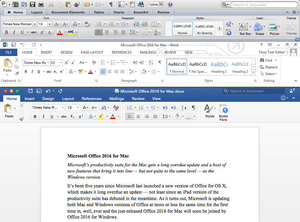
Word 2011 for Mac (top), Word 2013 for Windows (middle), Word 2016 for Mac (bottom)
It also adheres to operating system conventions more closely than Office 2013, with a menu bar and a largely standard File Save/Open dialog box, rather than the window-swamping Backstage' that Windows users are saddled with.
Just bear one thing in mind before you rush to upgrade. Office 2016 for Mac needs OS X 10.10 Yosemite and while Apple's latest operating system might be a free download, it only runs on Macs of a certain age.
Not-quite-complete cloud storage support
Office 2016 for Mac consists of Word, Excel, PowerPoint, OneNote and Outlook Access and Publisher are only available in the Windows version of the suite. As with Office 2013 for Windows, support for Microsoft's own cloud storage services (Office 365, OneDrive, OneDrive for Business and SharePoint) is built in just click the Online Locations' button in the Open/Save dialog box to switch between storage types.
Noticeably absent, however, is integrated Dropbox support, despite its inclusion in Office for iOS. Office documents stored in Dropbox can still be opened in Office Online via its web interface, but that's really a workaround rather than a solution.
Shared editing made simpler
Even so, one thing that Office 2016's cloud support greatly simplifies is collaboration, whether co-authoring documents or merely giving feedback.
Once a document is saved to the cloud, additional users (using Office 2013 or later) can then be invited to view or edit it. Multiple simultaneous edits can then be made in real time, but they don't appear on a local document immediately. Instead, they're only rolled out to everyone else when the editor document is saved, at which point they see a clickable notification to see them.
The problem is that remote edits aren't tagged by the user who made them they're merely highlighted. Highlights from one round of edits also disappear as soon as the next round rolls out, which makes it difficult to keep track of what's going on when three or more people are typing.
This makes Office 2016's collaborative editing confusing at times, so it's really only useful for certain situations, such as creating a document from scratch when a handful of people need to combine their ideas quickly (and without endless Cc'ed emails). Fortunately, it's also a problem that's largely solved simply by enabling Office's Tracking feature to show who's changed what and when.
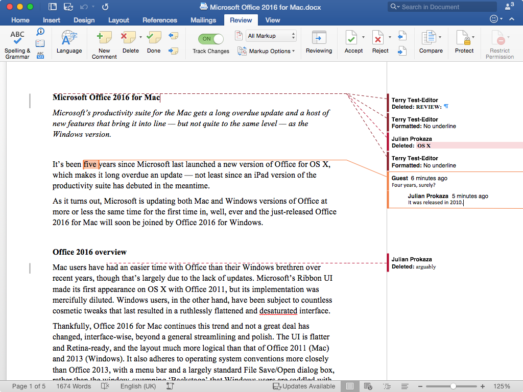
Cloud storage makes collaborative editing much simpler, but there are still plenty of kinks to work out.
Sharing edits with edit tracking
Edit tracking really comes into its own when there's only one centrally stored document being worked on, and it's vastly preferable to emailing multiple copies back and forth and trying to combine changes from several people. Better still, Office 2016 now supports the same nested comments as Office 2013 for Windows in Word and PowerPoint, and clear in-document conversations also take much of the pain from collaborative editing.
Unfortunately, all of the above only applies to Word documents. In PowerPoint, changes made by other users aren't highlighted, they merely appear, and there's no equivalent to Word's Tracking feature to help make sense of them. Excel is even worse. Share a sheet with another user and they see a "This file is locked for editing by [another user]" message when it's opened via the cloud, even when the sheet is appropriately configured via the usual Share Workbook option.
Admittedly, simultaneous shared editing via the cloud is perhaps most useful in Word, but there are many circumstances where other types of document would benefit from the feature. As it stands, Google Docs does a much better job of cloud collaboration and it's disappointing for Office 2016 to lag behind.
Outlook 2016
Email is still the main stalwart of 21st Century office communication, of course, and managing it is a task that still falls to Outlook in Office 2016. Users with an Exchange account should be up and running within moments, but while the necessary settings for an Outlook.com or IMAP account are automatically configured, two-step verification isn't natively supported not even for Microsoft's own Hotmail and Outlook.com services. So it's the rigmarole of creating per-app passwords all round if you're security minded.
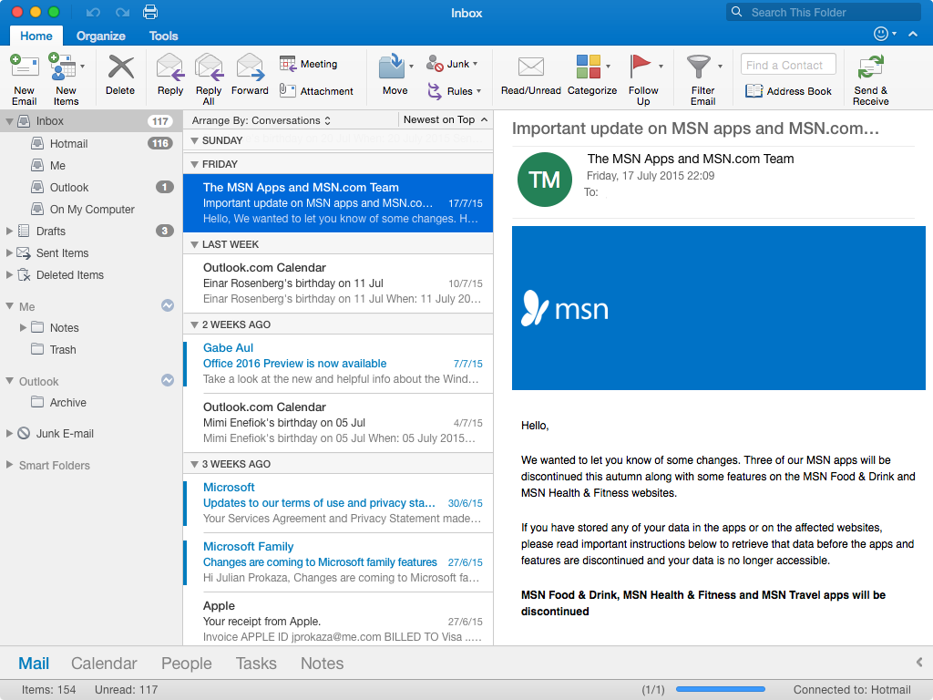
Outlook 2016 is little changed from before, but the inbox now has one-line message body previews.
Otherwise, not a lot has changed in Outlook 2016 compared to the previous version and upgraded users shouldn't miss a beat. One minor but nonetheless welcome change is a first-line preview of message bodies in the inbox, but there's no delayed delivery of messages and it's a shame Microsoft didn't introduce the Ignore' feature from Outlook 2013 for muting email threads you have no interest in. There isn't even the option to use the OS X Contacts list for the Outlook address book, although that probably isn't an issue for most Exchange users.
Word 2016
Many of the changes in Word are under the hood; the most surreptitious being support for common Windows keyboard shortcuts Ctrl + C to copy selected text, for example (these also work in Excel). The usual OS X shortcuts still work, but this clever move makes the Mac suite less finicky for someone switching platforms. Speaking of which, pinch-to-zoom now works in Word, Excel and PowerPoint, too, which helps smooth the transition between the Mac and iOS suites.
Another improvement of note is that the floating Toolbox palette is now a docked sidebar that's much easier to use, with Styles, Reference tools and other options appearing as required. Unfortunately, the Scrapbook and Citations manager didn't make the cut for this redesign, so you'll need another option if you relied on those two features.
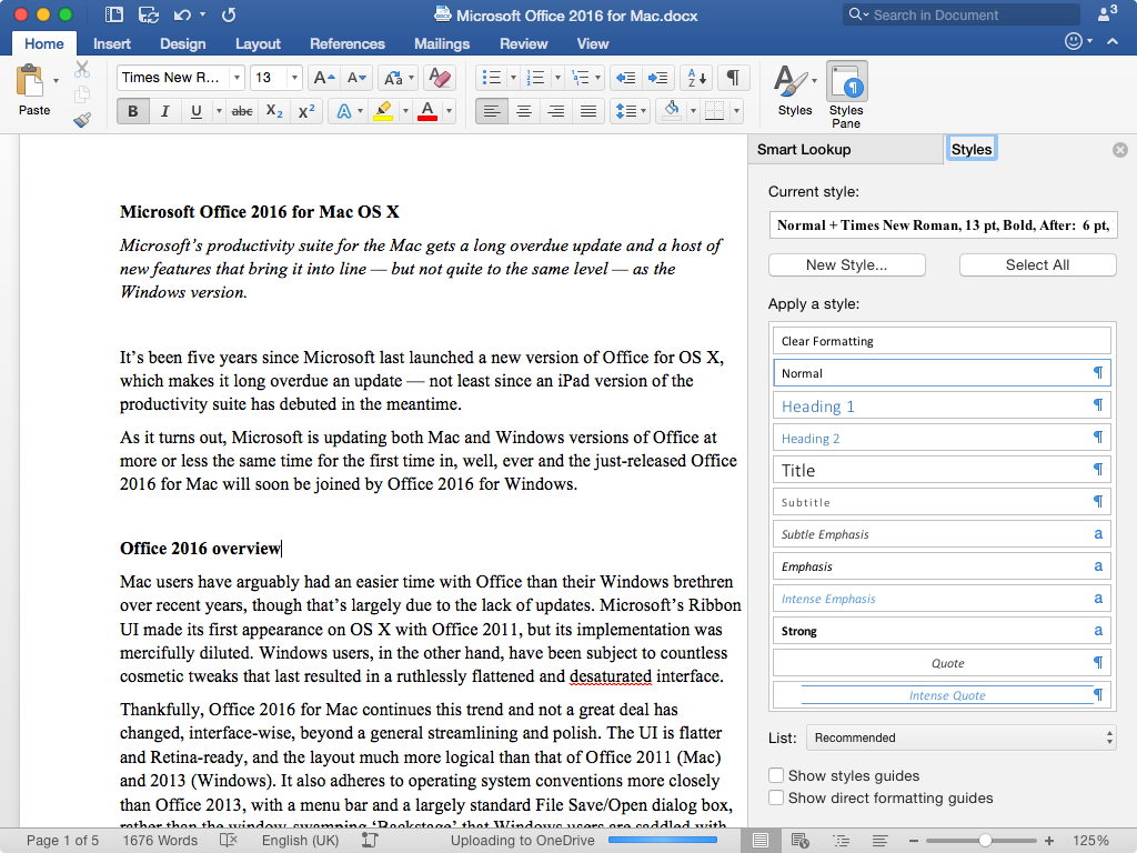
Office 2016's cleaner interface is a joy to use, with no irritating floating palettes in sight.
The DTP-lite Publishing Layout view has gone, too, and Word 2016 still doesn't support OS X's three-finger trackpad tap for an instant pop-up word definition. Word's Smart Lookup' option does at least present a list of readable results, though, rather than the awkward one-at-a-time of Office 2011.
Excel 2016
The impact of Excel's changes will depend on how you use the application. Power users will certainly appreciate the addition of PivotTable slicers for filtering data, Data Analysis ToolPak and Solver add-in support, and a slick integrated equation editor to replace the clunky separate utility of Office 2011. There's still no Mac support for Pivot Charts, however, and the Power Pivot add-in is reserved for Windows users.

Excel 2016 placates power users, too, with new pivot table and add-in support, plus a new built-in equation editor.
For everyone else, perhaps the most noticeable change is a new animation when selecting and working with cells. A couple of new hand-holding options should make Excel's more sophisticated features more accessible. In addition to a host of new types, the Recommended Charts button only presents charts that are appropriate for the selected data. You still need to know what you're doing, but the option might help avoid mocking from chart boffins in meetings.
The Formula tab has also been cleaned up and made much more accessible to neophytes, with the helpful Formula Builder now appearing by default in a sidebar as soon as a formula button is clicked.
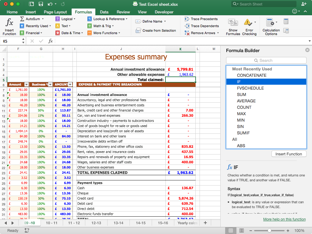
Excel 2016 has lots of new features to help novice users, including a formula builder sidebar that appears automatically.
PowerPoint 2016
PowerPoint perhaps gets the biggest benefit from the cleaned-up and rejigged interface, and the Ribbon now make much more sense to unseasoned users. The bulk of creative options now reside on the Design and Transitions tabs, for example, rather than the Themes, Tables, Charts and SmartArt tabs of old.
The new Animations sidebar is also a welcome addition for those that don't know PowerPoint inside out. It appears once an animation has been applied to an object on a slide, and aggregates the options previously found on the Animations tab (which is still present) and the easily overlooked Custom Animation floating Toolbox.
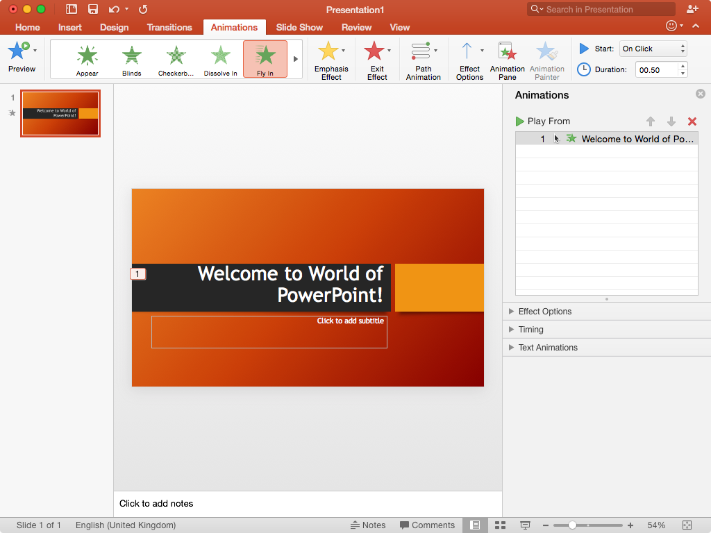
The streamlined interface makes PowerPoint much more user friendly, with slide animations in particular now much easier to deploy.
Presenter View has been spruced up, too, and the addition of a Switch displays' button alone might tempt some PowerPoint users to upgrade particularly those who've inadvertently displayed their web browser session to an auditorium full of people while scrabbling for the less-obvious option in PowerPoint 2011. Don't go looking for the Save as Movie' option, though it's gone.
Visual Basic for Applications
Finally and definitely only of interest to those aforementioned power users a few words on macros and Visual Basic for Applications (VBA). In short, there are changes and the good news is that the VBA Editor has been rewritten. The bad news is that even in Office 2016's release' state, the Editor remains largely unchanged from the early previews and is functionally inferior than that in Office 2011.
So for the time being, at least, the VBA Editor is intended solely for debugging existing macros for compatibility issues, of which there will be many as a result of the sandbox security measures imposed by OS X. Even so, the spartan interface, with no way to insert new modules or UserForms, will stymie many. So the prevailing advice for developers is to stick with Windows and debug on a Mac as required until the monthly update cycle (if you're bought the Office 365 subscription version as opposed to the standalone perpetual licence) hopefully addresses the situation.
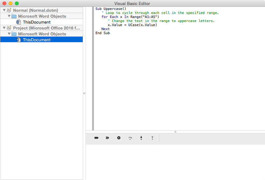
Visual Basic for Applications gets short shrift in Office 2016 and the revamped Editor is really only useful for debugging existing macros not creating new ones.
Verdict
There’s a lot to like about Office 2016 for Mac and certainly an improvement on the 2011 suite — even with the many omissions and shortcomings, both standalone and compared to the Windows suite. So Mac Office 365 subscribers have little reason to delay a download, and the interface parity of the Mac and Windows versions should make both 2016 suites appealing to business users, too.
Operating system: Mac OS X 10.10 Yosemite RAM: 4GB Hard drive space: 6GB Display: 1280 x 800
Get the ITPro daily newsletter
Sign up today and you will receive a free copy of our Future Focus 2025 report - the leading guidance on AI, cybersecurity and other IT challenges as per 700+ senior executives
-
 ‘Phishing kits are a force multiplier': Cheap cyber crime kits can be bought on the dark web for less than $25 – and experts warn it’s lowering the barrier of entry for amateur hackers
News Research from NordVPN shows phishing kits are now widely available on the dark web and via messaging apps like Telegram, and are often selling for less than $25.
By Emma Woollacott Published
-
 Redis unveils new tools for developers working on AI applications
News Redis has announced new tools aimed at making it easier for AI developers to build applications and optimize large language model (LLM) outputs.
By Ross Kelly Published
-
 Google layoffs continue with "hundreds" cut from Chrome, Android, and Pixel teams
News The tech giant's efficiency drive enters a third year with devices teams the latest target
By Bobby Hellard Published