Philips Brilliance 499P9H review: A truly mammoth monitor
Huge size and resolution, but it falters with some inconsistent design and a few poor benchmark results
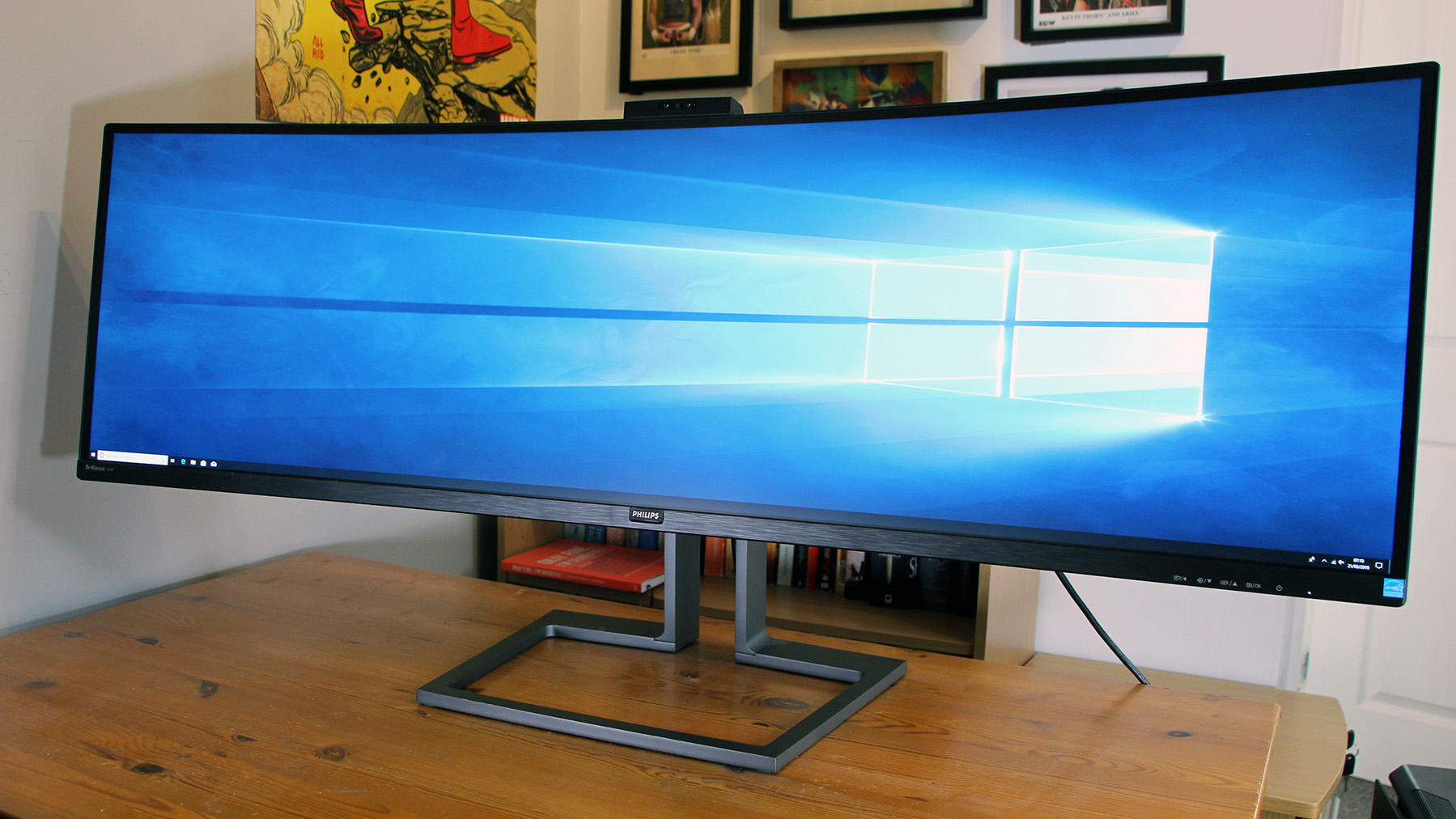
The Philips Brilliance 499P9H does have a lot going for it: the 32:9 widescreen and huge resolution do a good job of replacing multi-monitor setups in plenty of situations, there’s loads of connectivity, and its basic contrast, colour accuracy and sRGB gamut coverage levels are excellent. It can’t handle more demanding gamuts, though, and its uniformity levels are poor – so plenty of professionals will be better-served by more conventional screens.
-
+
Huge widescreen design; Vast resolution; Great basic benchmark results; Plenty of ports
-
-
Poor in some colour gamuts; Inconsistent uniformity; Some design issues; Very expensive

The Philips Brilliance 499P9H is one of the most outlandish monitors we've ever seen. It's an absolute unit, with a 49in diagonal, and its 32:9 aspect ratio makes it one of the widest panels available.
This unconventional, curved widescreen is designed for productivity, but its price of 942 exc VAT also makes it hugely expensive. Can it justify the price with its unique design, plentiful features and image quality?
Philips Brilliance 499P9H review: Features
The 49in diagonal and 32:9 aspect ratio means that the Philips has a barmy resolution of 5,120 x 1,440 - the equivalent of two 2,560 x 1,440 widescreens side-by-side. That means a density level of 109ppi - not as high as 32in 4K screens, but good enough for most work tasks.
Philips reckons that this screen's huge size and aspect ratio makes it an ideal replacement for multi-monitor setups. Using this screen does eliminate the annoying bezels and multiple cables inherent to multiple panels. However, it also means that it's not as easy to snap windows and applications around different screens - so it could be a double-edged sword depending on your workflow.
You do get loads of screen real estate, so it's extremely handy if you're working on tasks where extra width is beneficial - like using design tools, or huge spreadsheets and databases. The 1800R curve is good, too - it makes it easier to see the corners without the image becoming too distorted.
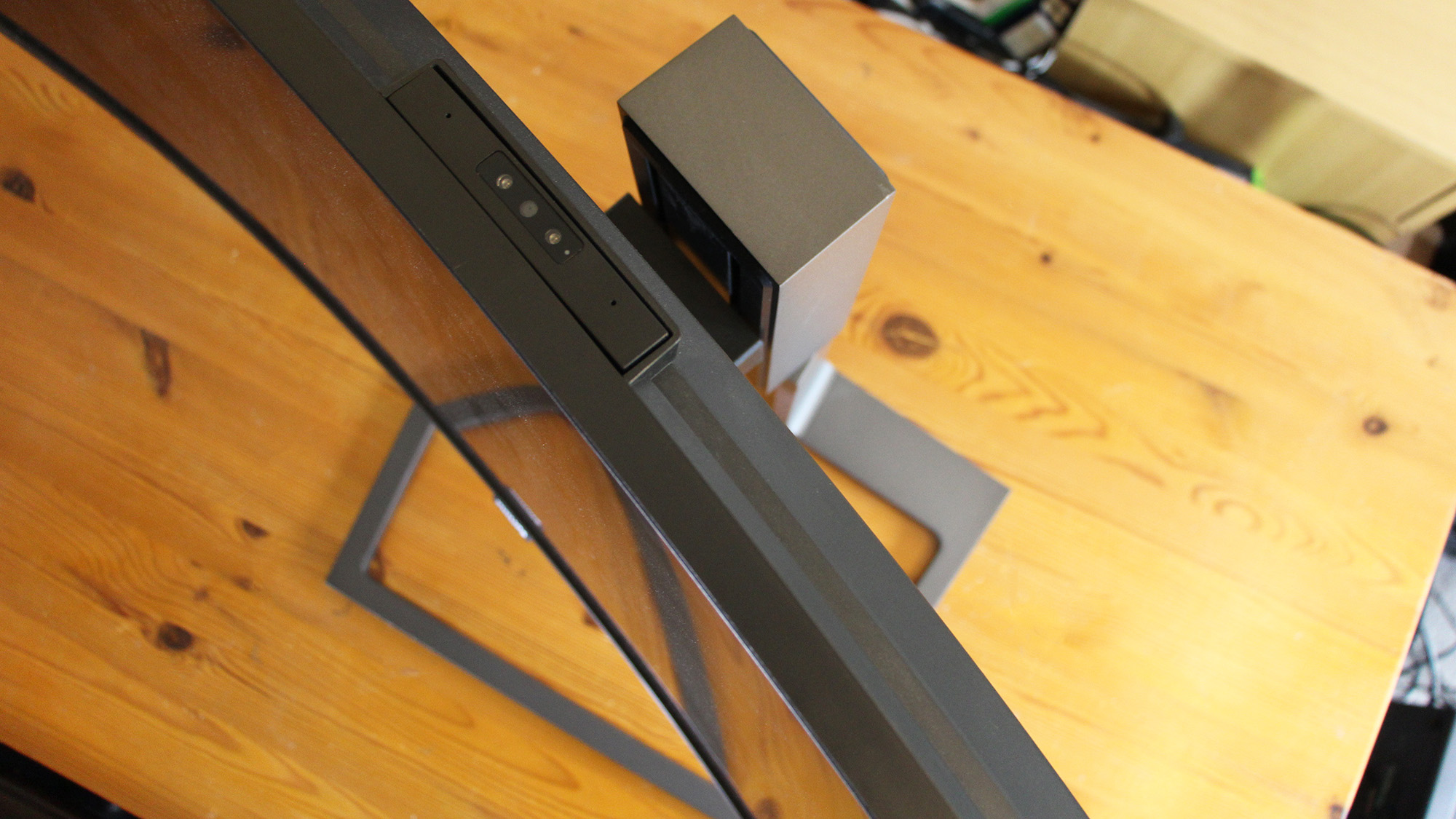
You can even connect two PCs or laptops in order to effectively run two devices using the same monitor, keyboard and mouse thanks to a clever integrated KVM switch.
Get beyond its imposing design, though, and the Philips is a little more ordinary.
Philips uses VA technology rather than IPS here, and the screen has 8-bit colour rather than 10-bit. That means it can display 16.7 million colours rather than 1.07 billion - which rules out its usefulness with the most demanding design work.
And, while refresh rate isn't as crucial for work as it is for gaming, this screen's Adaptive refresh rate only tops out at 70Hz. That's comparatively low, and applications that demand smooth motion will be better served elsewhere.
Also remember that this screen's resolution uses almost as many total pixels as 4K - so you'll need a beefy GPU if you're going to do any graphically-intensive work across this screen's whole resolution.
This screen supports HDR, but it only uses the VESA DisplayHDR 400 standard. That's one of VESA's weaker standards, and it requires a burst brightness level of 400cd/m2, a prolonged brightness level of 320cd/m2 and a black point of 0.1cd/m2.
Those are good figures for any normal screen, of course, but they're not particularly outlandish for any normal screen at this sort of price. The entry-level HDR standard also means that HDR content only gets a modest boost to punch and depth on this panel - rather than delivering a transformative experience.
There's a lot to like, but the Philips is far from perfect - so it's going to fall behind more conventional rivals. A 32in 4K screen like the Acer ProDesigner PE320QK is crisper and has 10-bit technology - and it doesn't cost any more than the Philips.
If you still want a widescreen, a panel like the Samsung CF791 has a 3,440 x 1,440 resolution, a higher refresh rate and a marginally better response time - 4ms compared to the Philips' 5ms.
Philips Brilliance 499P9H review: Design & Build Quality
The Brilliance is a little inconsistent when it comes to features beyond the screen itself, too.
While it does have three USB 3.1 ports, a Type-C connector and a Gigabit Ethernet socket, they're all installed at the back and face downwards - which makes them tricky to reach given the size of the screen.
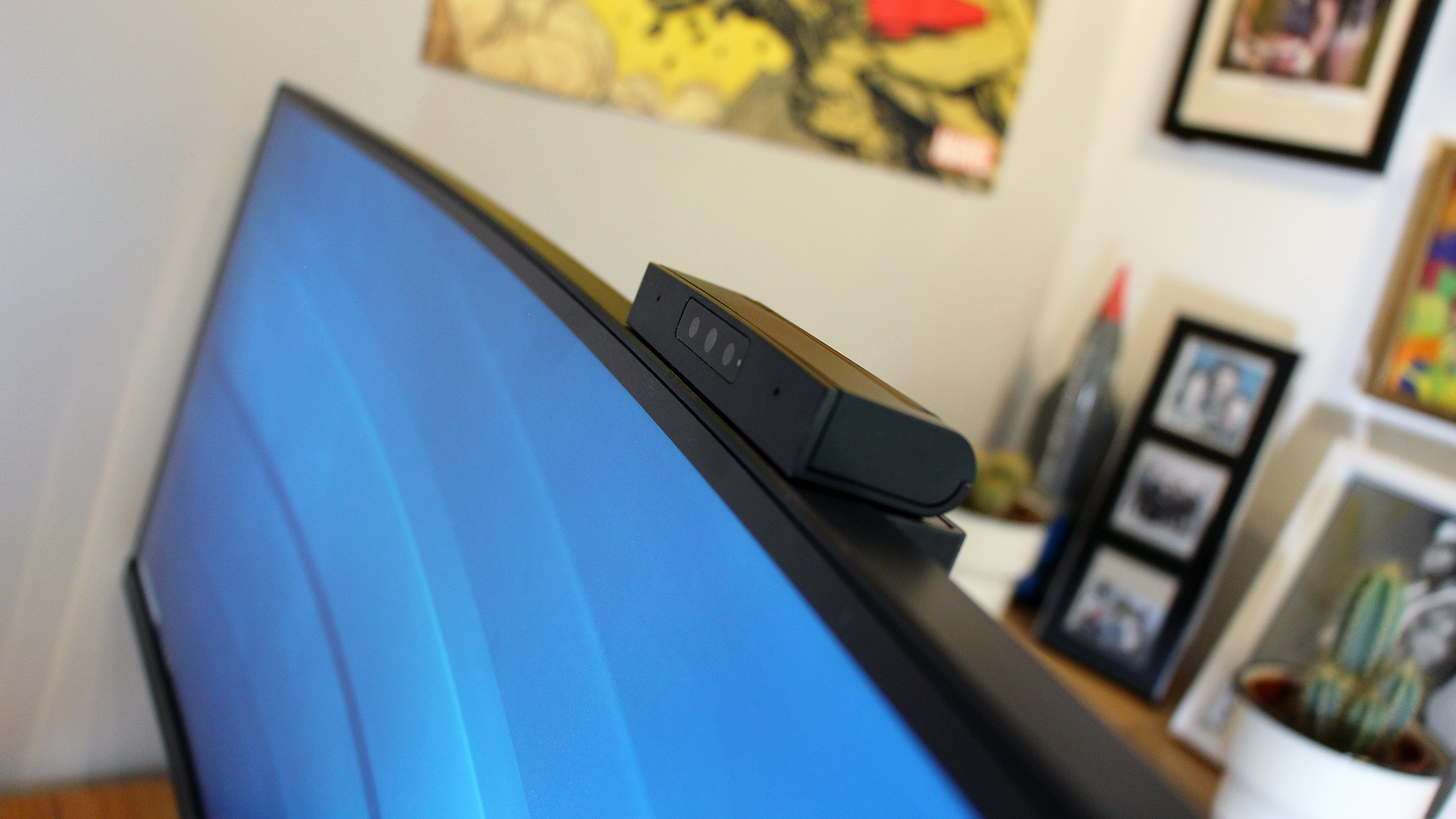
The two HDMI 2.0 ports and DisplayPort 1.4 connector are fine. So are the two 5W speakers: they provide enough quality and volume for casual media, even if the bass is a little too aggressive. There's a Full HD webcam that works with Windows Hello, and it can be hidden in the top bezel for privacy.
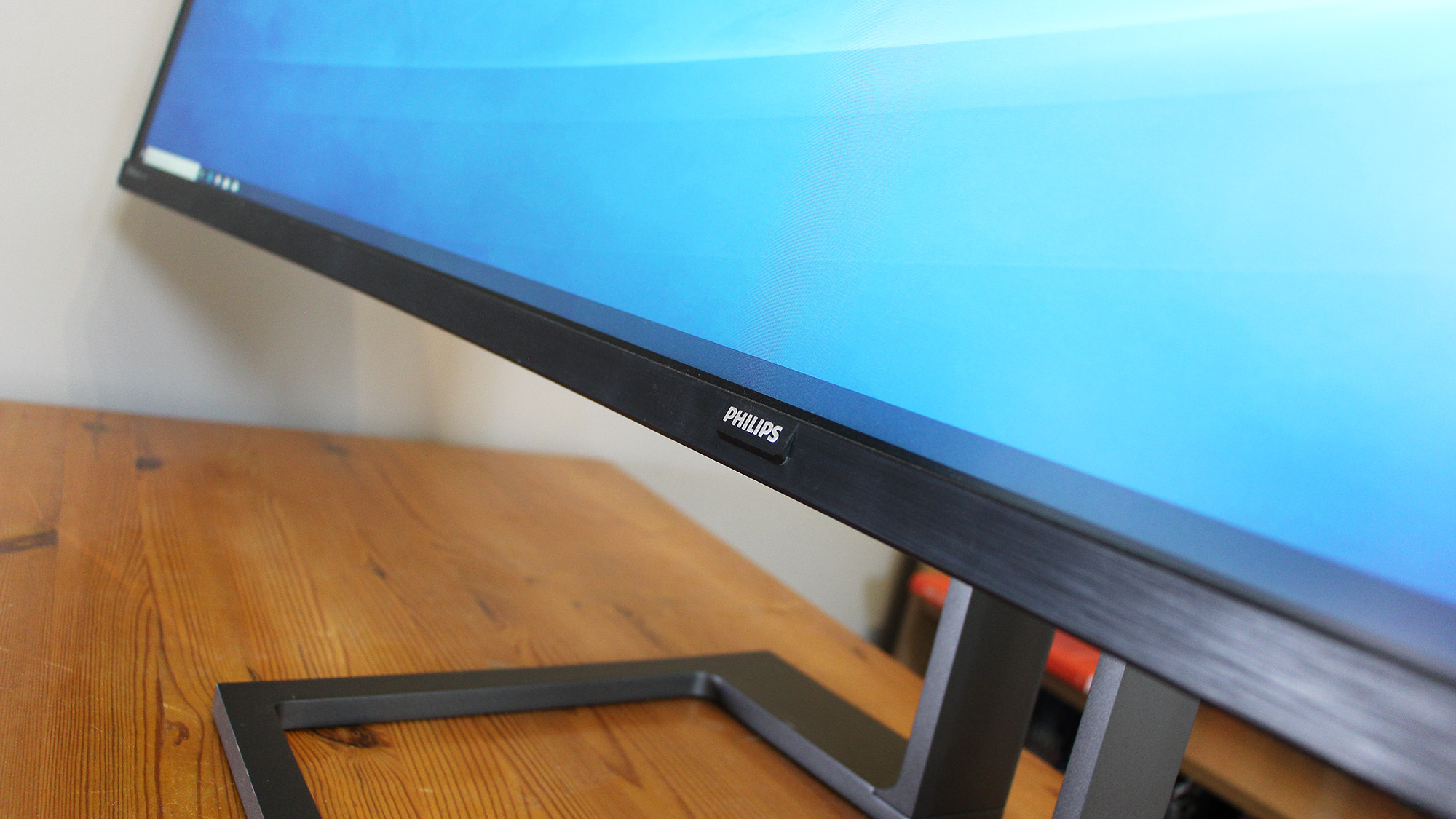
It looks solid, too: it's got slim bezels, subtle logos and a smart, minimal metal stand. You get good adjustment options. There's 130mm of height adjustment, alongside side-to-side swiveling and forwards-and-backwards tilting. The Philips also supports 100mm VESA mounts - if you can find hardware that'll support its 15.3kg weight.
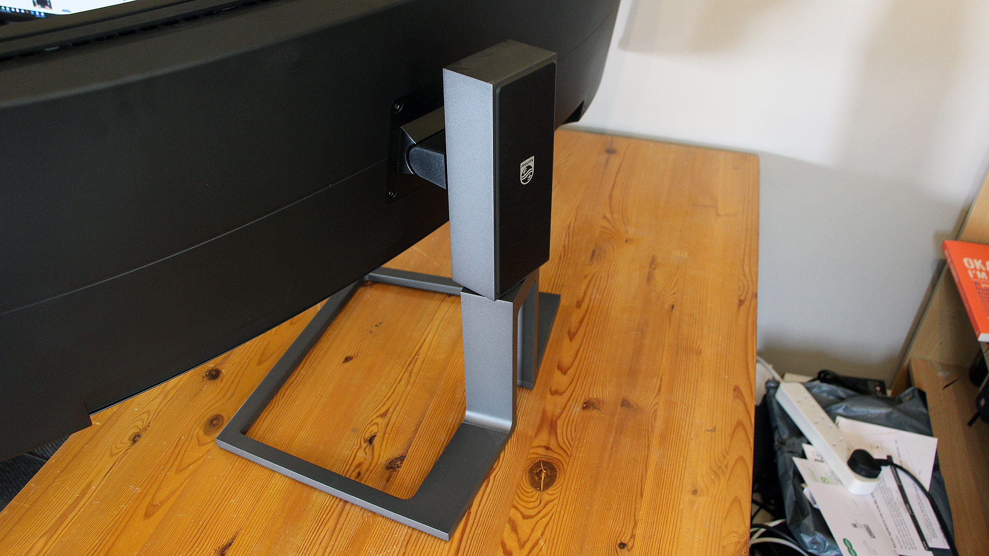
That weight makes this screen enormously heavy, and it's a mighty 1,194mm wide - but the screen is still unsteady on its stand. It's not a huge issue, but it is easy to knock this screen and make it wobble.
Screens with conventional aspect ratios are lighter, and often have better adjustment - the Acer could swing to portrait mode, for instance. Even the widescreen Samsung CF791 weighed almost half as much as the Philips, and that screen had better cable-routing options.
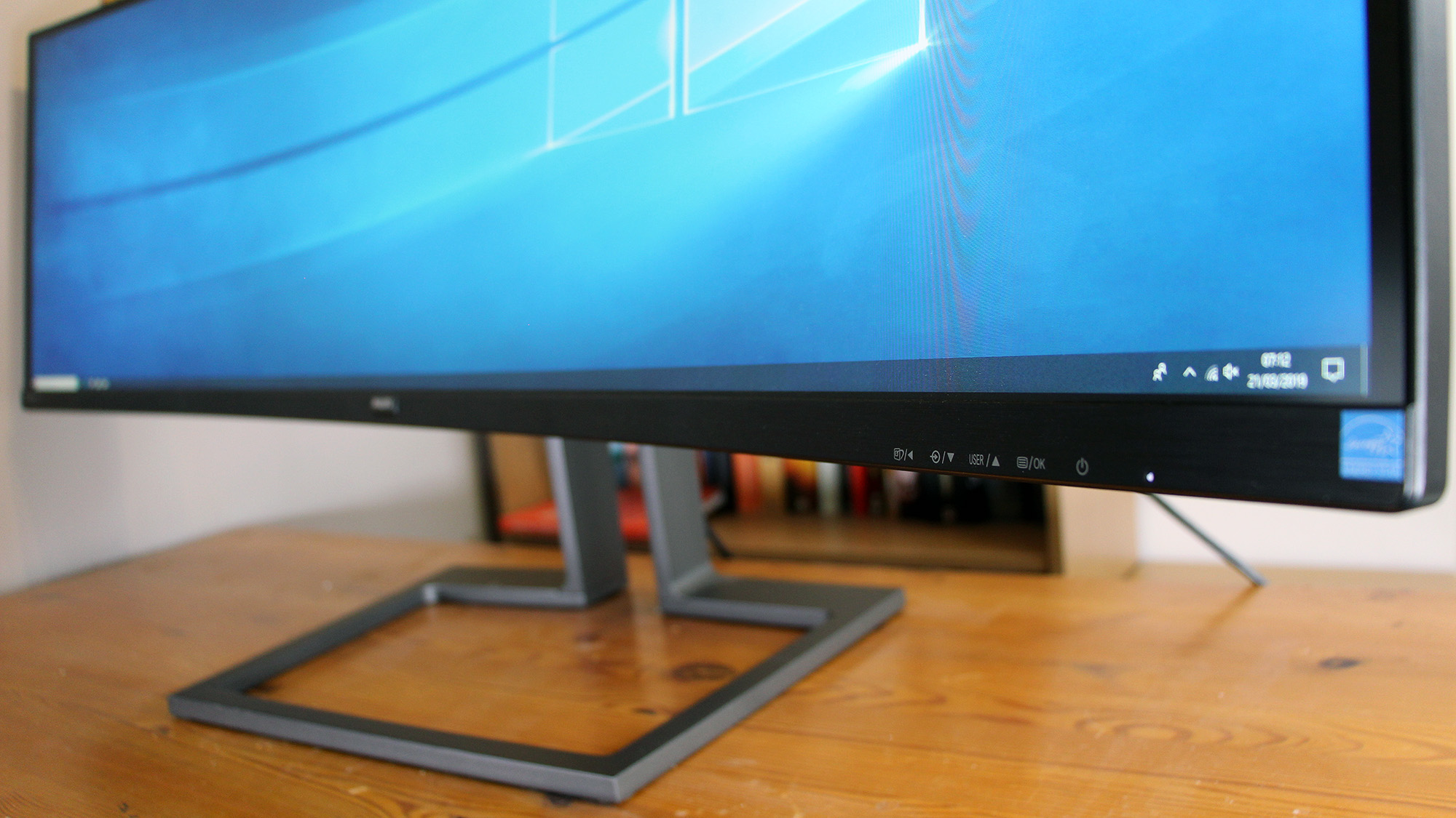
It is, at least, easy to use this screen's OSD. It's navigated by a row of small, snappy buttons beneath the bottom bezel, with mode-switching and input-switching quick-options on several of the buttons.
The main menu isn't eye-catching, but it is organised sensibly and it is quick to navigate - and that's more important when you're using a screen for work.
Philips Brilliance 499P9H review: Image Quality
The 499P9H has several inconsistencies when it comes to its design and specification - and we found more when we ran benchmarks.
There is certainly plenty to like when it comes to this screen's image quality. Colours, at a base level, are extremely accurate: the temperature of 6,550K is barely any different from the 6,500K ideal, and the average Delta E of 1.6 is good enough that human eyes can't tell that anything's amiss.
The Philips has the usual screen modes for office, movie or gaming use, but its sRGB option is the only one worth investigating. Using that improved the Delta E further, to an exceptional 1.06.
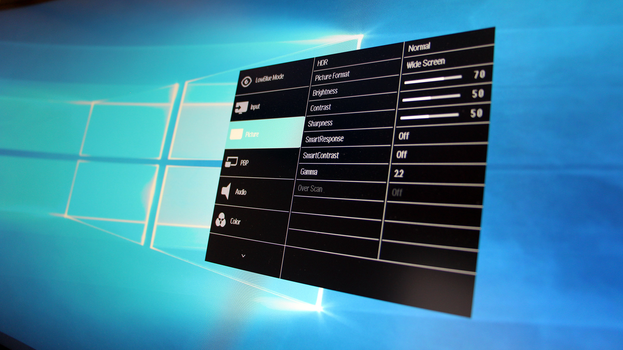
The SmartUniformity option ramps up the colour temperature, which makes colours look washed-out. The Photo mode made the Delta E worse and created an over-saturated image. The Office mode returned colour quality in between the factory and sRGB modes.
The screen followed up its exceptional colour quality with a fantastic brightness measurement of 405cd/m2. It's an excellent figure by desktop standards, and it's also high enough to meet VESA DisplayHDR 400's criteria - even if those are pretty modest.
The black point of 0.19cd/m2 is also excellent by normal standards, but it doesn't quite meet VESA DisplayHDR's requirements. Because of that, HDR content on this screen won't have as much depth as it would only other panels with higher criteria and better black points.
Nevertheless, those figures do deliver a contrast ratio of 2,126:1. That's a stonking figure when compared to normal screens, and it means that this panel will serve up fantastic vibrancy and punch at every point on the scale. It'll also eliminate banding, deliver inky dark levels, and carefully render subtle changes between different shades - all important factors when working in colour-sensitive scenarios.
The Philips displayed 99.8% of the sRGB gamut, too, which is high enough to handle the demands of mainstream colour work.
Here, though, is where the 499P9H begun to falter.
That sRGB coverage level is excellent, but this screen could only handle 87.4% of the DCI P3 gamut and 79.1% of the Adobe RGB gamut.
The DCI P3 gamut is used to create HDR content, and the Philips falls short - so it's not really suitable for creating HDR content. The Adobe RGB gamut is important for several high-end design tasks, and this is another area where the Philips can't match plenty of its professional rivals.
Uniformity is not particularly good either. The Philips lost 32% of its backlight strength in the top-left corner, 30% in the top-right corner, and 17% and 22% across the top edge. At the bottom of the screen the backlight weakened by 20% in the left corner and 24% in the right corner.
The Philips was always going to struggle here - it's harder to maintain backlight consistency across a larger screen, and the 499P9H is one the biggest screens we've ever seen.
However, the weaker backlight in the corners does have an impact, and those figures are poorer than the results you'll typically get from expensive productivity panels with smaller diagonals and more conventional aspect ratios. If you look closely the image is a little dimmer, and that's going to have an impact on work where colour accuracy and consistency is important.
The image quality of the Philips is hardly awful, but its rivals are better in key areas. The widescreen Samsung CF791 has better Delta E, gamut coverage and contrast figures, but without HDR, while the 4K Acer ProDesigner panel couldn't match the Philips for contrast, but it has better colour accuracy, and better gamut coverage levels.
Philips Brilliance 499P9H review: Verdict
The Philips Brilliance is a unique, outrageous screen - but it's not wholly successful.
The huge size, width and resolution are undoubtedly a boon for plenty of work scenarios: there's loads of screen real estate for applications that need loads of width, and it'll be easier to work on this panel than on an inconsistent multi-monitor setup. You get good USB connectivity, a surprising amount of adjustment and a fast, navigable OSD.
In many key areas, though, the Brilliance doesn't quite match more conventional screens. Its benchmark results are generally great, but you'll get better colour accuracy and gamut coverage elsewhere. Its HDR ability is entry-level, and its poor uniformity hampers its ability for complex, colour-sensitive work.
If colour-sensitive work isn't on your radar and you will benefit from having a huge, high-resolution widescreen, then the Philips is absolutely worth its 942 exc VAT price.
However, most people won't feel the benefit - they'll be sated by smaller, more conventional panels, or they'll need screens with better colour ability and uniformity for demanding work tasks.
Verdict
The Philips Brilliance 499P9H does have a lot going for it: the 32:9 widescreen and huge resolution do a good job of replacing multi-monitor setups in plenty of situations, there’s loads of connectivity, and its basic contrast, colour accuracy and sRGB gamut coverage levels are excellent. It can’t handle more demanding gamuts, though, and its uniformity levels are poor – so plenty of professionals will be better-served by more conventional screens.
Screen size: 49in
Screen resolution: 5,120 x 1,440
Screen technology: LED VA
Screen refresh rate: 60Hz
Video inputs: DisplayPort 1.4, 2 x HDMI 2.0
Audio inputs/outputs: 1 x headphone output
Speakers: 2 x 5W
Ports: 3 x USB 3.1, 1 x USB 3.1 Type-C, 1 x Gigabit Ethernet
Adjustability: Tilt -5° to 10°, 130mm height adjustment, 20° swivel, 100mm VESA mount
Dimensions: 1194 x 303 x 568mm (WxDxH)
Weight: 15.3kg
Warranty: 3yr RTB
Get the ITPro daily newsletter
Sign up today and you will receive a free copy of our Future Focus 2025 report - the leading guidance on AI, cybersecurity and other IT challenges as per 700+ senior executives
Mike Jennings has worked as a technology journalist for more than a decade and has been fascinated by computers since childhood, when he spent far too long building terrible websites. He loves desktop PCs, components, laptops and anything to do with the latest hardware.
Mike worked as a staff writer at PC Pro magazine in London for seven years, and during that time wrote for a variety of other tech titles, including Custom PC, Micro Mart and Computer Shopper. Since 2013, he’s been a freelance tech writer, and writes regularly for titles like Wired, TechRadar, Stuff, TechSpot, IT Pro, TrustedReviews and TechAdvisor. He still loves tech and covers everything from the latest business hardware and software to high-end gaming gear, and you’ll find him on plenty of sites writing reviews, features and guides on a vast range of topics.
You can email Mike at mike@mike-jennings.net, or find him on Twitter at @mikejjennings
-
 Cleo attack victim list grows as Hertz confirms customer data stolen – and security experts say it won't be the last
News Hertz has confirmed it suffered a data breach as a result of the Cleo zero-day vulnerability in late 2024, with the car rental giant warning that customer data was stolen.
By Ross Kelly Published
-
 Women show more team spirit when it comes to cybersecurity, yet they're still missing out on opportunities
News While they're more likely to believe that responsibility should be shared, women are less likely to get the necessary training
By Emma Woollacott Published
-
 OpenAI wants developers using its new GPT-4.1 models – but how do they compare to Claude and Gemini on coding tasks?
News OpenAI says its GPT-4.1 model family offers sizable improvements for coding, but tests show competitors still outperform it in key areas.
By Ross Kelly Published