BenQ DesignVue PD2720U review: A must-have for professional users
More expensive than its rivals, but can it justify the cost?
This monitor is more expensive than most rivals, but you're getting a lot of bang for your buck, including a pin-sharp screen, fantastic colour accuracy and heaps of professional features
-
+
Fantastic image quality throughout; Sharp 4K screen; Loads of screen modes and features
-
-
Contrast could be better; Smaller than rivals; Pricier than other panels

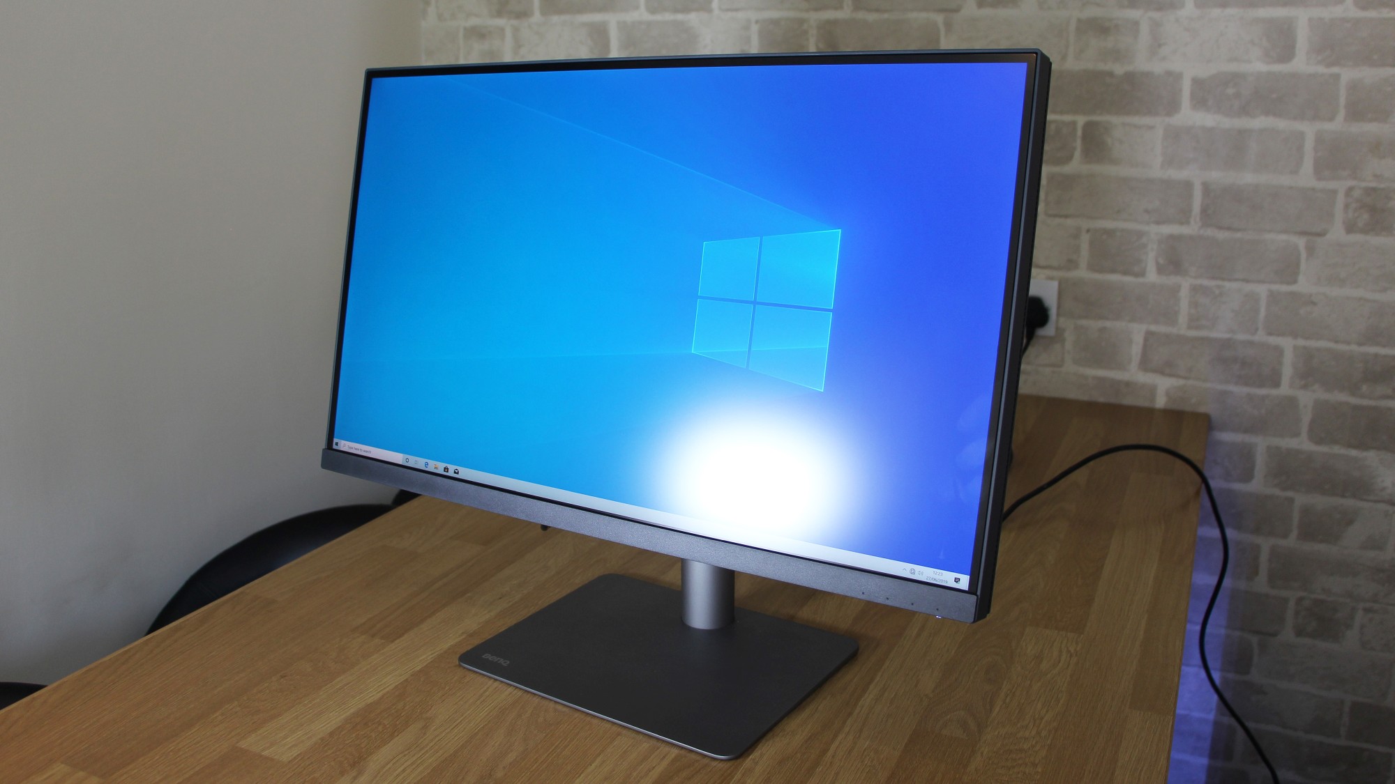
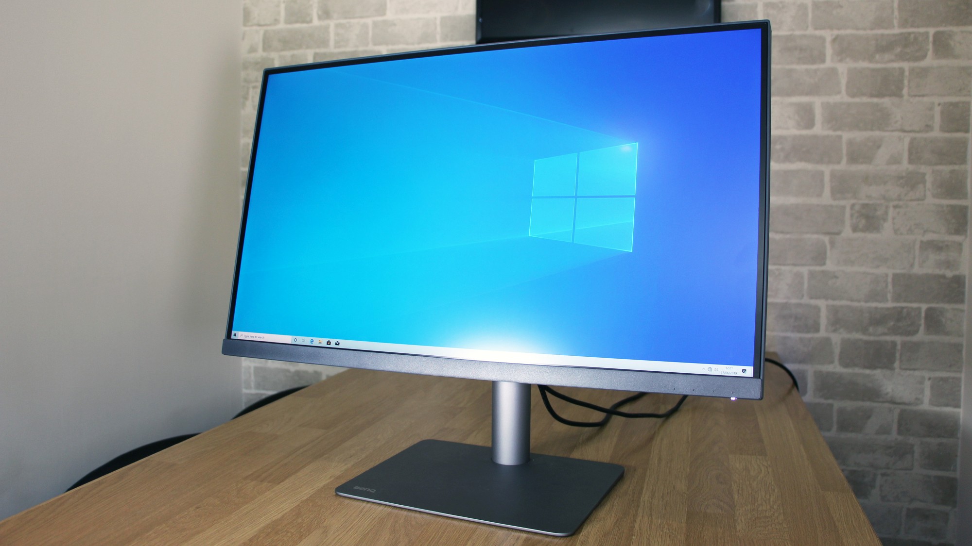
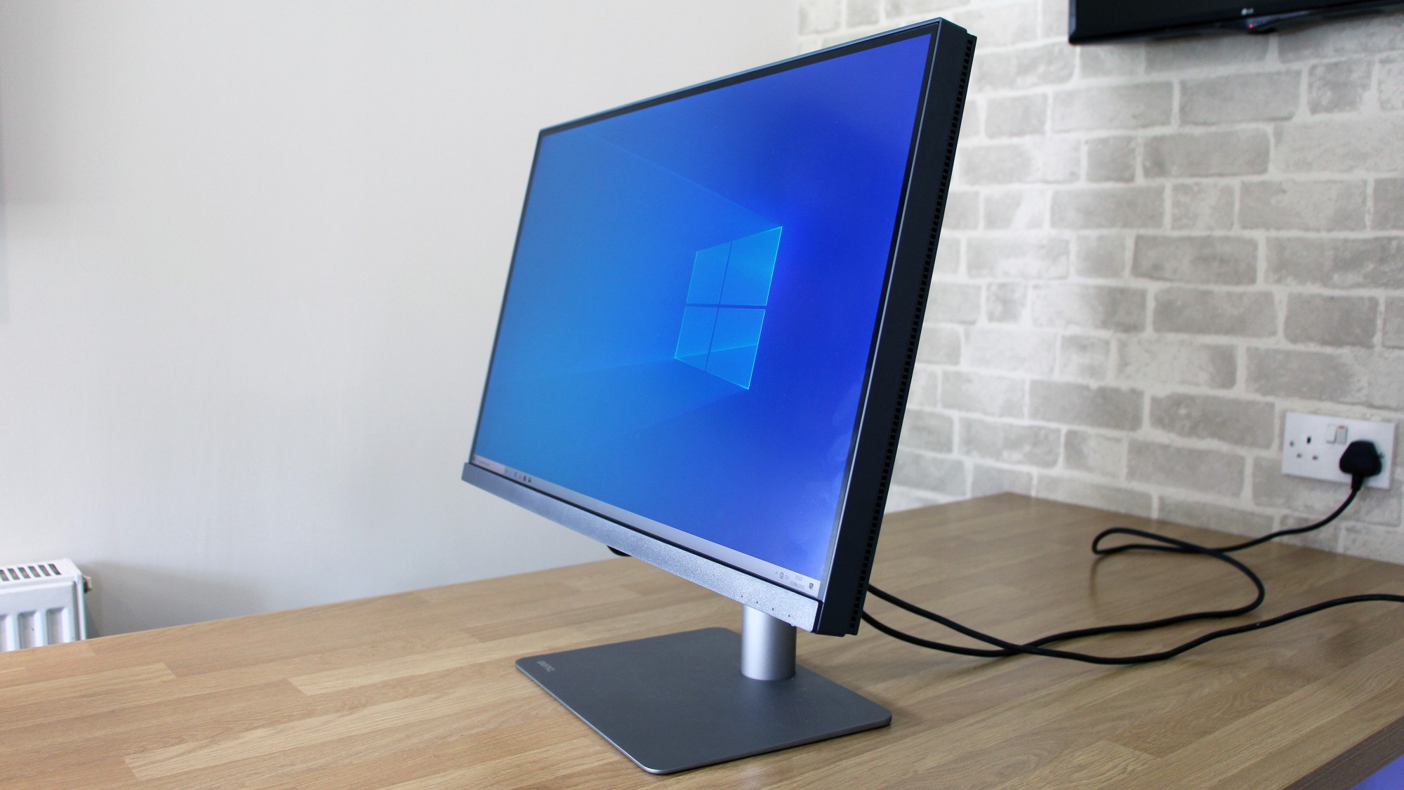
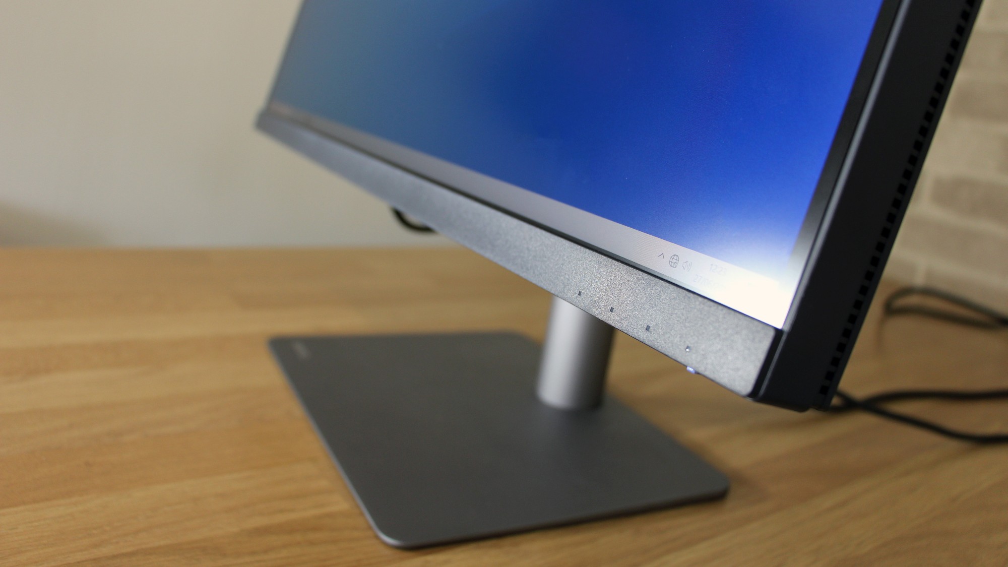
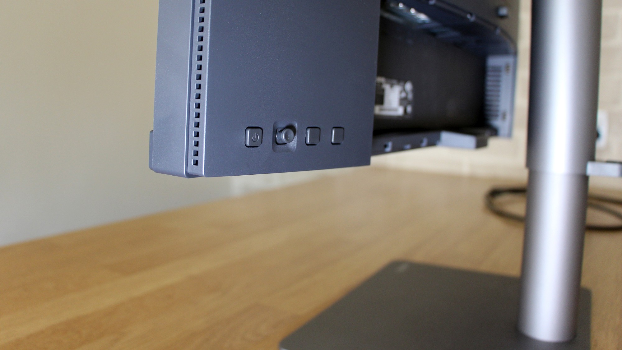
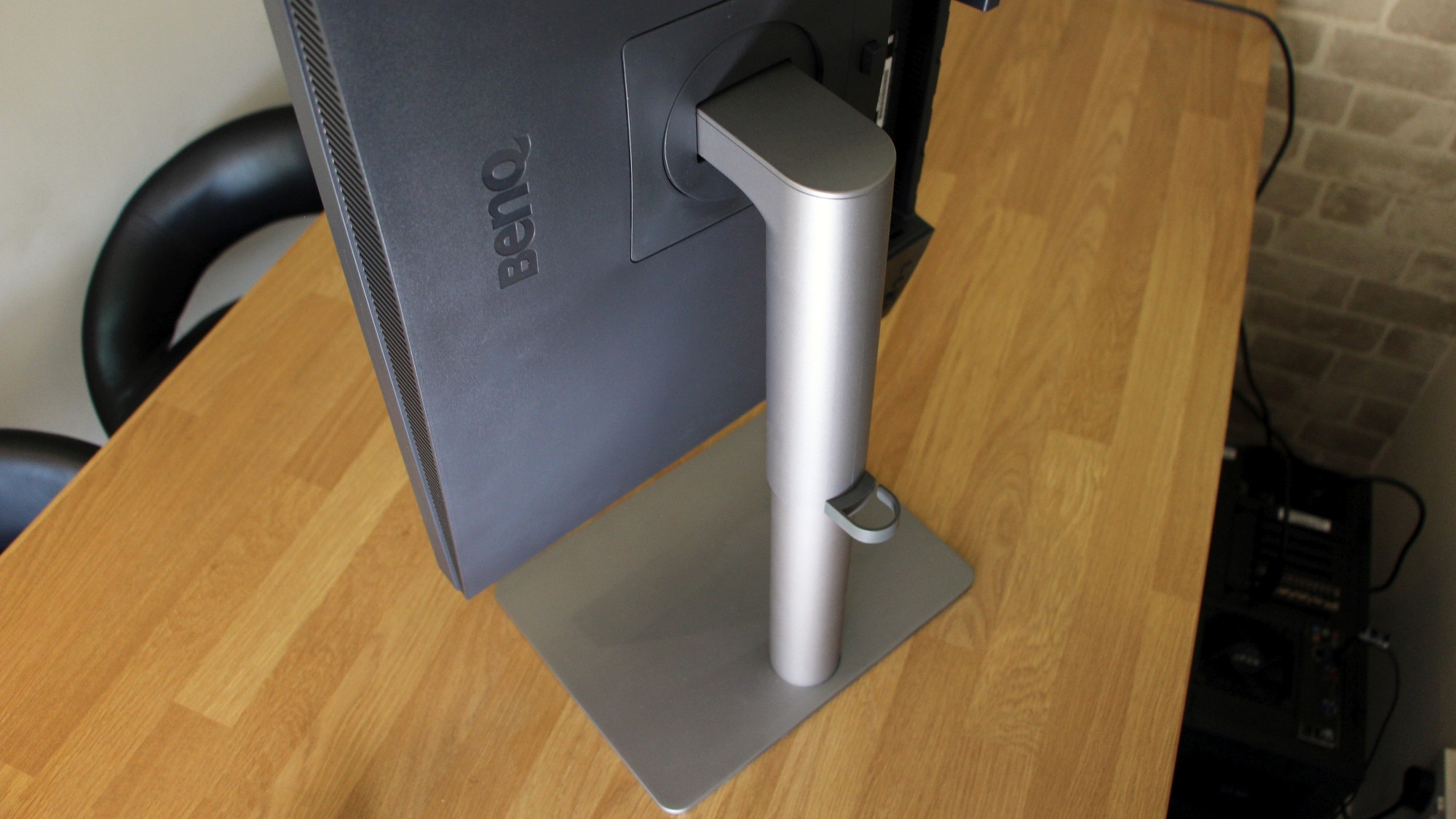
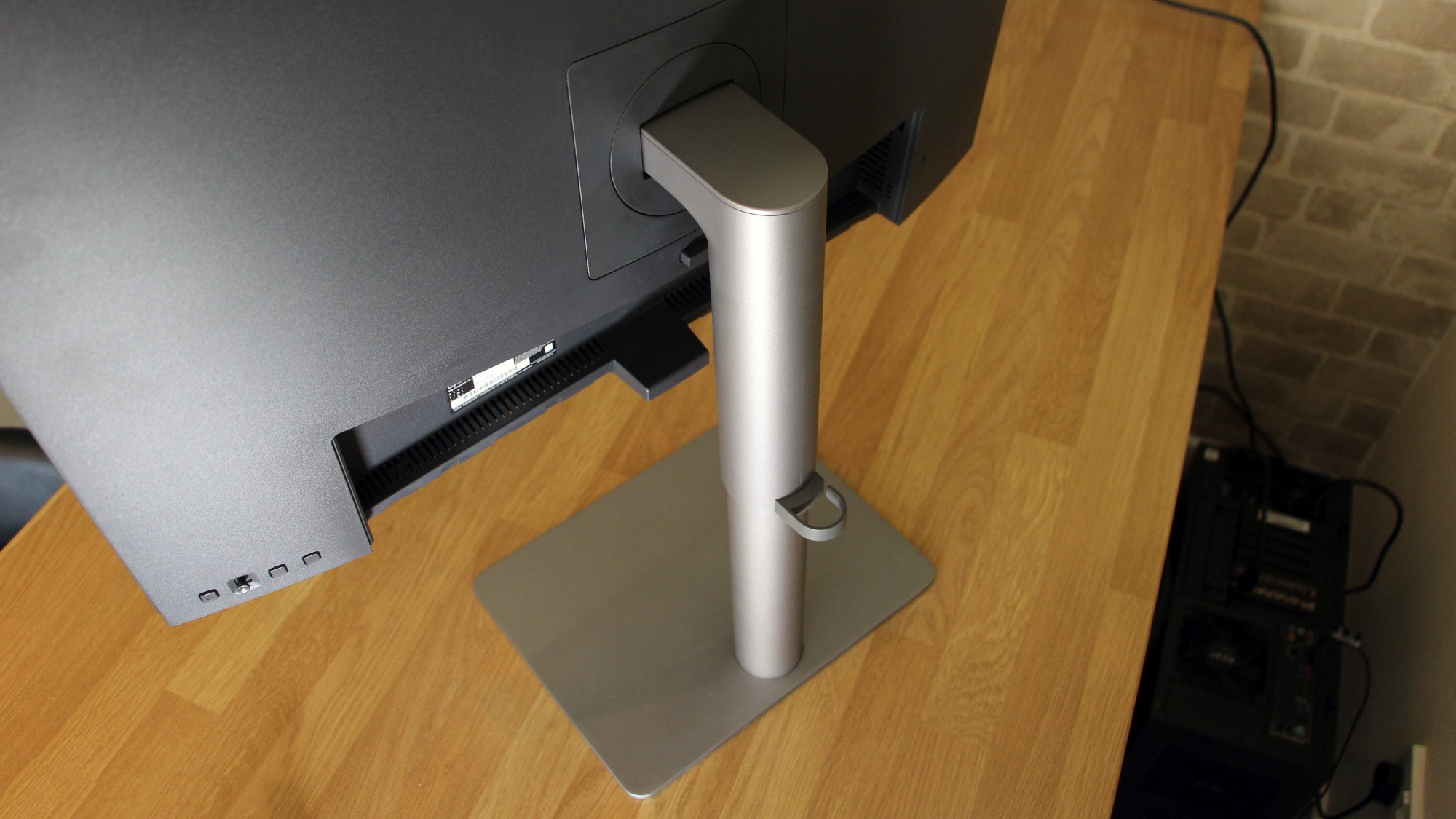
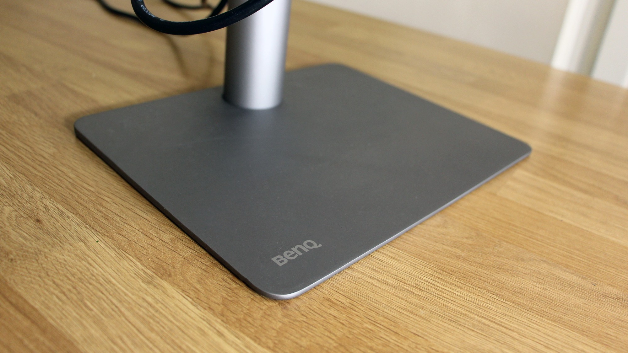
The BenQ DesignVue PD2720U has a high price, a keen sense of aesthetic and a broad range of features - so it won't look out of place in trendy offices or on designer's desks.
At least, that's what BenQ hopes - but this screen faces plenty of strong competition, and its 728 exc VAT price makes it the priciest panel among close rivals.
BenQ DesignVue PD2720U review: Features
The PD2720U is a 27in monitor with a 3,840 x 2,160 resolution, which means it's tremendously crisp - its density level of 163ppi is ideal for picking out fine detail in photos.
That's better than the competition. The Acer ProDesigner BM320 and the Philips Brilliance 329P9H are also 4K screens, but they have 32in diagonals - so they have density levels of 140ppi. That's fine, but the BenQ is sharper.
Elsewhere, the BenQ shares most of its core specification with rivals. Like those other panels, the BenQ uses IPS technology - ideal for colour quality and viewing angles. It's got a 60Hz refresh rate, which is fine for almost all work tasks, and its 5ms response time is equally acceptable.

BenQ's screen does go further in other departments - no surprise given the higher price. It's compatible with HDR10, which is the same standard used on most HDR-equipped TVs. That bodes well for working in broadcast environments - and it's an improvement on the Acer and Philips screens, which omitted HDR.
It's also better than most of the VESA DisplayHDR standards that are common on cheaper monitors - you'll have to have use VESA's top HDR protocols to match this, and consumer screens just don't offer that level of support.
The HDR compatibility is bolstered by a claimed 96% coverage level in the DCI-P3 gamut. BenQ also claims that this screen offers 100% coverage of the sRGB, Adobe RGB and Rec. 709 gamuts. The Acer claims similar figures, but the Philips can't get anywhere near this - it only claims 100% in sRGB.
There are good features elsewhere. The BenQ is verified by CalMAN and Pantone, and it has the usual range of picture-by-picture options. In addition, the BenQ can split its screen in half and display different screen modes on each - so users can compare images. It's also got a KVM switch, so two PCs on two panels can be controlled from one keyboard and mouse. Neither rival has any of these options.
BenQ DesignVue PD2720U review: Design & Build Quality
The BenQ is noticeably better-looking than either rival. The screen has slim bezels, and the base and stand are both made from dark metal that stands out amid the plastic and lighter materials elsewhere.

The base is a minimal slab of aluminium, and the stand is a sleek cylinder that uses a smart telescopic mechanism to deliver 150mm of height adjustment. The back of the stand has a neat cable-routing loop, and versatility elsewhere is good: it rotates to portrait mode, pivots and tilts, and works with 100mm VESA mounts. The 27in diagonal means that this screen is physically smaller than either rival. It's also lighter, at 8.3kg - the Acer and Philips both sit beyond 10kg.
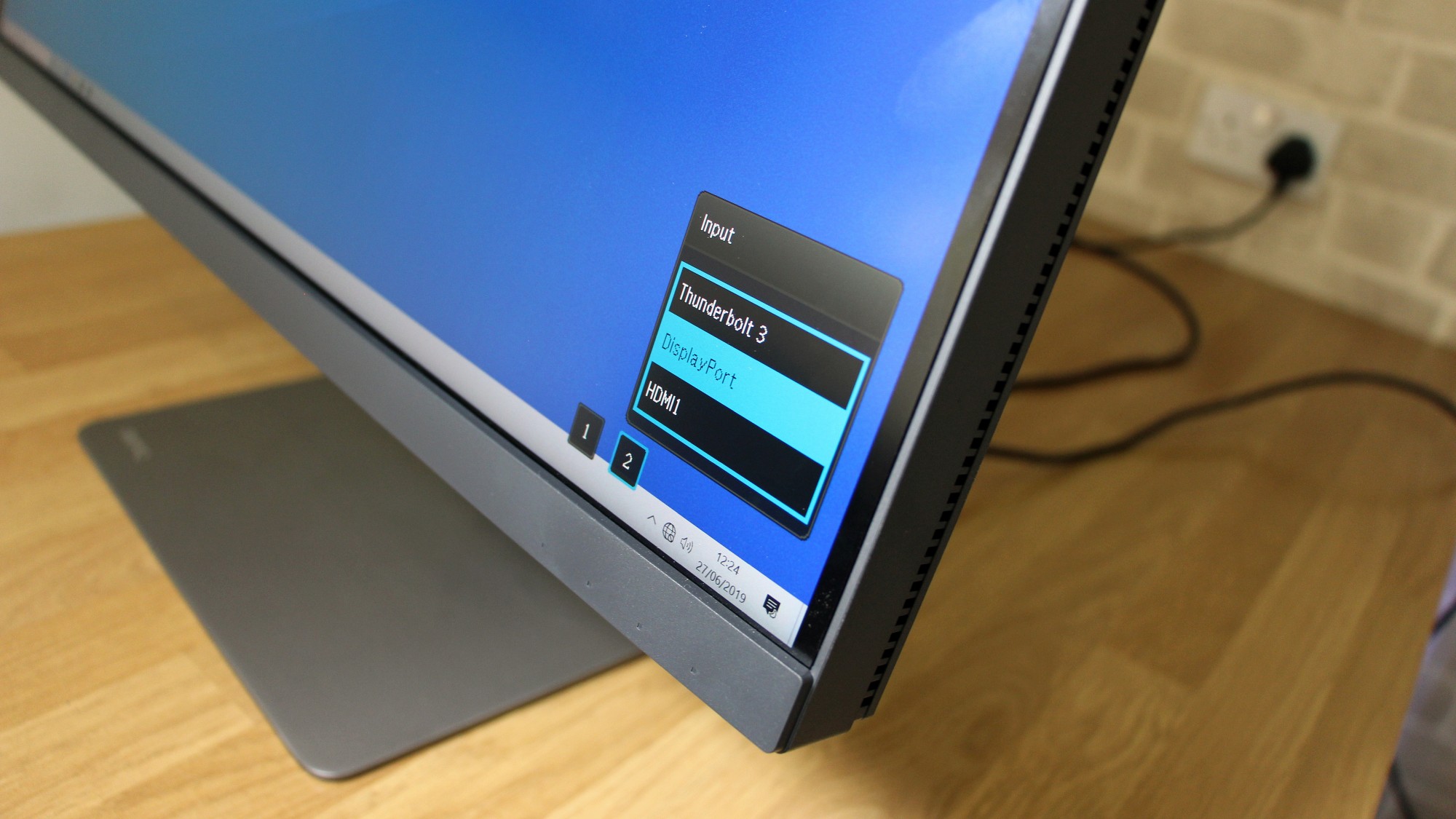
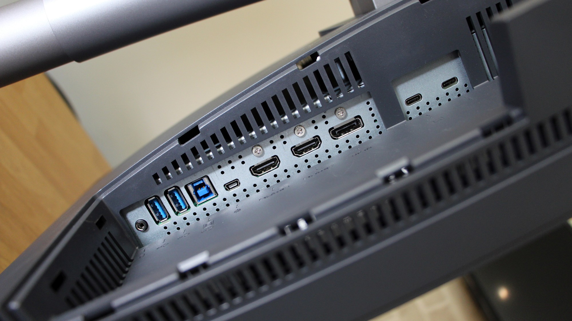
The port selection is more future-proofed when compared to other screens. The BenQ has the usual single DisplayPort 1.4 and dual HDMI 2.0 connections, and you get two USB 3.1 ports. It's also got two Thunderbolt 3 ports - while neither rival has any. They function with USB 3.1 Type-C, and support power delivery - so you can attach peripherals, charge laptops and daisy-chain monitors. One port delivers 65W of power and the other only churns out 15W, so only one will power certain devices - but it's a welcome option to have.
And, because this screen is a stylish, design-friendly product, a plastic panel can cover up all of those pesky cables and ports once everything is connected. The only downside is that none of the ports are in easy-to-reach spots on the side of the screen. They're all around the back, facing downwards.
The BenQ's OSD is good - fast and sensibly-organised. It's got noticeably more options than the Acer in particular. A sturdy, snappy joystick navigates the menu, and solid buttons open quick-select options. BenQ also includes a USB-based puck control that can be used to switch between screen modes and navigate the main menu. Neither rival has this, and it makes control easier.
BenQ DesignVue PD2720U review: Image Quality
Out of the box, the BenQ's brightness measurement of 353cd/m2 is great - higher than both rivals - and that's paired with a black point of 0.34cd/m2 - better than the Acer but poorer than the Philips. Those figures create an initial contrast ratio of 1,038:1. It's a great result that gives images enough depth and vibrancy at all areas of the range; far better than the Acer's 539:1 score, and only a little behind the 1,366:1 of the Philips.

The BenQ's initial colours are mixed. Their temperature of 6,601K is great, and the gamma average of 2.4 is impressive - a little further away from the 2.2 ideal than the Acer, but still good. However, the average and maximum Delta E figures of 4.45 and 1.06 are poor. They're both worse than rival panels, and it means that shades will be wayward.
The BenQ is a serious professional screen, though, and few will use this product at factory settings. Switching to its sRGB mode showed exactly how good this panel is: those average and maximum Delta E figures improved to 0.48 and 1.64. They're both fantastic, and both better than rivals: at its best the Acer could deliver results of 1.26 and 4.34, and the Philips arrived at 1.08 and 8.05.
Elsewhere, in sRGB mode the colour temperature sat at an excellent 6,453K, and gamma averaged 2.15 - closer to the 2.2 ideal than the Acer and Philips panels. In sRGB mode the brightness dropped to 252cd/m2, which is still plenty, and contrast declined to 741:1. That's short of the Philips, but it's better than the Acer and is still enough to deliver the depth required for image work. We're also pleased that other tests indicate that contrast can be go higher if that's necessary.
The BenQ has more screen modes than its rivals, and they're all fit for purpose. It's got the usual Adobe RGB and DCI-P3 options, and it also has a broadcast-friendly Rec. 709 mode. Unusually, the BenQ also has CAD/CAM and Animation options. The CAD/CAM option ramps up the contrast and brightness to make lines stand out, while the Animation mode has ten severity options and functions similarly.
The BenQ rendered 99.6% and 99.4% of the sRGB and Adobe RGB colour gamuts, and 89.9% of the DCI-P3 gamut. That's miles better than the Philips, but the DCI-P3 figure is a little short of the Acer's screen. However, the BenQ has far more all-round image quality than the Acer, and the BenQ's DCI-P3 figure is still good enough for most tasks.

The BenQ also has fantastic uniformity. Its maximum brightness deviation was just 4%, with many sectors of the screen not even hitting 1%. That's one of the best results we've seen, and it's far better than the Acer and Philips panels. There will be no noticeable colour or contrast changes in any area.
BenQ DesignVue PD2720U review: Verdict
When it comes to image quality, the BenQ is excellent. Its Delta E figures are better than both rivals, colour temperatures are good, gamut coverage is great and uniformity is spectacular. There are loads of professional screen modes, and contrast is fine - not as high as it could be, but not too low.
There's easily enough quality to handle almost any professional image or video task. The only way to get a quality improvement will be to spend far more, and jumping up to a four-figure product will deliver diminishing returns that most people won't notice.
The BenQ's great quality is paired with impressive design. It looks good and it's versatile, and it has a solid port selection - including Thunderbolt.
The BenQ DesignVue PD2720U costs a little more than rivals, but it justifies the price by offering fantastic image quality. Only particularly demanding tasks will require this level of performance - but if you do need it, this excellent screen is worth the cost.
Verdict
This monitor is more expensive than most rivals, but you're getting a lot of bang for your buck, including a pin-sharp screen, fantastic colour accuracy and heaps of professional features
Screen size: 27in
Screen resolution: 3,840 x 2,160
Screen technology: LED IPS
Screen refresh rate: 60Hz
Video inputs: 1 x DisplayPort 1.2, 2 x HDMI 2.0
Audio inputs/outputs: Headphone out
Speakers: 2 x 2W
Ports: 2 x USB 3.1, 1 x USB 3.1 Type-C, 2 x Thunderbolt 3
Adjustability: Tilt -5° to 20°, 150mm height adjustment, 100° swivel, 100mm VESA mount
Dimensions: 614 x 186 x 594mm (WxDxH)
Weight: 8.3kg
Warranty: 3yr RTB
Get the ITPro daily newsletter
Sign up today and you will receive a free copy of our Future Focus 2025 report - the leading guidance on AI, cybersecurity and other IT challenges as per 700+ senior executives
Mike Jennings has worked as a technology journalist for more than a decade and has been fascinated by computers since childhood, when he spent far too long building terrible websites. He loves desktop PCs, components, laptops and anything to do with the latest hardware.
Mike worked as a staff writer at PC Pro magazine in London for seven years, and during that time wrote for a variety of other tech titles, including Custom PC, Micro Mart and Computer Shopper. Since 2013, he’s been a freelance tech writer, and writes regularly for titles like Wired, TechRadar, Stuff, TechSpot, IT Pro, TrustedReviews and TechAdvisor. He still loves tech and covers everything from the latest business hardware and software to high-end gaming gear, and you’ll find him on plenty of sites writing reviews, features and guides on a vast range of topics.
You can email Mike at mike@mike-jennings.net, or find him on Twitter at @mikejjennings
-
 ‘Phishing kits are a force multiplier': Cheap cyber crime kits can be bought on the dark web for less than $25 – and experts warn it’s lowering the barrier of entry for amateur hackers
News Research from NordVPN shows phishing kits are now widely available on the dark web and via messaging apps like Telegram, and are often selling for less than $25.
By Emma Woollacott Published
-
 Redis unveils new tools for developers working on AI applications
News Redis has announced new tools aimed at making it easier for AI developers to build applications and optimize large language model (LLM) outputs.
By Ross Kelly Published
-
 Google layoffs continue with "hundreds" cut from Chrome, Android, and Pixel teams
News The tech giant's efficiency drive enters a third year with devices teams the latest target
By Bobby Hellard Published