Acer ProDesigner BM320 review: Cheap but a tad underwhelming
Cheaper than rivals, and with big claims about quality. Can this panel compete?
A solid feature set alongside good colours and a decent price, but contrast is just too low
-
+
Solid connectivity; Good colour accuracy; Broad gamut coverage levels
-
-
Disappointing contrast; Inconsistent build quality; No HDR

The Acer ProDesigner BM320 is a large, professional panel that only costs 525 exc VAT. That's a hefty chunk of cash, but it also makes this screen significantly cheaper than its key rivals.
Testing will reveal whether this panel is a professional bargain - or if it's worth spending a little more to get a lot more quality.
Acer ProDesigner BM320 review: Features
The BM320 has a good core specification. This screen uses an IPS panel and has a 3,840 x 2,160 resolution with a 32in diagonal. That's identical to the 644 exc VAT Philips Brilliance 329P9H, and it means that this screen delivers a density level of 140ppi - easily sharp enough to handle precise photo and video work. The 728 exc VAT BenQ DesignVue PD2720U also uses an IPS screen, but it's a 27in panel - so it has a density level of 163ppi, which means a crisper image, albeit over a smaller area.
The Acer uses 10-bit colour, just like both rivals, and it matches them with a 60Hz refresh rate - not particularly fast, but fine for work. The Acer comes with claimed 100% support of the Adobe RGB colour gamut, and it also purports to nail sRGB. The panel also arrives with factory calibration that promises a sub 2.0 Delta E, and it comes with a dedicated Rec. 709 mode. That's level with both rivals.

However, in other departments the cheaper Acer is lacking. There is no support for HDR. The Philips panel didn't have any HDR either, but the pricier BenQ adhered to the HDR10 standard. This omission also means you don't get a DCI-P3 mode. There's nothing like the intelligent light-dimming that the Philips included, no KVM switch like the BenQ, and there's no webcam. It's got a pair of 2W speakers, but they're not as loud or as clear as the audio hardware in the Philips.
Acer ProDesigner BM320 review: Design & build quality
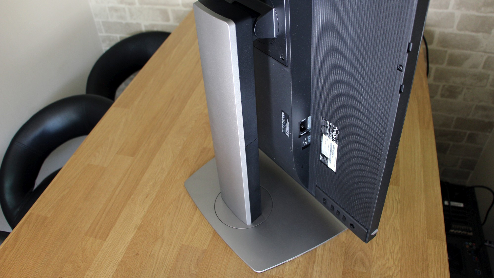
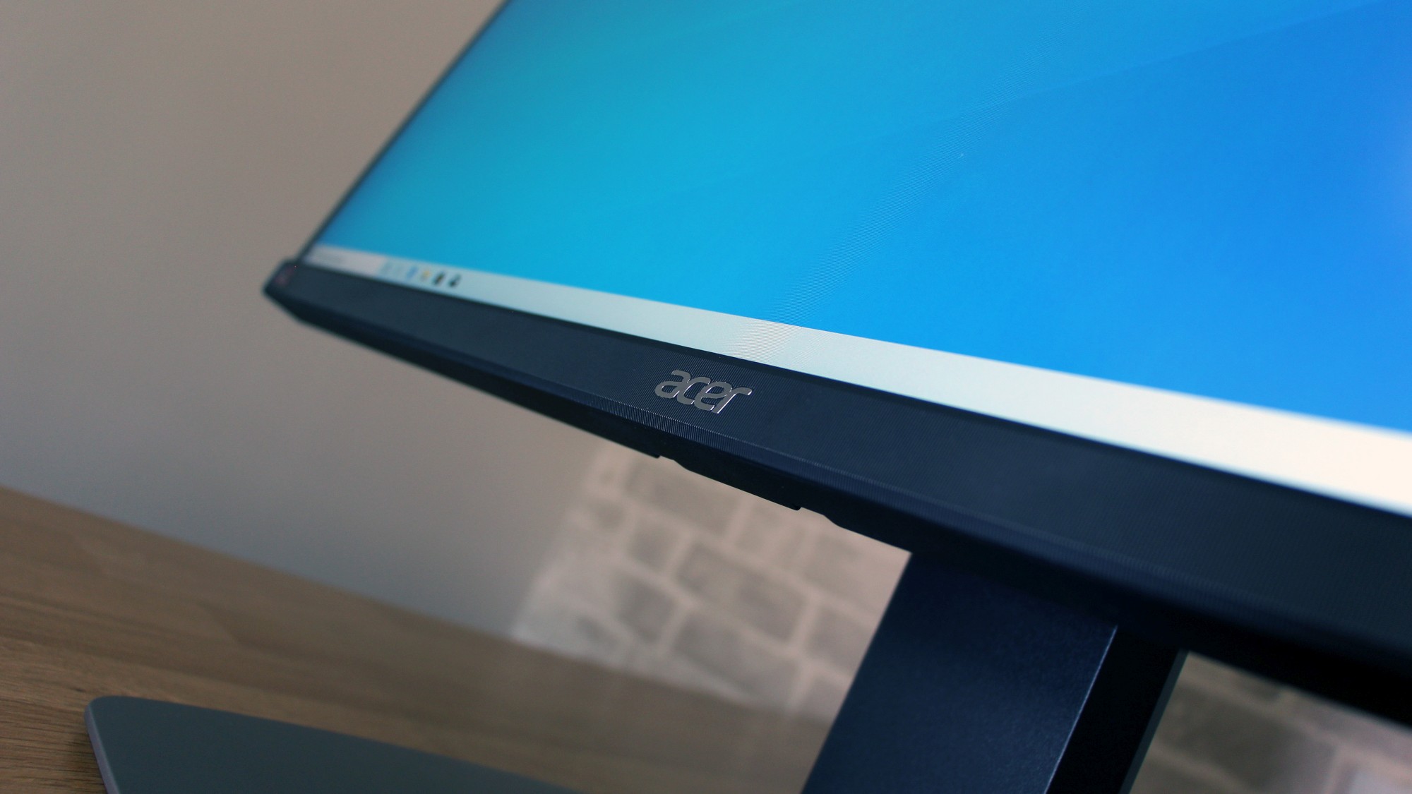
The Acer is built conventionally: the stand snaps into the screen's rear, and the base secures to the stand with a single screw. Its aesthetics are modest; the base is made from plain metal, and it's larger than the bases used on both rivals. Build quality is fine in most areas, but the bottom half of the rear is made of flimsy plastic. It's not the best option if you need a panel that will be moved frequently.
The unassuming design is improved by excellent practical features. The screen has tilting and swiveling options, it can switch round to portrait mode, and it includes a solid 150mm of height adjustment - as much as the BenQ and less than the Philips, and plenty for any office. It also attaches to 100mm VESA mounts, and Acer includes privacy shrouds that attach to the screen's left and right edges.
The port selection is solid. There are two USB 3 ports on the rear and two more on the side - so they're more accessible than the USB ports on either rival. Display input is handled by DisplayPort, mini-DisplayPort and HDMI connectors, and you also get a DVI port. Neither rival has two audio jacks either. It's good considering the price of this screen, but it's not perfect. There's no USB Type-C here, no card reader and no Gigabit Ethernet. There's also no Thunderbolt.
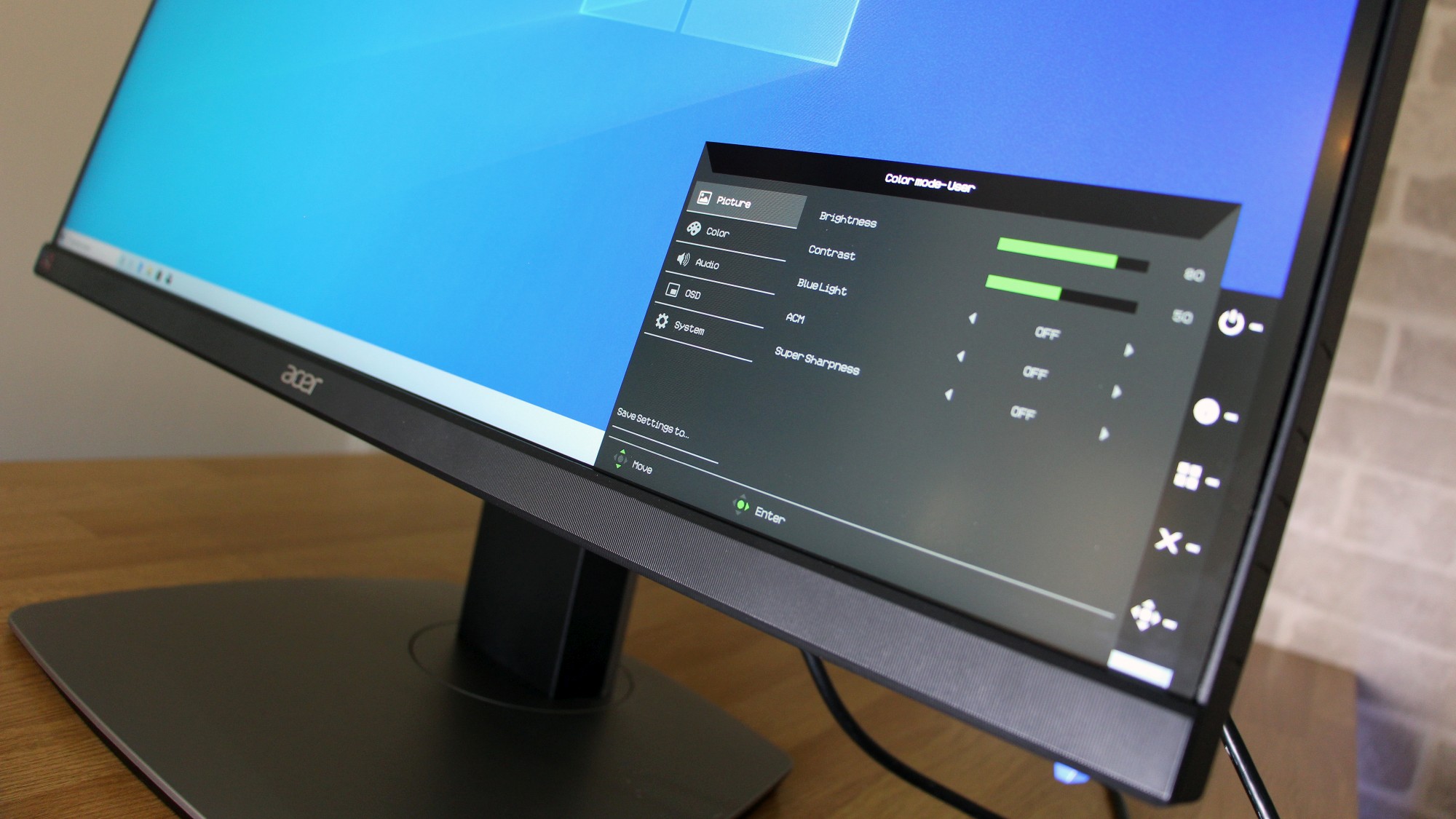
The on-screen display is mixed. Navigation is handled by a joystick and three buttons, and they're fine - the joystick strikes a good balance between being light enough to move easily and rigid enough to not feel flimsy, and the buttons are snappy.

However, the display itself is poor. It's tiny, which means that you don't get options presented in three columns - so it's tricky to see what's available and consider your alternatives. It also looks dull and dated when compared to almost everything else on the market.
Acer's website claims that a lot of this functionality is replicated on its Display Widget, which runs in Windows. It has access to basically all of the same options as the OSD, and it's easier to navigate. However, at the time of writing, it's not supported on the BM320 - despite the website saying otherwise. And having this Windows app running means just another utility on your PC - and some company IT departments may not like that.
Acer ProDesigner BM320 review: Image quality
With the screen hewn from its box and without any adjustments, the Acer delivered a mediocre Delta E measurement of 3.49 - better than the BenQ but behind the Philips, and not good enough for demanding colour work. Gamma sat at 2.26, which is a tad closer to the 2.2 ideal than the Philips and BenQ monitors. The colour temperature of 6,525K is excellent. Overall, though, it's a faltering start.
The brightness level of 291cd/m2 is fine - behind both rivals, but still ample for life beneath powerful office lighting. However, it's undermined by a black point of 0.54cd/m2. That's too high - it means that darker areas don't have enough depth or tonal variation to look their best.
Those figures create a measured contrast ratio of 539:1. That is low - lower than the 1,026:1 of the BenQ and the 1,366:1 of the Philips. It's not enough to put a stop to mainstream work and less-demanding image tasks, but it's not good. Images won't have the depth and punch that they do on those other panels, and the Acer doesn't have the subtle shade and tone variations that professionals need.

Happily, some of these results were improved in other screen modes. In the sRGB mode the Delta E improved to a superb 1.26 - slightly better than the Philips' top result, but unable to get near the BenQ. The colour temperature remained at an excellent 6,516K, while contrast sat at a disappointing 549:1. Gamma remained at 2.26, and these results remained broadly similar in the Acer's Adobe RGB and Rec.709 modes.
The Acer delivered solid colour gamut results. It rendered 99.6% of the sRGB gamut, which is near-perfect, and an excellent 97.3% of the Adobe RGB gamut. It also handled 93.3% of the DCI-P3 gamut. That latter one is used by the film industry, which makes it more of a shame that this screen has no HDR capabilities. That's better than the Philips, which only nailed the sRGB gamut. It's also a little more consistent than the BenQ, which faltered with DCI-P3.
Uniformity is average. The screen loses 10% of its brightness in its top corners, which is better than the Philips but not as good as the BenQ. It's not enough to make an impact in all but the most demanding of work situations.
Acer ProDesigner BM320 review: Verdict
The Acer has good gamut coverage and colour accuracy, and it can handle the sRGB, Adobe RGB and DCI-P3 gamuts - so it can be used for photographic, media and film work and deliver decent colours in all of those scenarios.
However, it's undermined by poor contrast, which leaves colours looking bright and breezy but without much depth, especially when it comes to darker shades. That said, the contrast on this screen is just about acceptable for most tasks, and at this end of the market spending more tends to deliver smaller and smaller improvements that only the most demanding professionals will notice.
Elsewhere, the Acer has adjustment options and solid port selections, even if it's not quite as sturdy or as good-looking as some of its rivals. It's cheaper than both of its competitors, too. The contrast level means that it won't suit the needs of particularly exacting workers, but it has the colour accuracy and versatility to handle plenty of tasks. It's a good option if you need a professional screen but want to save a little cash.
Verdict
A solid feature set alongside good colours and a decent price, but contrast is just too low
Screen size: 32in
Screen resolution: 3,840 x 2,160
Screen technology: LED IPS
Screen refresh rate: 60Hz
Video inputs: 2 x DisplayPort 1.2, 1 x HDMI 2.0, 1 x DVI,
Audio inputs/outputs: 2 x audio
Speakers: 2 x 2W
Ports: 4 x USB 3.0
Adjustability: Tilt -5° to 25°, 150mm height adjustment, 45° swivel, 100mm VESA mount
Dimensions: 728 x 201 x 616mm (WxDxH)
Weight: 11.14kg
Warranty: 3yr RTB
Get the ITPro daily newsletter
Sign up today and you will receive a free copy of our Future Focus 2025 report - the leading guidance on AI, cybersecurity and other IT challenges as per 700+ senior executives
Mike Jennings has worked as a technology journalist for more than a decade and has been fascinated by computers since childhood, when he spent far too long building terrible websites. He loves desktop PCs, components, laptops and anything to do with the latest hardware.
Mike worked as a staff writer at PC Pro magazine in London for seven years, and during that time wrote for a variety of other tech titles, including Custom PC, Micro Mart and Computer Shopper. Since 2013, he’s been a freelance tech writer, and writes regularly for titles like Wired, TechRadar, Stuff, TechSpot, IT Pro, TrustedReviews and TechAdvisor. He still loves tech and covers everything from the latest business hardware and software to high-end gaming gear, and you’ll find him on plenty of sites writing reviews, features and guides on a vast range of topics.
You can email Mike at mike@mike-jennings.net, or find him on Twitter at @mikejjennings
-
 AI is helping bad bots take over the internet
News Automated bot traffic has surpassed human activity for the first time in a decade, according to Imperva
By Bobby Hellard Published
-
 ‘We are now a full-fledged powerhouse’: Two years on from its Series B round, Hack the Box targets further growth with AI-powered cyber training programs and new market opportunities
News Hack the Box has grown significantly in the last two years, and it shows no signs of slowing down
By Ross Kelly Published
-
 Dragging your feet on Windows 11 migration? Rising infostealer threats might change that
News With the clock ticking down to the Windows 10 end of life deadline in October, organizations are dragging their feet on Windows 11 migration – and leaving their devices vulnerable as a result.
By Emma Woollacott Published