Lenovo ThinkPad X1 Carbon review (2014)
The 2014 ThinkPad gets updated input, but is it necessary?

Despite some unnecessary input changes, the X1 Carbon remains a top professional Ultrabook.
-
+
Great build quality; Anti-reflective screen coating is handy; Good for long-form typing; Security features; 4G an option
-
-
No sd card slot; Expensive; Polarising keyboard changes
Lenovo has taken a bold step with its 2014 model, making tweaks to its critically acclaimed keyboard and also introducing a touch-based adaptive strip in place of traditional function keys.
Of course the third generation model also aims to deliver the yearly incremental improvements to battery and performance using Intel's latest Haswell processors.
Starting at 1,099, you can load up the specification to include a Intel Core i7-4600U chip, 8GB of RAM and a 256GB SSD, driving the price up to 2,000.
Keyboard and trackpad
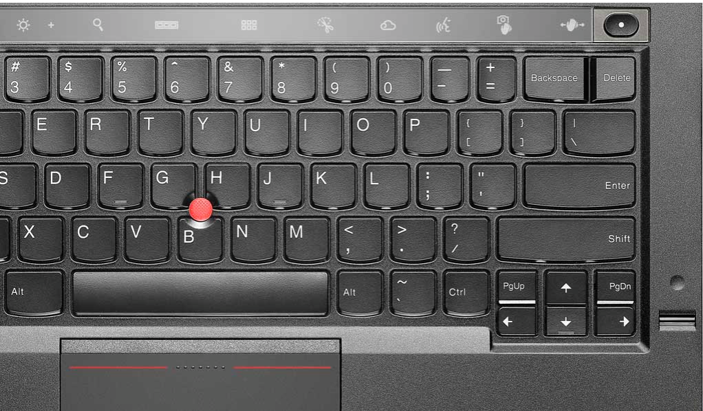
The keyboard changes on the X1 Carbon are contentious. Lenovo has moved the Home, End and Delete buttons into the main keyboard space to make way for the OLED strip. The Caps Lock button has been usurped by the Home/End combo, and the delete button now shares its spot with backspace.
These are typo-inducing adjustments, which could take even diehard ThinkPad users weeks to get used to. The change is comparable with the muscle memory shift needed when switching from a standard Windows laptop to a MacBook keyboard.
Typing remains a pleasure. Travelling action is deeper than you'll find on any other Ultrabook. The gentle feedback is perfect for longer-form typing, reducing the strain on your fingers.

The Lenovo ThinkPad X1 Carbon retains the classic pointing stick, which is nestled into the centre of the keyboard.
The mid-sized trackpad has integrated mouse buttons with unusually long travel too and the left-right mouse button zoning takes some getting used to. The textured glass surface of the trackpad is excellent, though.
OLED touch panel
In an attempt to jazz up the input, Lenovo has removed the function keys and replaced them with an adaptive monochrome OLED display. The buttons aren't programmable but shortcuts for web browsers and sound are available.

The ThinkPad X1 Carbon's touch strip takes a bit of getting used to because it operates with several layers of commands, which you scroll through using a function button at the end of the strip.
As well as introducing a learning curve to the laptop, it trades-away the instant feedback and tactility real keys provide. We're not convinced this is an improvement.
Design and Portability
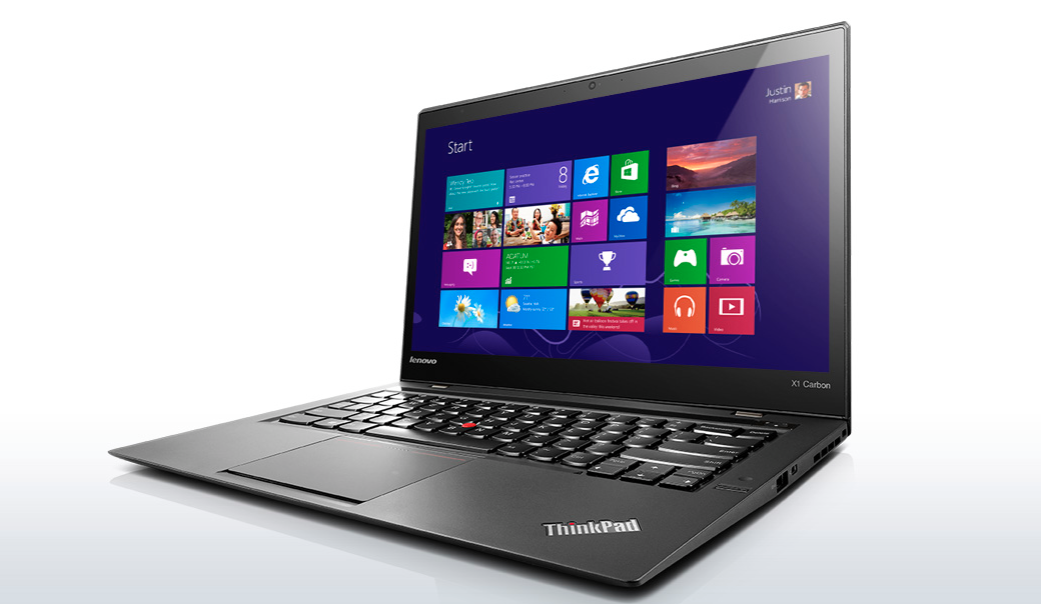
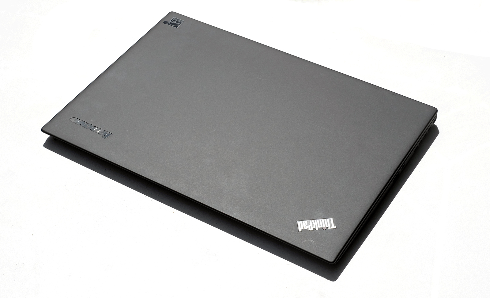
Lenovo has done little to the chassis with the shell almost identical to the 2013 model. The PC maker has resisted the temptation to turn its flagship model into a MacBook clone, preferring to stick with the sleek carbon fiber chassis.

With a weight of 1.39kg and a 18mm thick chassis, the X1 Carbon is portable. It's possible to carry around the X1 all-day without inducing shoulder ache.
Screen
Entry-level models ship with a 1,600 x 900 pixel display while the premium options offer users a pin-sharp 2,560 x 1,440 IPS touchscreen.
However, Windows isn't quite capable of dealing with such a high-resolution display at this time. The 8.1 Update 1 has added tools to combat scaling problems, but there is work to be done.
Scaling issues exhibit themselves in two forms: interfaces and icons either appear tiny or pixellated. Only core Windows apps are unaffected with even some of Lenovo's pre-installed software tools succumbing to the problem.
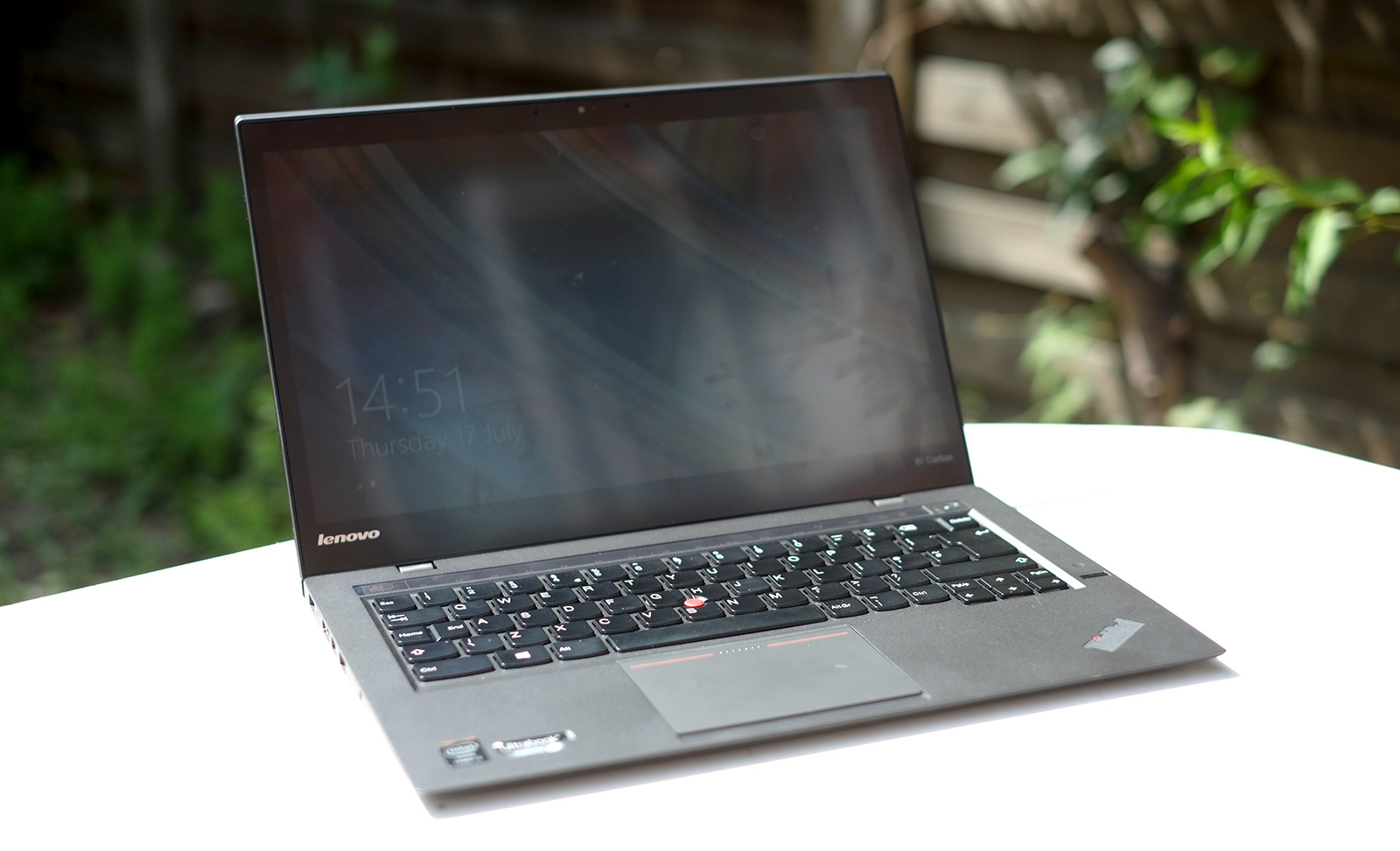
While resolution is the most eye-catching spec of the higher-end Lenovo ThinkPad X1 Carbons, what sets the display apart is its anti-reflective coating. This is not a 100 per cent matt screen, but this layer provides some characteristics, which will be useful in an office setting where bright lighting is dominant.
Outdoors, the top screen layer successfully takes the edge off reflections, and it's more usable than a glossy screen.

The anti-reflective coating does cause a minor texturing appearance to areas of block white and this makes it a little less impressive from an entertainment perspective than a glossy-screened alternative. There's also some obvious loss of brightness as soon as the screen is tilted back or forward from its optimal angle.
We weren't wholly taken by the 260cd/m2 brightness, and Lenovo's own specs suggest the non-touch version is 40 cd/m2 brighter. Contrast is also lower than you'd expect on a high-end machine.
Whites are a little on the warm side, but basic colour accuracy and image quality are good. The hinge flips the screen through a full 180 degrees for easy document sharing, and touchscreen responsiveness is great too.
Get the ITPro daily newsletter
Sign up today and you will receive a free copy of our Future Focus 2025 report - the leading guidance on AI, cybersecurity and other IT challenges as per 700+ senior executives
-
 Cleo attack victim list grows as Hertz confirms customer data stolen – and security experts say it won't be the last
News Hertz has confirmed it suffered a data breach as a result of the Cleo zero-day vulnerability in late 2024, with the car rental giant warning that customer data was stolen.
By Ross Kelly Published
-
 Women show more team spirit when it comes to cybersecurity, yet they're still missing out on opportunities
News While they're more likely to believe that responsibility should be shared, women are less likely to get the necessary training
By Emma Woollacott Published
-
 OpenAI wants developers using its new GPT-4.1 models – but how do they compare to Claude and Gemini on coding tasks?
News OpenAI says its GPT-4.1 model family offers sizable improvements for coding, but tests show competitors still outperform it in key areas.
By Ross Kelly Published