MacBook Pro 13in vs Surface Pro 3 review: Which is better?
OS X and Windows 8.1 battle it out to see is if the hybrid is better than the laptop
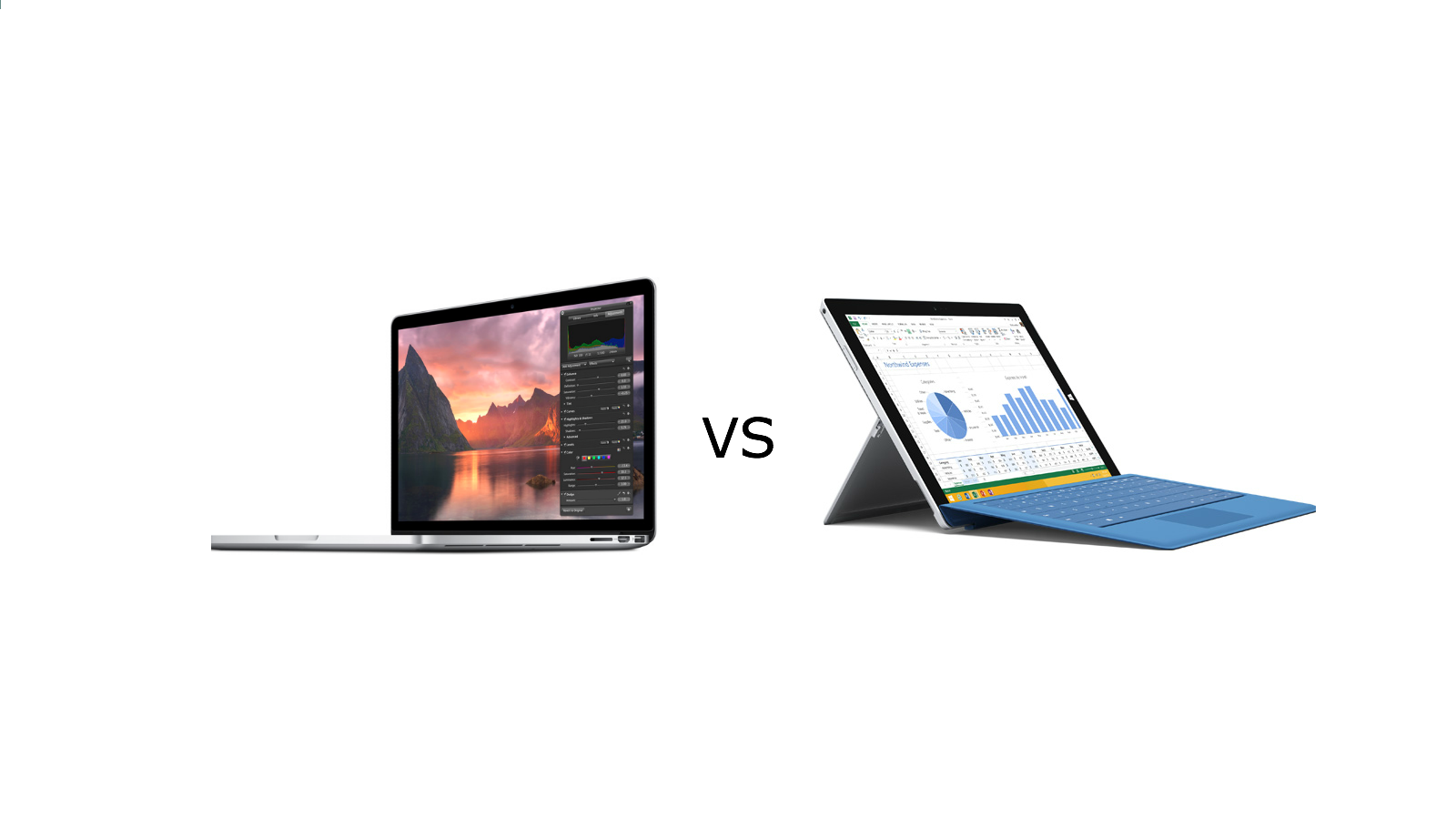
Microsoft has openly mocked the MacBook Air in comparison adverts with the Surface Pro 3. But if you take a closer look at the specifications of the Windows 8.1 hybrid, you'll see it has more in common with Apple's premium MacBook Pro range.
Hence it's fairer to compare the Surface Pro 3 with a fellow high-end rival like the 13in MacBook Pro (mid-2014). The devices battled it out to see which had the best design, display, input, operating system, battery life, performance, ports, repairability and pricing.
If you're eager to find out which device we recommend - jump to our verdict.
Design and Versatility
Microsoft has designed the Pro 3 as a 2-in-1 hybrid. It's got a detachable keyboard, which can be clipped in to use the device like a laptop. Or the machine can be used as a tablet with the touchscreen.
The built-in kickstand allows the Pro to be propped up on any flat surface and it tilts back to 150 degrees giving you multiple viewing positions.

The Surface Pro 3 has a beautiful and tough Magnesium-alloy chassis. It's got a thickness of 9.1mm and the tablet alone weighs 800g. Realistically, you're going to be spending most of your time with the Type Cover attached, which brings the weight of the device to just over 1kg. But even with the cover, the Pro 3 can be carried about comfortably.

The 13in MacBook has Apple's trademark aluminum finish. It looks great out of the box, but the light colour isn't good at disguising scratches and blemishes. Being the bigger device, the MacBook is bulkier with double the thickness of the Pro 3 at 18mm and a total weight of 1.6kg. The overall footprint isn't too much larger than the Microsoft device - and if you get a cover, this can easily be carried around too.
Designed as a content creation machine, the MacBook has a clamshell form factor. It looks great but it's as not as versatile as the Surface Pro 3 when it comes to viewing angles, with thescreen tilting back a maximum of 140 degrees.
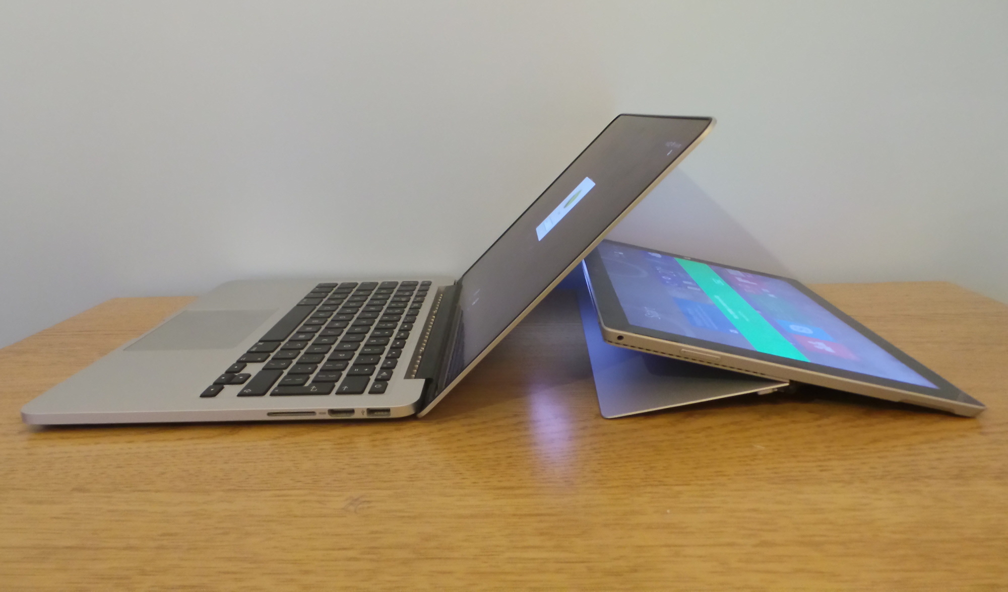
Winner: Surface Pro 3 - It's thinner, lighter and can be used as a tablet or laptop.
Display
The Pro 3's 12in screen is made using reputable Gorilla Glass 3. Microsoft has squeezed in 3.1 million pixels (2160 x 1440). It's fully touch screen enabled and we measured a maximum brightness of 352cd/m2. It's excellent for web browsing and multimedia tasks.
The Windows 8.1 device lays down a high-marker but the MacBook Pro is able to surpass it. Users get a 13in display with 4.2 million pixels (2560 x 1660) and the brightness is a touch higher at 374cd/m2. The only area where it does not match the Surface Pro is touch screen functionality.
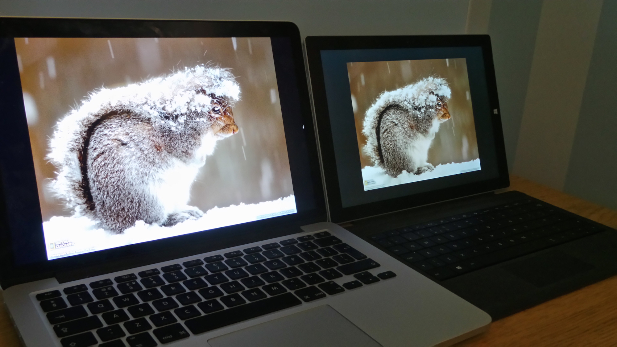
Colours are deep and vibrant on both machines, making it possible to use them for multimedia work. The Pro 3 does have more saturation, so colours look more realistic on the Mac.
Apple does more work on optimising the panel with OS X so you won't find scaling issues in the MacBook. Conversely, this is a problematic area on the Surface Pro 3, as current third party apps, such as Adobe Photoshop cannot be used comfortably on the high-res screen as the icons are tiny.
Winner: MacBook Pro - Perhaps the most closely contested category in this head-to-head. There is little to separate the displays but the MacBook offers a bigger, sharper and brighter screen.
Input
The Surface Pro 3 has three forms of input. The touch screen is ideal for web browsing, as you can tap in web addresses, click on links, pinch-to-zoom and scroll. It's also there when you want to switch between apps or close them down.
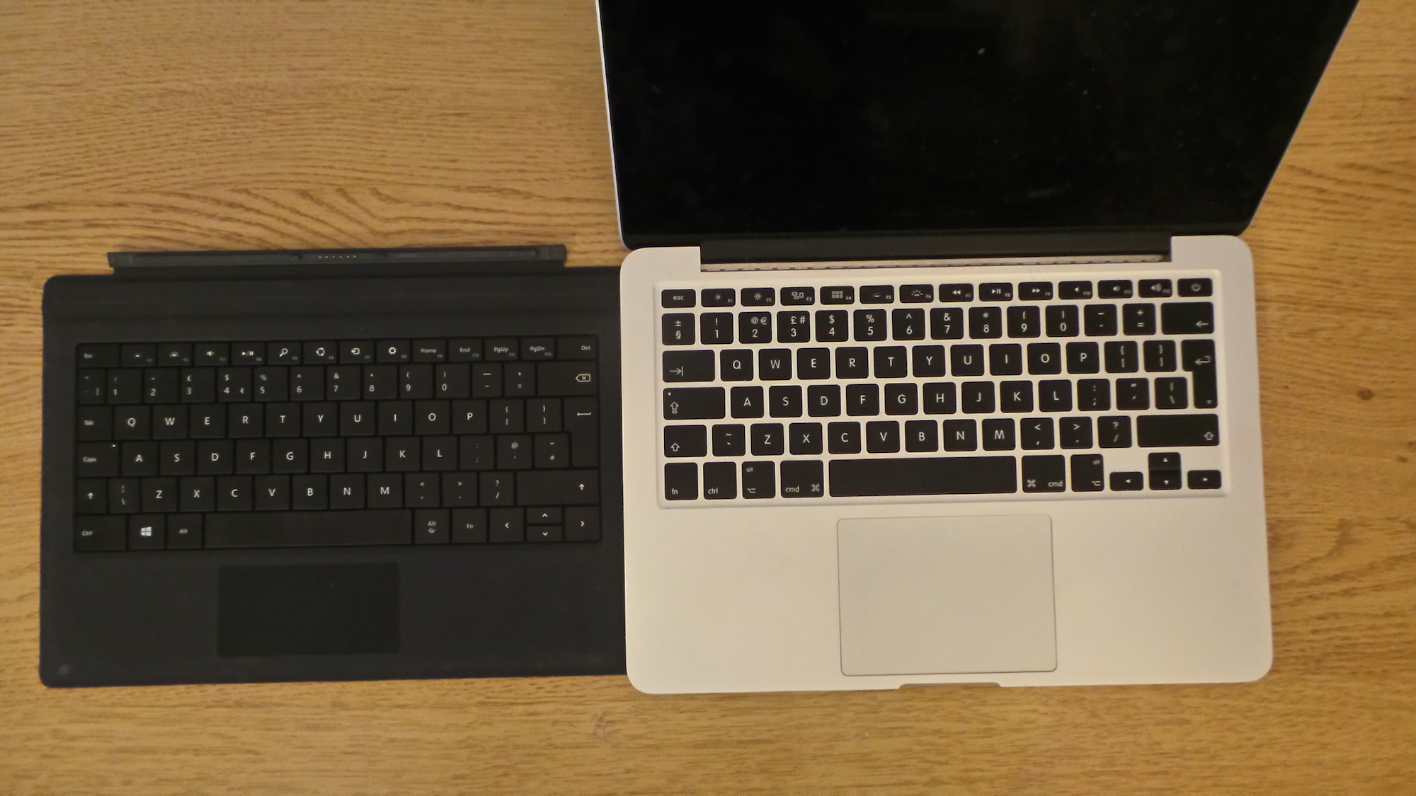
The keyboard can be clipped in for long-form writing and editing. It's adequate when you're on the move but typing on it all day can lead to wrist and finger fatigue. The trackpad is the weakest part of the Pro 3, but this is compensated to some degree by the touch screen.
Pen input is available for note-taking via OneNote and can also be used to interact with design applications. It's got 256 points of pressure and the implementation is fantastic. You can click the pen-lid anytime and start taking notes immediately.
In comparison, input on the MacBook Pro is restricted to the keyboard and trackpad. The chiclet style keys are well spaced - although travel could be better. The sharp edges on the MacBook can also be punishing on your wrists and we've experienced wrist cramps when using it for long periods. The trackpad is outstanding in terms of responsiveness and there are a number of gesture controls available to switch between apps and desktops. These work flawlessly and aid navigation between multiple apps.
Apple has yet to integrate a touch screen into its laptop devices and there's no pen input either.
Winner: Surface Pro 3 - Both keyboards could be better. The Pro 3 might have a poor trackpad compared to the MacBook but the outstanding pen input and touch screen functionality give it the edge.
Get the ITPro daily newsletter
Sign up today and you will receive a free copy of our Future Focus 2025 report - the leading guidance on AI, cybersecurity and other IT challenges as per 700+ senior executives
-
 Bigger salaries, more burnout: Is the CISO role in crisis?
In-depth CISOs are more stressed than ever before – but why is this and what can be done?
By Kate O'Flaherty Published
-
 Cheap cyber crime kits can be bought on the dark web for less than $25
News Research from NordVPN shows phishing kits are now widely available on the dark web and via messaging apps like Telegram, and are often selling for less than $25.
By Emma Woollacott Published
-
 Windows 10 vs Windows 8.1: Which was the best operating system?
Vs We rate Windows 10 vs Windows 8.1 in a number of key categories for professional use
By Barry Collins Last updated
-
 Windows 10 vs Windows 8.1 vs Windows 7 - Microsoft OS head-to-head
Vs We pit Microsoft's most popular operating systems against each other to see which is the greatest of all time
By Mike Passingham Last updated
-
 macOS Sierra UK release date, price, features: Night Shift mode returns with macOS Sierra 10.12.4 beta 8
Rumours The tech will reduce blue light from your screen at night time
By Jane McCallion Published
-
 Surface Pro 3 review: Everything you need to know
Reviews Microsoft may have just fixed Surface Pro 3 battery issue
By Joe Curtis Published
-
 OS X 10.11 El Capitan release date and features: Is it worth upgrading?
News OS X 10.11.6 update released for developer and public beta testing
By Maggie Holland Published
-
 Apple MacBook Retina 12in review - 'a superb choice, but challenging to fit into how you work'
Reviews Apple upgrades specs and adds rose gold model for 2016 MacBook Retina 12in
By Alan Lu Published
-
 Critical vulnerability discovered in OS X
News Built-in security measures no match for Zero Day flaw, claims security firm
By Jane McCallion Published
-
 Apple 13-inch MacBook Pro With Retina Display (Early-2015) review
Reviews A Broadwell upgrade provides impressive battery life for Apple’s business laptop.
By Cliff Joseph Published